Creating an Efficient UI in ASP.NET. Part 2
In the first installment of this series, we discussed the reasons for creating a clean and efficient UI, and some of the methods behind it. If you haven't read the first part I suggest you do so here. In this article we are going to go over some of the basics in getting setup to provide a streamlined user interface in a business sector. Examples of use would be an intranet application, a Contact management solution, or some similar file / information store. We'll discuss the pro's and con's of a few model types and ultimately choose a method and start our design. The goal at the end of this article is to provide an interface "shell" that can be reused across different application types. This shell should be similar to a template, but more extensible.
We are going to extend on the examples of the previous article, and attempt to give the user a method to prioritize the relevant information, so they can make fast and accurate decisions on how to navigate and extract the information they are looking for from your application. Here's a quick graph that you may find interesting. I'll describe the graph in the paragraph following the example.
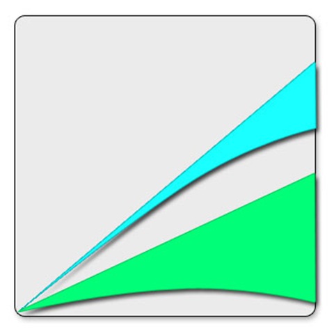
The blue section represents a UI that has been designed badly, or at the very least, not optimal. What we see here, is that eventually the area gets wider (IE: The user understands more of how your app works) but the ascent is steep, and the ultimate end is that they have a much smaller understand of the big picture than originally intended.
The green area represents an efficient UI. The learning curve isn't near so steep, and the user much more quickly understand a larger part of the application in their journey to being truly efficient at it.
So what's our next step you ask? The next thing any good developer / architect / designer should be doing is to examine the process. It's vital to putting your UI together correctly, that you understand exactly what your users want to accomplish...why the end goal is.
I've always said, that if monkeys delivered data packets by hand from computer to computer, we'd all be called .MNKY trainers instead of .NET developers.
That's a quick quote from a speech I did on this very subject. The point being, we happen to develop software for a living, but our users could care less...they don't care if it's software, or monkeys, or cheese fondue that solves their problem, they have a business process that needs accomplished...it's our job to fix it, luckily we do that through software and not either of the other two.
Example:
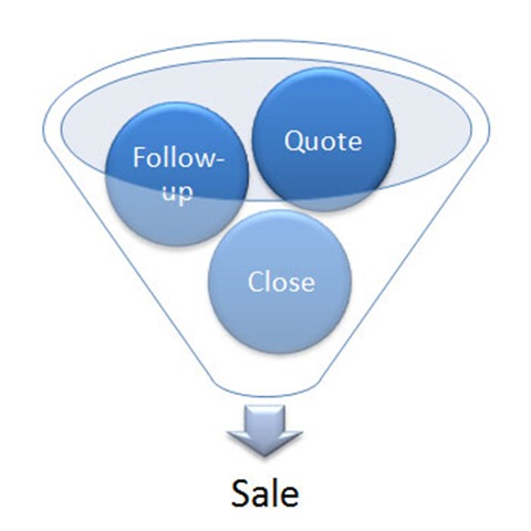
My software has screens to enter a customer, enter a contact to that customer, enter a communication to that customer, enter a follow-up..etc. From a development standpoint, all these are disparate entities with some type of hierarchical relation right? But what about from a design standpoint? What's the process here and what's the end goal? The end goal in this situation is to follow a business process to the ultimate end of a sale most likely, so how do we facilitate that keeping the end goal in mind? In this case, I'm likely to not reinvent the wheel and do a little industry research, how does Gold-Mine and Sage and Microsoft's CRM handle it? What's my message, and what specific needs does my user have? I'm likely to start with the goal and work backwards. Start with the Sale and and define everything that gets me there.
Lets not get ahead of ourselves though. You're thinking...but what about the shell we are supposed to be creating...and I'd say your right! But how does this recent information change our model? Well I'll tell you - it exposes considerations.
- Screen Area
- Navigation
- Task specifics
Ok, so lets get to creating our shell and get the download available for everyone here. I can speak from experience here when I tell you, there's a different skill-set required to create a corporate identity for a web application, and to create an internal / external business use application. I made many of the mistakes, and found out quickly that I was going to have to retrain my brain a little bit. I'm kind of a designer by heart, so my web 2.0 designs were chalked full of the typical web 2.0 junk. Bright colors, large pictures, glass or reflected areas...
This however cool and web 2.0 it may be - doesn't accomplish our task at hand, as I learned quickly. Almost everything that makes a great e-commerce or identity site, makes a horrible business application...almost.
![cp[1]](https://aspblogs.blob.core.windows.net/media/bryansampica/WindowsLiveWriter/CreatinganEfficientUIinASP.NET.Part2_8800/cp%255B1%255D.jpg)
You'll notice, consistent and matching colors, standard navigation location, and grouped information ARE consistent, so I'm going to start with that, and end this article with my applications shell, then describe it a little and provide your download.
I've included this line in the CSS but it's currently comment out, if you want a good indication on where the DIV's are.
Div
{
    border:1px solid black;
}

Ok, so now that I'm confident I have a working page with appropriate containers - here's the download.
Sandbox Download - Here