Archives
-
Adopting the Metro Style for Line of Business Apps
Here are some thoughts around adoption the new Metro style look and feel for line of business applications (LOB) in your organization.
I am not a UX expert (is anyone?) but I think I know what looks and feels right and I strive to try to include that in every solution I build. Metro introduces us to some new concepts and as Jensen Harris pointed out, it isn’t just recompiling your app on WinRT. You have to re-imagine it and think about how it’s organized, how users will interact with it, and do some trimming of the fat so to speak as you move into the Metro world.
Good design practices still apply here. Appropriate use of whitespace, good layout, clear typography, and consistent UI patterns make a big difference so remember these and use them. A UI checklist might be in order for any app, not just Metro ones. I’ll state this from my experience. Very few business users know what they need and most can’t visualize past what they already have. Know this and learn to adapt from this perspective and I think you’ll go farther with the success factor with your users. Far too many times users are stuck with what they have, perhaps a spreadsheet-like application (where the one and only screen is 8000 rows of data and 300 columns). Anything you present to them, no matter how effective, is just shadowed by that grid in their mind.
I’m a strong advocate of the task oriented UI and think it works. Try to keep this in mind when designing the system and don’t let your user try to do 80 things at once on the same screen. You’ll just run around like a chicken with your head cut off trying to cater to everyone and in the end deliver a mediocre product that works for all cases rather than separate UX instances that are stellar for each situation.
Metro is different. It forces you to think about your application in a different manner. No longer are you trying to get tree view feeding items into list view feeding details into file view. There are still groups and collection of groups and all that but remember your UI now is a functional, breathing, living thing. Minimalism is best here so you want to get out as much information in as effective space as possible. As Microsoft pointed out, a live tile isn’t something you should be posting every detail to. It’s an extension of the application so treat it as a first class citizen, not a UI element that needs to be pretty.
Lists should contain just the right amount of information. Again, go back to your users and push them. Try not to take the route of “What do you need” but rather provide them with a solution that accomplishes the goal they’re aiming for (of course that means you need to establish a goal first). If they’re coming from a giant screen of data saying “We need *this*” then push them to answer what they use it for. What goal are they trying to accomplish? Are they trying to summarize information or are they looking for something (e.g. show me all the users with more than 10GB of storage). If they have a goal, key in on it and that might become the basis of a UI workflow.
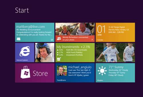
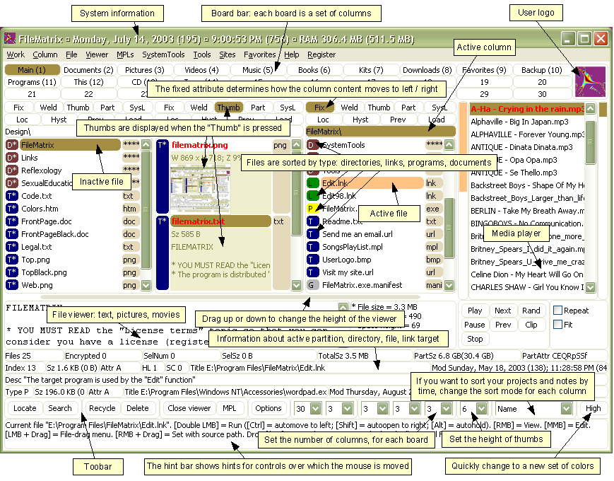
Again keep the focus on the goal. You don’t want this thing to get out of hand or you’ll end up with a Frankenstein monster of a UI like this:
Take them by the hand and show them. Lead by example and show them what is possible. Giving them design documents might not be enough and don’t describe things like “Imagine this window over here with a list of things…”. You’ll probably be met with the deer in the headlight look. You might be thinking that Metro isn’t right for this app and perhaps you’re right. Don’t assume that you *have* to build a new UI in Metro just because it’s there. Photoshop isn’t going to be a Metro app (ever, at least I hope) but your LOB app might. You need to be sure you’re doing the right thing and don’t try to fit a square peg into a non-existent hole. LOB apps *can* be great looking and useful. I highly recommend you check out Billy Hollis’ screencast he did on LOB apps with WPF. While it’s not Metro, it does show that LOB apps can be great looking and functional. A lot of great tips from Billys talk.
Build something. Even if you sit with them in a whiteboard session and draw pictures on the screen it’ll help. Build up the UI using something like Basalmiq is great and easy for them to see quickly. Visio is just too mechanical to fiddle around with and your users will quickly loose interest. Rapid feedback wins over here but then take that back to the development environment and build it. The next day show them it in action on the real website or desktop you’re building it for.
There’s a danger here that I’ve seen of the “It’s done” syndrome. Users will see a mock-up in a website and think that all the work is done. It isn’t so temper your system with that and read your users. Find out if they really believe it’s just some if/then/else statements you have to do to make it work. I would opt to not call this “prototype” or “mockup”. I prefer to call it the working software. It’s what they’ll use in the production release and it’ll just evolve as they provide feedback, new elements are added, and parts of the system become functionally complete.
Look for some re-imaging of “Classic” apps into Metro ones soon as I’m planning on doing a few blog posts about this.
Many thanks to @colinbowern for some great tips on Twitter.
-
Microsoft's Next Move, Split Metro and Classic Mode in Windows 8?
Caveat lector. This is an opinion piece and not something I do often (or probably well) but my thoughts on this were a little more than 140 characters could handle. You have been warned.
Recently Netflix CEO Reed Hastings stood up and, doing his best impression of a half-pregnant Jeff Bezos, announced the physical division of it's DVD lending system and streaming services. This resulted in Internet carnage that continues to this day. The general feeling there is that the separation is going to cause pain and suffering with long time users who now look at it as having to search two separate and distinct places to find the same stuff, get two different bills, two different user experiences, etc. Visionary perhaps, but not fully baked.
Many who went to the recent Build conference (and others like myself who didn't) got their taste of Microsoft's Jekyll and Hyde next operating system, Windows 8. The "alive with activity" (sans spiders and snakes) view of the living tile Metro user interface is almost revolutionary in style, approach, and implementation.
The Metro UX is a new experience (some say a new way of life) in Windows 8 and is all about building an immersive user experience that’s unlike anything we’ve seen for a long time (a pre-cursor was the Metro makeover they gave Windows Phone 7 last year). Users get information from living tiles rather than static icons on a free-flowing desktop devoid of a clumsy arrangement and optimized for fingers, not mice.
Now that the dust has settled, the question that seems to be bubbling up to the surface for me (and some others), is Microsoft making a mistake? Combining the "optimized for touch" interface with the antiquated keyboard and mouse apps looks like it might be. Maybe Microsoft should be following in Apples footsteps and creating an optimized for touch operating system and a classic one.
Don't get me wrong. I'm not actually saying they should ditch what they have but it could potentially be tweaked. The classic interface could be completely removed from the Metro one and vice versa. This I see is a move that might be welcomed by developers and users alike.
The Development Story
Right now the developer story is just shaping up but already it’s causing confusion. Some developers are still asking the question about the Windows Runtime (WinRT). Why can’t we build Metro apps on Windows 7? Why is the WinRT a different API than the classic CLR. The bits are different. The runtime is different. The security is different. Heck, in Windows 8 you can write “desktop” apps using HTML5 and JavaScript for goodness sake. That in itself just says we’re not in Kansas anymore Toto.
It makes sense, if you think about it. Metro WinRT apps have a distinctive style to them and have restrictions you don’t have in the classic development world. Metro apps can’t even access the underlying file system (sans some Isolated storage which is not meant for large amounts of data). The UX is completely different from the classic desktop we’re familiar with and requires you to “re-imagine” your apps. There is no cross-platform compilation here. This isn’t “build a UI for Metro and build a UI for Classic mode”.
While you have to build two different applications anyways, what’s the difference if they’re on the same OS or not? It doesn’t mean you have to rewrite your entire system from scratch for each OS like you have to do today with Apple. A good developer is going to structure his system so the UI is separate and through the use of patterns like MVVM, changes to the back-end stuff, the important stuff, is minimized.
It does however require you to re-think your application, perhaps removing large chunks of the underlying system and changing the way it not only presents itself but what it presents. I’m not just talking about a UI makeover (which needs to happen) but the fact that your ViewModels today are not the same ones you need for Metro.
For example a Movie Catalog app might provide a ViewModel of titles in a single collection with a category attribute. The current UI might present this in a typical tree view, allowing the user to filter on single or multiple categories which then also lazy fetches the list of titles and presents it (through a child ViewModel) in a list view on the same screen. This two or three pane view of your data might be fine in a traditionally designed app but in Metro things might behave differently. Perhaps the categories are already broken down for you in a grouped collection and selecting one takes you to a view where no collection information is needed so only the movie titles and metadata are displayed. The information you show on the screen might be different for each style as well so ViewModels here cannot really be reused. Even the lazy fetching of the data on the back-end might be different in a Metro style app from a classic one.
In any case, the development story might be a little muddy right now and we’re still playing the Sesame Street “One Of These Things” games. Heading it off at the pass might be a good plan and let developers focus on the target platform that suits their purpose.
The User Story
Users are a whole new ball of wax with Metro and Windows 8. The causal user who’s going to use a touch device wants big targets and easy to use minimalistic apps. They’ll bounce around between weather, RSS feeds, Twitter and Facebook so the “flipping through apps like pages in a book” approach works well here. Nobody in the user community I hear is complaining about how you change between apps in Windows 8. Apps are designed for this. By their very nature, Metro apps are all about quick and concise information and not 800 buttons, 300 windows, 150 graphs, 50 tools, and a partridge in a pear tree in a single app here. The user experience for Metro is flipping through items while waiting for a bus or sitting in a meeting or lying on the couch. It’s casual, even for business users.
People are all impressed to Hell about the Metro look and feel. Look how easy it is to find things. Look how fun it is to share things. Look at how fast I can get to my data. This is not for business users who are going to stare at a 70 by 3000 spreadsheet for hours at a time. It’s for users on the go and a step up from having the same information on a 8 inch phone platform.
Business users need the classic look. As Jensen Harris pointed out in his excellent 8 Traits of Metro Apps presentation, apps like Photoshop just don’t fit into Metro. They don’t belong.
Identity
I see an identity crisis here in the making (or perhaps that ship has already sailed). Microsoft keeps touting the Metro look and says “And your classic apps are right here”. Then the user is subjected to a jarring shift from the beautiful typographic world of Metro to the classic desktop we have now, full of chrome and frames and toolbars oh my. It’s like watching the magnificent tranquility of Claude Monet’s “Water Lillies” and then be suddenly thrown into the world of Jackson Pollocks “Composition with Pouring I”.

The experience right now is jarring. Click on any “classic” app and Metro goes bye-bye and you’re back at traditional desktop. Then you look down, see the iconic Start button, click it, and BAM! You’re back in Metro land, wondering how to get back to the comfort zone. Users don’t know how to use shortcut keys. I struggle and watch people who have been “using” computers for years still not use Ctrl+C/Ctrl+V to copy and paste and if I asked 100 people at work right now if they knew they could lock their computers with a single keystroke (Windows + L) they would shake their heads in disbelief.
I know what you’re thinking right now. Two platforms. Two deployments. Two SKUs. Two nightmares. I don’t think so. It’s a choice. Do you really see people complaining they can’t run their iPad apps on their desktops? Yes, it’s more work but I think it’s the right work. While Microsoft continues to say that Metro works just as well with a mouse and keyboard than it does with touch, people continue to look at the “optimized for touch” interface and scratch their heads wondering what this experience is going to be like with a keyboard. It works but it’s not the best. How do you pinch zoom with a mouse? How do you dual scroll with a keyboard? Just because you can do something, doesn’t mean you should.
Your Move Microsoft
I’m just a guy. Some people think I might have some internal influence with Microsoft but I don’t. I bitch, I complain, I praise just like everyone. People at Microsoft possibly (probably) already have the plans in place for Windows 8. That decision was probably baked over a year ago during early design or roadmap sessions.
Is it a good move for Microsoft? I think so. As a developer I would be happy building systems targeting two operating systems. As a developer I might go through the entire Windows 8 lifecycle without building a Metro app and that’s okay. Some developers might bitch and groan that they need to build two different solutions for the same platform so this would fix that problem. Now you’re building one app for one platform (and optionally another app for another platform should you choose to go that route).
-
Adding Ratings and Comments to SharePoint Publishing Pages
One of the cool features that was introduced in SharePoint 2010 was ratings. Ratings allows you, with a simple configuration option, to provide the ability for users to rate individual list items. This includes pages and documents because, after all, a publishing page is just a document in a library which in turn is just a list item.
On almost any news site you might find the ability to rate content. Voting things up by providing a “I like this” type tag to a page or by giving a page rating. This is missing in the out of the box SharePoint for publishing pages and takes a little work to get it going so let’s turn SharePoint up to 11 and get it done.
Tools you’ll need:
- A SharePoint publishing site
- A “Pages” library where new articles are created (any site created with the Publishing site template creates this automatically)
- SharePoint Designer
- A few minutes of your life
We’ll start with the stock Publishing Site. I’ve added a few articles and just modified the navigation on the side to display pages.

If you navigate to the Pages library (Site Actions > View All Site Content > Pages) and go into the settings for the pages you’ll see the list of default columns for the page library:

Go into List Settings and click on Rating settings under the General Settings section

You’ll be given the option to turn ratings on. Do this for the Pages library and click OK.

Note: You must have the SharePoint Timer Services running and the User Profile Service configured and started for ratings to work. Why? Ratings for items are updated via timer jobs so when you rate an item it takes up to 15 minutes before the rating are updated and propagated throughout the farm. Part of that propegation is updating your SharePoint “social” profile (things you’ve done like rating items, creating tags, and leaving comments). These functions require the User Profile Service to be configured and working (which is way beyond the scope of this article).
After turning on ratings for the library you can look at the updated columns which are going to capture the rating for each item.

The columns are also completely functional so if you just look at the All Documents view of the Pages library you can rate individual items immediately:

This is great but we want to make it a little more intuitive. We’ll modify the page to allow for ratings on the article page when the user views it. For this we’re going to modify the article layout page. We modify the layout page because we need to store the ratings for each page so having it on the Master page won’t work. This approach is fine but remember two things. First, you’ll need to add this snippet to any layout pages you use. Also remember that when you create a new site (and a new Pages library) that it will continue to use the existing layout pages but the library needs additional work to enable ratings on it.
Open the site in SharePoint Designer and select Page Layouts from the Navigation Tree:

We’re going to modifying the first page layout that we’ve used in the articles so far. If you edit the page the click on the Page tab you can view what Page Layout the page is using (it’s also displayed by default in the All Documents List View). Click on Page Layouts and the highlighted one is the layout the page is using. Below it shows we’re using the Body only layout.

Back in SharePoint Designer we need to find this layout. In the Page Layouts view find the page with the title that matches the layout in the browser.

When you click on it to launch it in SharePoint Designer you’ll be warned that there are no editable regions through this dialog box:

Click OK to open the page in “Advanced Mode” which basically just means “Let me edit the entire page”.
Scroll down near the bottom. You’ll find the ContentTemplate that’s for SharePoint 2010 (UIVersion=”4”). This is the layout that is used to display the article (be careful not to change the UIVersion=”3” section above, it’s a carry over when the system is running in “Make it look like SharePoint 2007 mode”).
We’re going to insert this snippet:
This is the control that you saw in the List View which will render the average rating for the item (compiled from all the votes and updated through the Timer service mentioned earlier).
We’ll add it below our article and wrap it in a div tag using the “article-content” class (which will style it the same as our story)

Refresh the page on your site and you’ll probably see this error:

The SharePointControls tag we inserted isn’t known by default in the layout pages so we have to add a declaration to the top of the page. Add this snippet at the top of page:
This just tells the page that when you see the SharePointControls prefix, use this control from this assembly. Insert it at the top of the page like this:

Now go back to the page in your browser and hit F5 to refresh it. You’ll see the rating control added below your article.

Sweet! Go ahead and create a new page (or a few of them) using the Body only layout. You’ll see the rating on each page. Remember that clicking on a rating will take up to 15 minutes before it’s updated so be patient!
Oh, but ratings are not enough. Let’s face it, if we want to foster “social” type of atmosphere with SharePoint in the corporate environment we need social tools. Not only can we add ratings to articles we can also add comments.
Comments are something new to SharePoint (and not stored in lists, don’t get me started on how to do something like aggregate comments). Comments come from the server and are similar to tags (like the “I Like It” tag that you can hit on any page). They’re part of the whole social upgrade SharePoint 2010 got and a very cool thing.
It’s only natural to allow users to comment on articles so let’s do that.
Still in SharePoint Designer insert this snippet below the DIV tag you created for the ratings:
It’s that simple.
Now view the page in your browser again.

That entire chunk in the red box is what was added with the SocialCommentControl.
Enter a comment and click Post. The comment is saved on the server (in one of the new Social databases) and associated with the article. Go to another page and you’ll see that there are no comments so comments are unique for each article.
There’s one gotcha with the comments. Here’s a new comment added to the article:

Note the craptastic layout. It’s as if there’s an imaginary box drawn around the comment that’s forcing it to be a certain size. And if you guessed that, you’d be right! Here’s the behind-the-scenes markup for a comment:

Yup. Comments are rendered inside a DIV tag that’s forced to a width of 390px. If you’re okay with this then you can leave it alone, otherwise insert this into the top of your page layout:

Now refresh the browser to see this:

That’s better. Now the comment takes up the entire width of the screen. We insert the custom CSS onto the page because the default CSS for comments is in a system file (and used on the My Site pages) so we don’t want to screw up that with a global change. If you have a custom CSS file for your site you can add it there too.
Like I said you’ll need to do this on every page layout in the system if you want to enable ratings and comments on article pages. It shouldn’t take more than a few minutes though (probably less time to implement than it took to read this article). Don’t forget to enable Ratings on each Pages Library in your system too. Comments don’t need anything special done to the library as they’re stored centrally (but you do need the My Site functionality setup along with the Social databases it creates).
Hope that helps and have fun! It’s a great feature to enable and a great way to get your users to participate in your corporate content!
Enjoy.
Opening Files in the Browser with SharePoint
A change in SharePoint 2010 is how it handles browser file permissions which results in how files are opened when they’re selected. A common problem is clicking on a PDF file and seeing the browser Save dialog instead of launching the Adobe reader.
There is a setting called Browser File Handling in each Web Application (under General Settings). By default it is set to strict which causes additional HTTP headers to be injected which blocks the opening of PDF and other files. Switching the option to permissive will allow things to function like they did in SharePoint 2007.
This is web application wide so you’ll need to do it for each web app in your farm. Here’s the dialog and the setting.

Hope that helps!
Demystifying the Windows 8 Grid Application
If you’re looking to “re-imagine” your apps on the Windows 8 platform in Metro style you can start with the Grid Application template that’s provided in the Visual Studio 2011 preview.
From Visual Studio choose New Project and select Grid Application under Windows Metro Style in the template tree:

When you start you’ll get a fully blown Windows 8 Metro application, ready to begin filling in with your own content.
How did all that stuff get there and where does it go?
First open up the Sample Data folder in the solution. In there you’ll find a file called SampleDataSource.cs. This contains some sample data to work with and is bound to the Xaml pages in the solution at runtime. You’ll of course replace this with runtime data but the sample helps you visualize your app along with understanding where stuff goes on the screen.
Or does it? The default app is all in Lorem Ipsum speak and while this is great for visualizing a fully populated application, I thought it was a little confusing to know how it fit together. To make it clearer where everything goes I’ve modified the first collection and item in the SampleDataSource.cs calls with more descriptive labels. Here’s a better picture of the GroupedCollectionPage.xaml, the “Home” page in the app:

Note the collection title appears above the group but only the description and category for the item appears for each item. So if you’re relying on users finding things by the item title (maybe it’s the title of a recipe or a newsfeed) then you might want to modify the layout for this to bind the title somewhere. You can get creative for example and overlay the title on top of the image.
And here’s the DetailPage.xaml, what you see when the users clicks on a single item in the collection:

The Collection Title is the prominent title here but it does show the Item Subtitle. Again this might not be the desired location for titles. For example the Item Title is a small item below the image and category. Personally I would swap out the Item Title and Item Subtitle here or even use the Item Title in place of the Collection Title and leave the Item Subtitle alone (removing the Item Title below the image).
There may be some Metro guidelines coming out to help understand the reasoning behind this positioning and maybe my brain isn’t thinking “Metro” just yet, but it doesn’t make a lot of sense to me the way the default locations are.
And here’s the CollectionSummaryPage.xaml, you would navigate to this if you clicked on the Back Arrow in the screen above (next to Collection Title).

Interesting to note with this is that the Collection Content isn’t used here, only the Collection Description. I would probably modify this to include the content or drop that property entirely and just use the description.
You don’t necessarily need to follow all of the structures the default Grid Application layout offers but do keep true to the Metro style and keep things consistent. I urge you strongly to watch Jensen Harris’ keynote on the 8 traits of a Metro app and realize that by using the default setup they give you, you’ll achieve a consistent look to your app that will fit harmoniously within the Windows 8 operating system.
Make more sense now?
Enjoy.
Realistic Blood For Your Films (or Halloween)
With Halloween approaching I thought I would share a recipe for blood (and start a new tag in my blog). I used to do a lot of special effects and animation for amateur and semi-pro films back in the 80s and 90s so thought I would see how that knowledge transfers to the 21st Century. Obviously we’re not shooting in Super-8 anymore and dealing with back winding film, optical printers, and A+B rolling but some things are timeless.
One makeup effect often taken for granted is blood. It’s easy enough to power some store bought “stage” blood but some of these stage bloods are not as realistic as the real thing and tend to look too bright-red. You want to make sure that the blood you see on the screen looks like blood. In addition to stage blood being somewhat expensive, it’s even cost prohibitive these days to get large quantities of it. 8oz of it is about $13 so you’re looking at over $200 for a gallon.
Dick Smith is the undisputed master of makeup and was responsible for making Linda Blair a demon in The Exorcist, John Hurt a caveman in Altered States, and getting pretty bloody with Robert DeNiro in Taxi Driver. Fortunately, Smith was also very open about how he did things and shared a lot of his professional experience over the years.

Here are Dick Smith’s tried-and-proven formulas for creating movie blood guaranteed to set your audiences squirming…
Karo Syrup Zinc Oxide Red Food Color Yellow Food Color Kodak Photo-Flo *see note below Water 1 Pint 1/2 Tsps. 1 ounce 2 1/2 Tsps. 1 ounce 1 ounce 1 Quart 1 Tsps. 2 ounces 5 Tsps. 2 ounces 2 ounces 2 Quarts 2 Tsps. 4 ounces 1 ounce + 4 Tsps. 4 ounces 4 ounces 3 Quarts 3 Tsps. 6 ounces 2 1/2 ounces 6 ounces 6 ounces 1 Gallon 4 Tsps. 8 ounces 3 ounces + 2 Tsps. 8 ounces 8 ounces * If the blood will not be used in the mouth, the Photo-Flo can be added. Photo-Flo is a wetting agent which makes the blood flow over surfaces without beading and helps it to soak into fabrics naturally, like real blood. If you use the Photo-Flo, shake your mixture more gentle than otherwise to avoid excess foaming (caused by the Photo-Flo). Remember, do not use blood with Photo-Flo in the mouth!
Mixing Procedure
Put the zinc oxide in a bowl, add an equal amount of water and stir into a paste. Add the measured amounts of red and yellow food colours and stir. Add a little of the Karo syrup and stir until it is well-mixed.
Pour this mixture into a container which is larger than the final amount of blood; that is, if you are making three quarts of blood, your container should be a gallon jug. This is necessary because once the formula is mixed, it must be shaken prior to each use in order to re-mix the contents, which tend to separate while sitting.
Add the remaining amount of Karo to your container and shake well. Finally, add the amount of water specified, mix thoroughly and you will have blood with normal consistency (thickness).
Ingredients and Tips
Food Colors: Most red food colors are similar, but the yellow ones vary. Some stain white paper lemon-yellow while others are more orange. Do some tests on your targets to see the effect and reduce the amount of yellow you add if it stains too much.
Karo Syrup: This is just a brand name for corn syrup. It’s preferable to get the clear stuff but if that’s not available reduce the amount of yellow food colouring by half for regular corn syrup.
Zinc Oxide: The type referred to in the formula is the pure powder form and can be obtained from a drug store or chemical supply house. In the small amounts used it’s harmless and adds opacity to the blood. It’s the same zinc oxide that’s added to breakfast cereals.
Darker Blood: The formula above matches true blood but might look too bright when used on white materials. Use about 35 drops of green food colouring per quart of Karo blood to darken it.
Thinner Blood: If you want a thinner blood (to pump through tubes) use the same formula (with the Photo-Flo) but dilute the Karo Syrup with an equal amount of water. For instance if the formula calls for one pint of Karo, add one pint of water to it before mixing in the rest of the ingredients.
Keep your blood mixture refrigerated when not in use. If you don’t it will form mould and have to be thrown out. A covered, plastic container is good enough. If refrigerated it’ll keep for long periods of time (months, not years). The regular formula washes off skin and clothes without any trouble but I wouldn’t be dressing in my Sunday best. Get your actors or victims to wear old clothes.
Enjoy!
jQuery, SharePoint Picture Libraries, and automatic thumbnails
Picture Libraries are an interesting beast in SharePoint. When you upload a picture to a picture library you get not one but three images! Whenever you upload an image to a Picture Library, SharePoint automatically creates two additional images for you. A small thumbnail it uses in views and a preview image it uses when you’re viewing the picture properties. Leveraging this “feature” we can build a pretty cool client side gallery using the auto-generated thumbnails and some JavaScript to produce this:

No C# or custom web parts needed. Just a few simple things to get this effect:
- jQuery installed on your site (there are many ways to do this like Jan Tielens solution here)
- A document library to store the JavaScript we’re going to write
- The jQuery Thumbnail Hover Popup for Greasemonkey plugin
- A SharePoint Picture Library
Creating the Picture Library
Create a picture library. I named mine “Pictures” but your can be whatever you want it to be. You must create a Picture Library as we’re going to be using the automatic thumbnails and only the Picture Library template will do this for us. In the demo I just grabbed half a dozen images from the Windows 7 wallpapers on my hard drive (C:\Windows\Web\Wallpaper) and uploaded them.
The Script
Here’s the complete source code to the JavaScript we’ll use. Copy this and upload it to a document library. I use the Site Assets library that’s available on any SharePoint site where the Wiki Home Page feature is activated (like the Team Site template) or you can just use or create any document library for it.
Let’s break down some of the parts to this.
First we have a div tag with an id of “pictureMicroGallery”. This is where we’ll load our pictures into. The text “Loading…” is just a placeholder. You can put an animated image here or whatever you want while the images are fetched.
Next we start our own script.
The first line is this:
Here we’re using a built-in function in SharePoint to tell it to call our own method, “loadSharePointPictures” after the sp.js file is loaded. This is similar to the typical jQuery document load technique you might see:
However instead of waiting for the document to load, we’re waiting for a script to load. If you try to execute client side functions before sp.js is loaded, you’ll run into problems. So we let the system launch our function when it’s ready. Next is the loadSharePointPictures function. This is our call to the client side object model to load content dynamically.
All the lines are commented so pretty self explanatory. In a nutshell we’re loading a list called “Pictures” (line 7), creating a query to fetch all the items (line 9), selecting two columns (line 13), and then executing the call asynchronously (line 15-17).
When this call is successful, we call this function:
Here we get the enumerator of items from our “pictures” variable (this was set in the previous function). Then we iterate through each item, fetching it and the data from each item in the list in lines 6-10.
The FileLeafRef column contains the name of the image file we uploaded (test.jpg, etc.). The FileDirRef column contains the folder where the list lives.
Line 11 is where the magic happens. Remember when you upload a file to a picture library I said there are three images. Your original + two additional images that are automatically generated for you.
Here’s the picture library in SharePoint Manager:

See how we have img13.jpg (which is the original image file uploaded) but then in a “_w” folder there’s “img13_jpg.jpg” and the same in a folder called “_t”.
The _t folder contains the small thumbnail image (set to 160 pixels wide). It’s the image used when you view the “All Pictures” view of your picture library. The other _w folder is the large thumbnail (set to 640 pixels wide). This is the image used when you view the picture properties.
The great thing about these images (apart from being created for you) is that they’re set to a known size (width wise) and the do some magic in setting the height, getting it as close to the original aspect ratio as possible. That means you can use these images yourself to produce a gallery (like we’re doing here) and get pretty consistent results even if your images are totally off.
In any case, in this example I deliberately uploaded very large images (1920 x 1200) to show you that you can use these thumbnails as your gallery rather than trying to resize the originals.
Back to the code. In lines 7-11 we take the filename and directory and build our path to the small thumbnail version of the image (in our _t folder). So img13.jpg becomes:
The thumbnail itself is a .jpg file (regardless of what the original source file is) so the original extension is embedded in the filename if you need it. Just decompose the thumbnail file, drop the extension, and replace the “_” with a “.” to find your original file. Lines 8 and 9 turn our original filename into our thumbnail version.
Lines 15-19 we take the array of pictures we previously built (which is a url to the thumbnail image) and build up a HTML string of IMG tags with the SRC pointing at where the thumbnail is.
Finally in line 21 we use jQuery to replace the contents of our DIV tag with our new HTML containing the IMG tags.
Note: You can separate these out and just have an include file with the .js content and manually add to the <div> tag to your page. Your choice. I just find that SharePoint often mangles the HTML I write and litters it with it’s own styles and tags so I just include the whole thing from a library. That way none of my markup is messed with. Take that Microsoft!
Adding It To The Page
With our script ready, add a Content Editor web part to the page and point the content at our JavaScript include file we uploaded to the Site Assets library (or wherever you have the script living).
Save the page and it should look something like this (I just replaced the Documents web part on the Team Site home page with my Content Editor):

Thumbnail Hover Popup Plugin
I mentioned this up front but why? As it happens, I stumbled over this jQuery plugin awhile ago and filed it away for something to look at some day. Turns out it’s a cool plugin which mirrors how the automatic thumbnails in SharePoint are generated. The author created it for Greasemonkey so he could preview larger images on sites without having to click through to a page. It works where the thumbnails and larger images have similar filenames (except for a change or two).
This works great for SharePoint because the _t or _w directories hold different size images and the filenames are built from the filename of the original image. Once you know one, you can get the image for the other.
We’ll do this on our gallery (which uses the thumbnails) so when we hover over the image, we present the preview image.
First upload the plugin (a single file, jquery.thumbhover.js) to your Site Assets library (or wherever your other script is).
Next add the following line to your own script to include the thumbhover one:
We’ll add a call to the plugin for all our images. Remember the IMG tag we added a class named “pictureGallery” to it (line 16 above). Now we can use a jQuery selector to attach the plugin to every IMG file. We need to do this after we rewrite the HTML for the IMG tags so find this line:
And add this after it:
This attaches the thumbPopup to every IMG tag with the class “pictureGallery”. The imgSmallFlag is the folder for the small images and the imgLargeFlag is for the medium thumbnails (the _w folder).
When it comes time to render the popup, the plugin will grab the SRC of the image then change the imgSmallFlag to the imgLargeFlag (so changing the IMG from the 160 pixel wide thumbnail to the 640 pixel one).
Now when you hover your mouse over the image thumbnails on your page, the plugin will fetch the large thumbnail and use it in the popup. The final effect will look something like this:

Enhance it!
That’s it. Now you have a simple script you can drop onto a page and get a cool looking gallery display out of it, leveraging the automatic thumbnails SharePoint generates for you. Of course, that’s only the beginning.
Some ideas on enhancements you can do to the script:
- Add in the ability to fade the popups in when you hover over the thumbnail. This will create a nicer effect for the user
- Display additional text on the popup in an overlay (use the description field from SharePoint for the text!)
- Change how you display the thumbnail, perhaps link each thumbnail to the original image or SharePoint list item (you’ll need to add more fields to your JavaScript if you want to read them in the success function)
- Add paging to the list of images so you display them in batches of 20 or 30
- Do some better formatting on the gallery and jazz it up a bit
Have fun and don’t be afraid to experiment!
Last Note: We don’t really *need* jQuery for this to work (except for the hover effect). Most of the code is just plain old JavaScript. The line to replace the contents of the DIV tag can be done with regular JavaScript so if you don’t want the hover effect (which is a jQuery plugin so requires it) and don’t want to use jQuery… then don’t. You’ll still have a simple and free client side photo gallery from the automatic thumbnails SharePoint gives you.
Enjoy.


