InstaCam MetroMakeover - Spacing, Margins, and Polish for your Windows Phone App
In the spirit of a recent article that Jeff Wilcox posted on his blog about the MetroRadio app, I thought I would do something similar for the InstaCam app.
InstaCam is a 3rd party app written by Dmitry Manayev to bring Instagram functionality to the Windows Phone platform. I contacted Dmitry about this post to get his permission. Here are a few tweaks that you can keep an eye out for in your own apps.
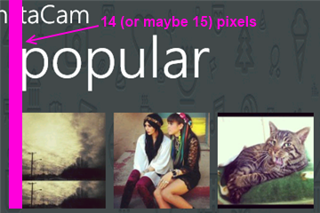
First up is the Popular Page. This has small square images of the most popular pictures currently posted on Instagram. The page is built on the Panorama control so the title is the default. It’s the pictures that are off a bit here. If they were indented 14 (or maybe 15) pixels then the edge of the pictures would line up with the pano title. Part of Metro is about lining things up and keeping it clean. You should see an invisible line down the left side of your pages that align things up. I saw the same margin issue on the search results page.
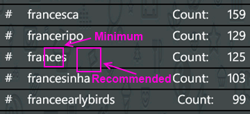
Next up is the search results page. I found the spacing to be a little tight so after measuring it I found that the spacing was in line with the minimum recommended target size from Microsoft, 7mm (check the guidelines here for target sizes). In the recommendations they suggest a target size of 9mm rather than the minimum of 7mm. The idea with Metro is to open up the design and make liberal use of white space. Don’t crowd things together if you can avoid it. There's plenty of space so hitting the target of 9mm (with perhaps a larger font) might open up the page a little more.
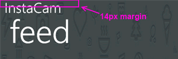
On the feed page there are a few little tweaks I would look at. First is the title for the app. The unwritten rule is that a page title should be in all CAPS. Hey, it’s a style. Check out (most) of the core apps and you’ll see the style applied there. Next is spacing. Jeff Wilcox mentioned there’s no hard and fast rule with vertical spacing (I really wish there was so we could all follow it, hint, hint) but he does say he tends to use 4, 6, 12, or 24 pixels. The default vertical on some of the initially generated XAML you get from Microsoft pegs some vertical space at 17 pixels so the message here can be confusing. For the title spacing I thought a 14px top margin would work here (but 12 would be fine too).
The thing about spacing is be consistent! I don’t think it matters if it’s 12, 17, or 24 but keep it the same on every page. That should be your mantra. Consistency. With vertical spacing (and especially page titles) watch out for the top margin where the system indicators are. If you leave them turned on, you lose 22 pixels. If you turn them off you get that back but remember to turn them on or off across your entire app (or compensate for pages where you have it turned on). For example Panorama pages have the system tray turned off by default so if your app goes from a Pano to a single page (or a pivot) then you might notice a slight “jump” with the title as it moves from a page without the system tray to one with.
Down in the details for a single picture it shows the user who took it, some information about them, and the likes and comments for that photo.
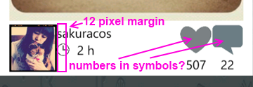
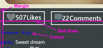
The name and when the picture was taken is a little crowded here and butts up against the profile picture. The suggestion here is to apply a 12 pixel margin to the left of the name (or the right of the picture) to open things up. In addition I would personally put the like and comment counts inside of the symbols (using white to offset the colour). That’s just a personal preference but it might make it a little tighter and gives you more space to be able to use larger symbols. There is a gotcha here of course with numbers inside of symbols. Some images will have 0 comments, other will have 10,000. I have seen a situation where the font scaled based on the width of the number so that might be an option. For sure when testing something like this you should consider ranges like this and try out the extremes. You might not be able to catch every scenario but don't just design for say 4 digits when the possibility of 8 exists for example.
When you view a single image I noticed a few things that a slight adjustment would fix. Again, a lot of these changes here are just minor tweaks to the UI, nothing major. I think this is the case for a lot of applications out there. A couple of hours going over things and moving a few items around goes a long way.
Here again the margin issue rears it’s ugly head. The margin for the Like button is fine (and bleeding the picture itself to the edge of the phone is a nice touch, lets you see more of the image). It’s the tags and detail labels. The colour doesn’t work against a dark background. Whenever you’re looking to highlight something consider using the PhoneAccentBrush colour (but use it sparingly). Dmitry did mention in the latest update that he fixed the colour to the blue phone accent colour. I took these sceenshots from the marketplace so maybe that hasn't been updated. On my phone the text does look better than here but again, watch out for themes when deciding on using accent colours, especially with fixed colour or image backgrounds.
As for the buttons, they’re a little off so as your eye moves horizontally across you see text jump up or down. It’s only a few pixels but a design technique mentioned by Arturo Toledo, a Senior User Experience Designer at Microsoft. On his UX blog he recently talked about the design process for Metro apps. In it he talks about Redlines, marked up screenshots of your app with lines drawn across and up to show alignment and spacing. This is something everyone should incorporate into their release process. Yes, my lines are magenta but that was just for clarity. Red, yellow, magenta, whatever works for you.
For the buttons themselves I would consider doing something with the extra space. Split the buttons (either using a Grid or a StackPanel with the Orientation set to Horizonal) so they’re evenly distributed (Width = 0.5* in the case of a grid). Then regardless of how much the content takes up, they’re consistent and not as jarring to the eyes. Again here I might consider putting the counts inside the symbols (to be consistent with the other views if you did that) but leave the words “Likes” and “Comments” so people know what it refers to. Here the words work because you’ve got the entire width of the phone to display them (vs. the previous image where there’s only room for the symbol).
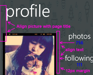
Finally the user profile page. I would suggest a few small changes here just like the other pages.
For this page:
- Align the profile picture with the page title
- Align the counts and count labels (photos, following, etc.) on the left. This tends to be the norm rather than centered text which sometimes looks like its floating without an anchor. Again refer to the core apps for some guidance here, for example take a look at a persons profile page (your own or someone else). They’re a good model to follow.
- The colours here are awkward again and hard to read. If you use the PhoneAccentBrush colour then pay attention to how the light and dark themes work against your backgrounds. Sometimes when using background images you need to adjust the Opacity dynamically. When testing, just go through all of the Theme colours in both light and dark mode. It takes an hour or so with a few screens and all of the combos but you’ll cover all the bases.
That’s it. Hopefully that helps you in your own application development and gives you a few little things to look out for. They’re all minor tweaks but things that you can add to a final checklist of things to go over before you submit your app to the marketplace. Thanks for Dmitry for letting me write this post and perhaps he’ll put some of these suggesting in a future release.