Metro Inspiration–Designing Better Looking Apps for Windows Phone 7
Recently I had the pleasure of checking out @jeffwilcox’s newest app for the Windows Phone 7 platform called 4th & Mayor. It allows you to interact with the location-based platform called foursquare.
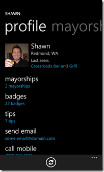
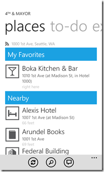
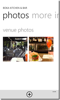
His app allows you to check in, take pictures, find friends, etc. Everything other mobile apps for foursquare do. In the design of the app, Jeff has really done a nice job on embracing and extending the Metro look and feel that’s prevalent on the Windows Phone 7 platform.
Inspiration
For me, I’m not even a foursquare junkie. I (still) don’t see the value in telling the world where I am at any given moment but I gave it a shot with Jeff’s app. Using his app I created an account, checked into a few places, and even became mayor of a few local hops (like the corner variety store, go me). I still think foursquare is silly, but 4th & Major made it fun for me.
Some key design features I saw in 4th & Mayor:
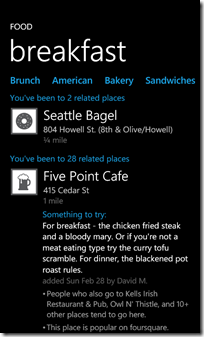
- Large touchable icons. Not tiny little things but big, bold 200 pixel wide images that expanded out to full size when tapped.
- Use of Accent Colour. Jeff uses it sparingly and doesn’t overdo it by setting subtitles and key information on the screens in whatever accent colour you use.
- Light and Dark. Jeff makes sure that the app still looks good in both dark and light themes and uses bold Metro like icons for types of locations (instead of say photos)
- Whitespace and Alignment. Nothing is too crowded in the design, even when there’s a lot of information to present and all the text aligns nicely so it’s not all over the place.
Enter Metro
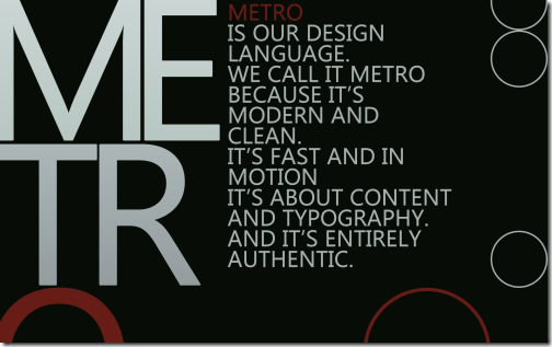
What’s Metro? Metro is the name of the new design language created for the Windows Phone 7 interface. It’s heavily influenced by Swiss print and packaging and focusing on simplicity. You can read up more about Metro here and review the Windows Phone 7 design guide that talks about specific controls and implementation here.
Since the release Jeff has also posted what he’s calling his Metro Design Guide. It’s a checklist (of sorts) that goes through the various aspects of the Metro design fundamentals and some things he’s sharing with everyone. It’s a great read and gets you into “thinking Metro” so I encourage everyone to check it out.
So where were we? Oh yeah. After playing around with 4th & Major and checking out a few other apps (like the Rock & Snow App out of the U.K. Marketplace) I thought it would be appropriate to give my simplistic Hamurabi game a facelift, Metro style. Little tweaks here and there just to clean things up a little. Here’s how I transformed the app to the next version.
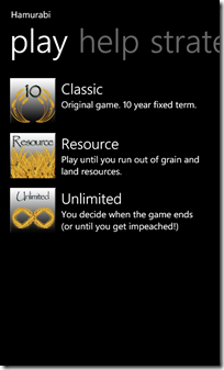
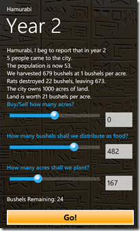
The app is pretty basic. A pivot table with various sections for playing the app, getting help, etc. and one gameplay screen where all the action takes place. Here’s version 1.0
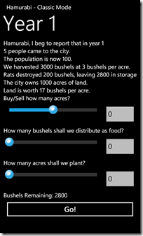
Bland and boring. The pivot control is the out of the box one. The gameplay screen is just a portrait page with some controls on it. I did do some styling in the first version around the slider control to make it a little better. I really didn’t care for the out of the box slider as my first test user claimed they didn’t know how to use it. So I just styled it with a round button with a little gradient background to make it more prominent. Yes, it looks a little like an iPhone control but there’s no real Metro equivalent and the default implementation sucks.
Metrofication
First up I went through the entire app and cleaned up the various offsets. In Jeff’s guide, the magic number is 12 pixels. I think I have engrained into my head now. 12, 12, 12, 12. And multiples of 12 are fine too, but by default regular text is indented 12 pixels from the edge of the screen. It’s a nice number so don’t mess with it.
As you can see from the screenshots above, I’m not completely consistent in my alignment and spacing. Text overhangs various places and isn’t consistent. Also the text on the home page doesn’t seem to stand out. It’s hard to tell the difference between the titles and the descriptions (they’re larger in size but I think we can do better).
The Prime Directive
If there were a Prime Directive when building an app for WP7 this might be it. Simplicity through consistency. Stick with known styles and numbers. The default spacing is 12 pixels and while you might need some more, try to keep with that number in mind. Keep your spacing consistent throughout your entire app as well as colours and fonts. I don’t mean use the same font everywhere but I do mean to not arbitrarily space controls on the design surface.
This idea here is that when a user is looking at one app, then flipping to another it shouldn’t be a jarring user experience. Your own app pages should be consistent in their font use and spacing as well. If everyone follows some simple consistent rules (both in and out of your app) then the user benefits. The experience is consistent and while you’re totally allowed to be creative, don’t overdo it.
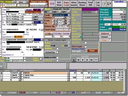
That is, don’t do this:
Here’s a Windows app that someone wrote which just goes to show that being unique isn’t the best experience in the world for the end user. Cluttered, multiple colours, multiple fonts. In a word, confusion just from an aesthetic sense (let alone the poor sucker who has to use this app).
Metro is like a design pattern. In software development we have all kinds of patterns. Patterns for separation of responsibility, patterns for accessing external data. If you can program it, there’s probably a pattern for it. The thing is with patterns think of them like sewing patterns. They provide a shape to cut out and some instructions on how to use them. You can follow them by the book and get a good result. It’s the people that take patterns and apply their own creativity to them that makes them stand out. This is the same with Metro. There’s no rule written in stone that says you have to use a specific font in a specific size for a panorama title. What the Windows Phone toolkit provides out of the box is a default implementation.
Pivot to Panorama
For example let’s take a look at the Panorama control. As I was cleaning up the Hamurabi app I thought it might fare better as a panorama control instead of a pivot. It’s a choice as to what control to use as the two are very similar but I follow a simple rule. If the data presented is different slices of a bigger list (for example filtered views of a large list) then a pivot might be more appropriate. If the screens are somewhat disjointed and don’t really go well together then a panorama might work. Again, no hard and fast rule here but I thought I would try a panorama control.
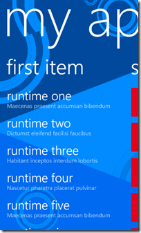
Here’s the default panorama control you get if you use the Microsoft template:
Simple and it works. Nothing special you need to do except replace the background image with you own.
Or is there?
For Hamurabi I didn’t want the harshness of the title that comes with the out of the box panorama control so I created a new style for the title and added it to the page:
Then instead of using the default Header property I overrode that with a custom TitleTemplate:
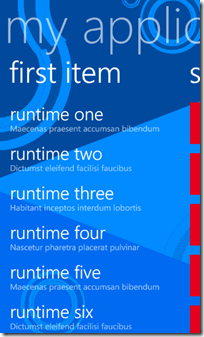
The result is a slightly less glaring title. It’s still a Panorama control but I like it better than the default one. The text doesn’t stand out as much and I find it more inviting. Also with the reduced font size from the default, I have a little more room for my application.
Next up were the Panorama Items. Again, here’s the default:
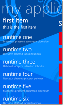
And again we do a little styling. Instead of a single text title I wanted to put in a subtitle and change up the font weights and sizes a bit. Here’s the new XAML styles that we’ll use in our custom item header:
And here’s the updated XAML for the Panorama Item:
And here’s the updated Panorama control from the app:
These are simple changes we’re making here. Nothing Earth shattering but they’re making a difference. I’m not saying everyone should go out and make their apps look like this but be creative. Look at your subject and think about what experience you want your user to have. Is it better to identify things with icons than words? If you’re building something common that everyone knows by sight, maybe you should use graphics for titles (or to supplement them). Again, don’t go overboard here. Look back at good examples like 4th & Mayor. It’s not littered with graphics in every corner. Use it sparingly as an accent, not as the cornerstone of your app.
After doing the initial changes I found a suitable background image for the Panorama control. As Jeff points out in his article, don’t use a Panorama control if you only have two pages (it doesn’t flow very well) and keep the number down (he recommends no more than three). I went a little overboard with mine as I had help, tips, and strategy pages. If I combine them all I could bring that number and maybe I will.
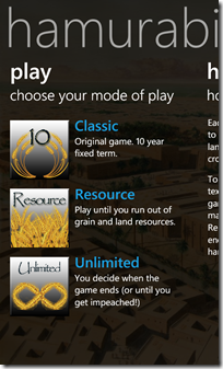
The other slight change I did was to style the default button. Again I didn’t go overboard here as I didn’t want buttons to look like WinForms apps or something. I just felt the default white border button was boring so I just used a simple gradient background and a colour that was more appropriate for the application. Hopefully it blends in a little more. Here’s some screenshots from the transformation.
A little different from the original but not by much. Here’s a summary of the UI changes I did:
- Changed from Pivot control to Panorama (new background image)
- Styled Panorama Title (smaller font; lighter opacity)
- Styled Panorama Item Header to be two lines instead of one (plus slight font and size changes)
- Styled default buttons
- More use of Accent colours sprinkled on various pages to highlight important parts
- Larger icons for game mode selection (130 pixels instead of 100)
- More consistent alignment and spacing throughout the app
All in all it took me about two hours to do all the changes (including hunting down some stock images and putzing around with the button gradient). No real investment and I think it’s an improvement over the original version. It’s still not perfect and I can see a few little tweaks here and there with margins that I need to correct. There’s also version 1.2!
So if you’re going to take anything away from this its to be creative. Don’t always just accept the norm as norm. Apply your artistic talents to your apps and with a few slight modifications you can go from bland and boring to interesting and fun. And remember to not to go crazy. Get an outside opinion. Pass your app onto others, post screenshots, etc. Above all, go out and create.
4 Comments
Comments have been disabled for this content.
