Spreading some SharePoint Love to EditorPart
EditorPart. Such a lonely guy in SharePoint land. Back in the 2003 era (remember that?) we had this thing called ToolParts. You would create a class to handle your custom property editors and then hook it back up into your Web Part. Well, times are a changing and in 2007 land we use these things called EditorParts now.
By default when you add a property and expose it for editing by the user, a set of default EditorParts built into SharePoint kick in. These will handle basic types (text, boolean, enums). Here are the properties in code:
1: [Personalizable(PersonalizationScope.Shared)]2: [WebBrowsable(true)]
3: public string MyProperty { get; set; }
4: 5: [Personalizable(PersonalizationScope.Shared)]6: [WebBrowsable(true)]
7: public bool MyOtherProperty { get; set; }
and you get something like this in SharePoint for editing properties:
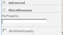
You can name the group (default is "Miscellaneous") and all is well in the world. However what if you want to use a Color Picker? Or a Rich Text Editor? Or something even more customized than that? That's where the EditorPart comes in.
Briefly you add the IWebEditable[link] interface to your WebPart[link], implement the CreateEditorParts method and WebBrowsableObject property and then create a class to do your property editing for you. This new class will inherit from EditorPart and basically handle a) creating all the controls for editing propert(ies) and sync the data back to your Web Part.
No big deal right? Here's the CreateChildControls for our custom EditorPart:
1: protected override void CreateChildControls()
2: {3: Controls.Add(new Label { Text = "MyProperty"});
4: Controls.Add(new TextBox());
5: Controls.Add(new CheckBox());
6: Controls.Add(new Label { Text = "MyOtherProperty" });
7: }and the resulting UI is something like this (I've added a couple of breaks):
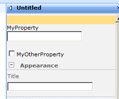
Functional yes, but the form is somewhat lacking. The labels are not the right colours and there's no dotted separator between items. It's not bad but still not the *seamless* effect we might want and frankly, trying to match SharePoint styles is like trying to birth a baby without a uterus (sorry, I'm just all out of good analogies today).
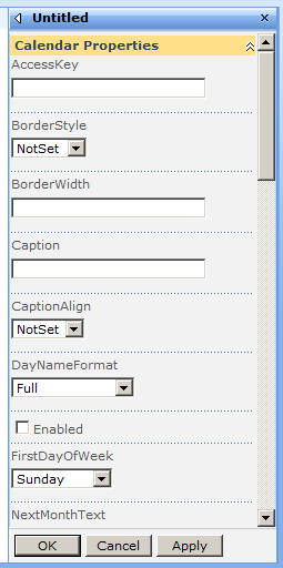
I thought it would be nice to put together some simple controls that mimicked the SharePoint 2007 UI a little closer. This was for a bigger project (which the blog is in the works for shortly) but it's a fairly simple process to format your controls so you can have something like this instead:
Here's how you do it. First add the IWebEditable interface to your Web Part. Now you can override/implement the one method and property to get this:
1: #region IWebEditable Members
2: 3: EditorPartCollection IWebEditable.CreateEditorParts() 4: {5: var editors = new List<EditorPart>
6: {7: new SPCalendarExWebPartEditorPart(ID)
8: };9: return new EditorPartCollection(editors);
10: } 11: 12: object IWebEditable.WebBrowsableObject
13: {14: get { return this; }
15: } 16: 17: #endregion
The naming isn't really hot so come up with something more appropriate. In this case we've got an EditorPart that's going to allow us to set properties on a Calendar (this is for the second post that has yet to come). The WebBrowsableObject just returns the currrent Web Part so nothing special there.
The EditorPart requires and ID to work so we pass it in from the parent into the constructor and give it a prefix. This allows you to have multiple instances of your Web Part on the same page. We also set the Title property which will appear in the Editor Pane.
1: public SPCalendarExWebPartEditorPart(string id)
2: {3: ID = "SPCalendarExWebPartEditorPart" + id;
4: Title = "Calendar Properties";
5: }Finally we override the EditorPart's CreateChildControls method. Here's where the fun begins. The method starts off with a table but then a series of new controls are added:
1: protected override void CreateChildControls()
2: {3: Controls.Add(new LiteralControl("<TABLE border=\"0\" cellSpacing=\"0\" width=\"100%\">"));
4: 5: Controls.Add(new LiteralControl("<TBODY>"));
6: 7: Controls.Add(new SPTextBoxEditorPartControl("AccessKey", "Keyboard shortcut used by the control."));
8: Controls.Add(new SPDropDownListEditorPartControl("BorderStyle", "Style of the border around the control.", typeof(BorderStyle)));
9: Controls.Add(new SPCheckBoxEditorPartControl("Enabled", "Enabled state of the control."));
10: 11: Controls.Add(new LiteralControl("</TBODY>"));
12: 13: Controls.Add(new LiteralControl("</TABLE>"));
14: }What the heck is a SPTextBoxEditorPartControl you ask?
It's a custom control that I created to encapsulate the look and feel and bits and pieces that SharePoint uses to display it's own controls in the same style. I hunted around to see if there was a way to do this through the API and just leveage what SharePoint gives you but it's a typical story. The code in there is overly complicated and there are so many dependencies it's hard to tell what to call to get the same look and feel or effect. (if anyone has figured this out and thus making all this junk redundant I would love to hear it!).
In any case here's the text box control wrapped up in a table row and surrounded with a few DIV tags from the UserXXX classess you can find in core.css. This matches the HTML output that the SharePoint default EditorPart controls emit (or at least come pretty close) so you can get a seamless UI.
1: public class SPTextBoxEditorPartControl : Control, INamingContainer
2: {3: public string Label { get; set; }
4: public string ToolTip { get; set; }
5: 6: public SPTextBoxEditorPartControl(string label, string toolTip)
7: { 8: Label = label; 9: ToolTip = toolTip; 10: } 11: 12: protected override void CreateChildControls()
13: {14: Controls.Add(new LiteralControl("<TR>"));
15: Controls.Add(new LiteralControl("<TD>"));
16: Controls.Add(new LiteralControl("<DIV class=\"UserSectionHead\">"));
17: Controls.Add(new Label { Text = Label, ToolTip = ToolTip });
18: Controls.Add(new LiteralControl("</DIV>"));
19: 20: Controls.Add(new LiteralControl("<DIV class=\"UserSectionBody\">"));
21: Controls.Add(new LiteralControl("<DIV class=\"UserControlGroup\">"));
22: Controls.Add(new LiteralControl("<NOBR>"));
23: Controls.Add(new TextBox { CssClass = "UserInput", Width = 176 });
24: Controls.Add(new LiteralControl("</NOBR>"));
25: Controls.Add(new LiteralControl("</DIV>"));
26: Controls.Add(new LiteralControl("</DIV>"));
27: 28: Controls.Add(new LiteralControl("<DIV class=\"UserDottedLine\" width=\"100%\"/>"));
29: Controls.Add(new LiteralControl("</TD>"));
30: Controls.Add(new LiteralControl("</TR>"));
31: } 32: }I've wrapped these up into a simple control that takes in what it needs via the constructor. It's a couple dozen lines of code, but something you can put away for a rainy day and makes it quick to just grab when you want to blend in with the SharePoint look and feel. As for branding, since everything is using SharePoint styles, just modify those and everything will (should) [might?] fall into place.
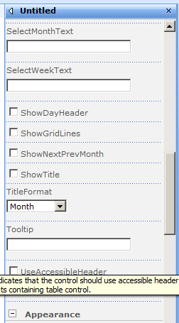
There are a couple of other control wrappers here, one for a CheckBox and one for a DropDownList. All of these follow the same pattern as the TextBox (inherit from Control and INamingContainer, override CreateChildControls with SharePoint-y look and feel magic).
The CheckBox is pretty much the same as the TextBox. The DropDownList is kind of fun as you pass in the enumerated type you want to pick from and it adds the items to the control. For example, here's the call to create a dropdown control for the DayNameFormat of a Calendar control:
1: Controls.Add(new SPDropDownListEditorPartControl("DayNameFormat", "Format for day header text.", typeof(DayNameFormat)));
Here's the drop down wrapper (Choices is an autopropty and set from the third parameter in the constructor):
1: public SPDropDownListEditorPartControl(string label, string toolTip, Type choices)
2: { 3: Label = label; 4: ToolTip = toolTip; 5: Choices = choices; 6: } 7: 8: protected override void CreateChildControls()
9: {10: Controls.Add(new LiteralControl("<TR>"));
11: Controls.Add(new LiteralControl("<TD>"));
12: Controls.Add(new LiteralControl("<DIV class=\"UserSectionHead\">"));
13: Controls.Add(new Label { Text = Label, ToolTip = ToolTip });
14: Controls.Add(new LiteralControl("</DIV>"));
15: 16: Controls.Add(new LiteralControl("<DIV class=\"UserSectionBody\">"));
17: Controls.Add(new LiteralControl("<DIV class=\"UserControlGroup\">"));
18: Controls.Add(new LiteralControl("<NOBR>"));
19: 20: var list = new DropDownList();
21: foreach (var choice in Enum.GetNames(Choices))
22: { 23: list.Items.Add(choice); 24: } 25: Controls.Add(list); 26: 27: Controls.Add(new LiteralControl("</NOBR>"));
28: Controls.Add(new LiteralControl("</DIV>"));
29: Controls.Add(new LiteralControl("</DIV>"));
30: 31: Controls.Add(new LiteralControl("<DIV class=\"UserDottedLine\" width=\"100%\"/>"));
32: Controls.Add(new LiteralControl("</TD>"));
33: Controls.Add(new LiteralControl("</TR>"));
34: }And the result that provides a dropdown of all the values of the enum provided:
Features of this code over the OOTB properties? It's fairly simple to use (just add the controls, specifying the name, tooltip, etc. in the constructor). Seamless look and feel integration with the regular SharePoint properties. Tooltips for labels. This is just a sampling but any control could be used here for more sophisticated property editing.
That's it. I'll post the full source along with something special coming later that utilizes this, but there's enough here to get you going should you want to roll your own. Feel free to leave comments, suggestions, and "What the hell are you doing Bil?" notes with me.
Here's a bunch of great links on writing your own custom EditorParts: