Using the Visual State Manager in Silverlight Templates
In a previous post I demonstrated how templates could be used along with styles in Silverlight 2 applications to customize controls. By using templates you can change colors, shapes, sizes and much more on a given control. Here’s an example of a standard Silverlight 2 Button control with a custom template applied:
The template applied to the Button control uses a Border and ContentPresenter to change the overall look and feel. The XAML code for the template is shown next:
<Style x:Key="ButtonFlatStyle" TargetType="Button">
    <Setter Property="Width" Value="100" />
    <Setter Property="Template">
        <Setter.Value>
            <ControlTemplate TargetType="Button">
                <Grid>
                    <Border Width="{TemplateBinding Width}" Height="{TemplateBinding Height}"
                            Background="{TemplateBinding Background}"
                            CornerRadius="8" BorderBrush="Black"
                            BorderThickness="1">
                        <ContentPresenter Content="{TemplateBinding Content}"
                            HorizontalAlignment="Center"
                            VerticalAlignment="Center" />
                    </Border>
                </Grid>
            </ControlTemplate>
        </Setter.Value>
    </Setter>
</Style>
Although the template applies the desired rounded corners effect to the Button, no user interaction is included making for a poor end user experience. If the user clicks the button they won't see any visual indication that they pressed the Button which may result in them clicking it multiple times just to make sure it worked.
To remedy this problem you can write custom code for the Button and handle mouse, focus and click events. There's an easier way, however, that involves much less code especially if you have access to Expression Blend 2 SP1. Silverlight 2 provides a Visual State Manager (or VSM) that manages different states as users interact with controls. For example, you might want to change the background of the Button as the user mouses over it and make it look slightly bigger or smaller when a user clicks it. All of this can be done using the Visual State Manager either in code or in Blend 2. The discussion that follows will walk through using Blend 2 and show how custom templates and VSM states can be created visually.
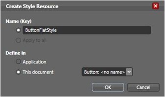
The easiest way to get started creating styles and templates is to open Expression Blend 2 SP1, create a Silverlight 2 project and add a Button control onto the design surface. Next, right-click the Button control and select Edit Control Parts (Template) -- Edit a Copy. You'll be prompted with the Create Style Resource dialog as shown next:
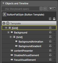
Enter a name for the style (the style's key), select where the style will be stored and select what control the style targets from the drop-down list. Once the style resource is created you'll see all of the parts that make up the Button control in the Objects and Timeline window as shown here:
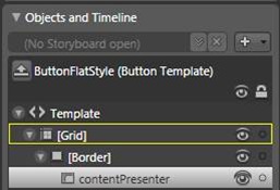
To create a flat rounded button as shown earlier, delete the Background (and all associated child parts), DisabledVisualElement and FocusVisualElement parts. These parts are only being deleted so that we can work with a simple control template similar to the XAML code shown earlier. You can always customize the existing parts to your satisfaction as opposed to deleting them. Once you've deleted the parts drag a Border control from the Asset Library and add it as a child of the Grid in the Objects and Timeline window. Drag the contentPresenter onto the Border control so that it becomes a child as shown next:
Select the contentPresenter in the Objects and Timeline window and switch to the Properties window located in the upper-right corner of the Blend 2 interface. You should see all of the properties available for the contentPresenter. Change the HorizontalAlignment property to Center and the VerticalAlignment property to Center. Next, highlight the Border control and perform the following steps:
- Change the Background color to light gray in the Properties window.
- Change the BorderBrush property to black.
- Change the BorderThickness property to 1.
- Change the CornerRadius property to a value of 10.
Your Button control template should look similar to the following at this point (note: you may need to resize the Border control to get it to look like this):
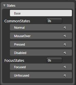
Save your work and press F5 to test out the control template. Although the Button control is now rounded and flat, you'll notice right away that it provides no state management. When you interact with the Button control nothing happens. To add some interaction capabilities or "states", locate the States window in Blend. You'll see several different control states defined:
These states were defined in the original Button control template and copied to the current style you're working on. At this point they don't do anything since you deleted all of the parts they interacted with.
Click the MouseOver state to select it. Highlight the Border control in the Objects and Timeline window and change the Background property to light blue in the Properties window. Highlight the Pressed state and change the Border's Background to light red. Scroll down in the Properties window and locate the Transform section. Click on the Scale tab (mouse over each tab to see what it represents) and change the X value to 0.9 and the Y value to 0.9.Press F5 to run the application again and you'll see that you can now interact with the Button.
Although this isn't the nicest interaction you've probably seen, it does demonstrate the power and simplicity of the Visual State Manager. By changing the different Button control states visually, Blend 2 automatically creates the appropriate XAML used by the Visual State Manager to change the Button's state based on end user actions. The complete template including the code for the VisualStateManager element is shown next. Notice that the MouseOver and Pressed states have Storyboard and animation elements defined.
<Style x:Key="ButtonFlatStyle" TargetType="Button">
    <Setter Property="Template">
        <Setter.Value>
            <ControlTemplate TargetType="Button">
                <Grid>
                    <vsm:VisualStateManager.VisualStateGroups>
                        <vsm:VisualStateGroup x:Name="CommonStates">
                            <vsm:VisualState x:Name="Normal"/>
                            <vsm:VisualState x:Name="MouseOver">
                                <Storyboard>
                                    <ColorAnimationUsingKeyFrames BeginTime="00:00:00"
                                       Duration="00:00:00.0010000" Storyboard.TargetName="border"
                                       Storyboard.TargetProperty="(Border.Background).(SolidColorBrush.Color)">
                                        <SplineColorKeyFrame KeyTime="00:00:00" Value="#FFBFC1F2"/>
                                    </ColorAnimationUsingKeyFrames>
                                </Storyboard>
                            </vsm:VisualState>
                            <vsm:VisualState x:Name="Pressed">
                                <Storyboard>
                                    <ColorAnimationUsingKeyFrames BeginTime="00:00:00"
                                      Duration="00:00:00.0010000" Storyboard.TargetName="border"
                                      Storyboard.TargetProperty="(Border.Background).(SolidColorBrush.Color)">
                                        <SplineColorKeyFrame KeyTime="00:00:00" Value="#FFF43D3D"/>
                                    </ColorAnimationUsingKeyFrames>
                                    <DoubleAnimationUsingKeyFrames BeginTime="00:00:00"
                                      Duration="00:00:00.0010000" Storyboard.TargetName="border"
                                      Storyboard.TargetProperty="(UIElement.RenderTransform).
                                       (TransformGroup.Children)[0].(ScaleTransform.ScaleX)">
                                        <SplineDoubleKeyFrame KeyTime="00:00:00" Value="0.9"/>
                                    </DoubleAnimationUsingKeyFrames>
                                    <DoubleAnimationUsingKeyFrames BeginTime="00:00:00"
                                       Duration="00:00:00.0010000" Storyboard.TargetName="border"
                                       Storyboard.TargetProperty="(UIElement.RenderTransform).
                                        (TransformGroup.Children)[0].(ScaleTransform.ScaleY)">
                                        <SplineDoubleKeyFrame KeyTime="00:00:00" Value="0.9"/>
                                    </DoubleAnimationUsingKeyFrames>
                                </Storyboard>
                            </vsm:VisualState>
                            <vsm:VisualState x:Name="Disabled">
                                <Storyboard/>
                            </vsm:VisualState>
                        </vsm:VisualStateGroup>
                        <vsm:VisualStateGroup x:Name="FocusStates">
                            <vsm:VisualState x:Name="Focused">
                                <Storyboard/>
                            </vsm:VisualState>
                            <vsm:VisualState x:Name="Unfocused"/>
                        </vsm:VisualStateGroup>
                    </vsm:VisualStateManager.VisualStateGroups>
                    <Border CornerRadius="10,10,10,10" Background="#FFE4E1E1"
                       BorderBrush="#FF000000" BorderThickness="1,1,1,1"
                       x:Name="border" RenderTransformOrigin="0.5,0.5">
                        <Border.RenderTransform>
                            <TransformGroup>
                                <ScaleTransform/>
                                <SkewTransform/>
                                <RotateTransform/>
                                <TranslateTransform/>
                            </TransformGroup>
                        </Border.RenderTransform>
                        <ContentPresenter x:Name="contentPresenter"
                           ContentTemplate="{TemplateBinding ContentTemplate}"
                           VerticalAlignment="Center" HorizontalAlignment="Center"/>
                    </Border>
                </Grid>
            </ControlTemplate>
        </Setter.Value>
    </Setter>
</Style>
Although the example shown here isn't flashy and has been over simplified, it should give you a feel for what can be done with control templates and the Visual State Manager. By using the VSM you can add many different effects into your Silverlight 2 applications without writing a lot of code in many cases.

Interested in learning more about Silverlight 2 application development? Visit Interface Technical Training’s website for more information about their Silverlight 2 training course.


