Tuesday, August 11, 2009 9:45 AM grant.barrington

Styling the ASP.NET Wizard Control to have the Steps Across the top

The default style of the ASP.NET Wizard control is not the best. For the sidebar to work, and display all the wizard steps in a wizard requires quite a bit of space. And in all the wizards we end up creating, we don't want the user to jump from one step to the next using the sidebar. We make the user click from step to step linearly.

We've spent a little time lately changing the way the wizard looks and have come up with the following look and feel.

wizardDetails

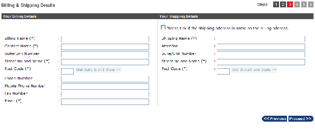
The top HeaderTemplate contains the current step the user is on (derived from the WizardStep Title) and an indication of the total number of step (we use three different classes in indicate the current step, completed step and incomplete step). The "steps" also have tooltips added to let the user know what steps are coming. (See image below)

 Tooltip when Mouse hovers over the step number

The WizardStep in the image above is all the information regarding "Billing and Shipping" details (this is just standard Wizard Step stuff)

How its done

The markup for the wizard aspx code is as follows:

<asp:Wizard ID="wzd" runat="Server" Width="100%" DisplaySideBar="false">
    <HeaderTemplate>
        <table style="width: 100%" cellpadding="0" cellspacing="0">
            <tr>
                <td class="wizardTitle">
                    <%= wzd.ActiveStep.Title%>
                </td>
                <td>
                    <table style="width: 100%; border-collapse: collapse;">
                        <tr>
                            <td style="text-align: right">
                                <span class="wizardProgress">Steps:</span>
                            </td>
                            <asp:Repeater ID="SideBarList" runat="server">
                                <ItemTemplate>
                                    <td class="stepBreak">&nbsp;</td>
                                    <td class="<%# GetClassForWizardStep(Container.DataItem) %>" title="<%# DataBinder.Eval(Container, "DataItem.Name")%>">
                                        <%# wzd.WizardSteps.IndexOf(Container.DataItem as WizardStep) + 1 %>
                                    </td>
                                </ItemTemplate>
                            </asp:Repeater>
                        </tr>
                    </table>
                </td>
            </tr>
        </table>
    </HeaderTemplate>
    <SideBarTemplate>
    </SideBarTemplate>
    <WizardSteps> ... removed... </WizardSteps>
</asp:Wizard>

We add the following event handler to Page_Load in our code-behind

protected void Page_Load(object sender, EventArgs e)
{
    wzd.PreRender += new EventHandler(wzd_PreRender);
}

And have the following methods in the code-behind

protected void wzd_PreRender(object sender, EventArgs e)
{
    Repeater SideBarList = wzd.FindControl("HeaderContainer").FindControl("SideBarList") as Repeater;

    SideBarList.DataSource = wzd.WizardSteps;
    SideBarList.DataBind();

}

public string GetClassForWizardStep(object wizardStep)
{
    WizardStep step = wizardStep as WizardStep;

    if (step == null)
    {
        return "";
    }

    int stepIndex = wzd.WizardSteps.IndexOf(step);

    if (stepIndex < wzd.ActiveStepIndex)
    {
        return "stepCompleted";
    }
    else if (stepIndex > wzd.ActiveStepIndex)
    {
        return "stepNotCompleted";
    }
    else
    {
        return "stepCurrent";
    }
}

Explanation of the code above

When the wizard goes into PreRender, we bind the collection of WizardSteps to the Repeater in our HeaderTemplate

The "GetClassForWizardStep" is a helper method we have to determine what wizard step we're on, and render the appropriate class in the table cell.

Style Sheet Rules

The rules I'm using above to generate the page are as below...

/* WIZARD */
.stepNotCompleted
{
    background-color: rgb(153,153,153);
    width: 15px;
    border: 1px solid rgb(153,153,153);
    margin-right: 5px;
    color: White;
    font-family: Arial;
    font-size: 12px;
    text-align: center;
}

.stepCompleted
{
    background-color: #4d4d4d;
    width: 15px;
    border: 1px solid #4d4d4d;
    color: White;
    font-family: Arial;
    font-size: 12px;
    text-align: center;
}

.stepCurrent
{
    background-color: #e01122;
    width: 15px;
    border: 1px solid #e01122;
    color: White;
    font-family: Arial;
    font-size: 12px;
    font-weight: bold;
    text-align: center;
}

.stepBreak
{
    width: 3px;
    background-color: Transparent;
}

.wizardProgress
{
    padding-right: 10px;
    font-family: Arial;
    color: #333333;
    font-size: 12px;

}

.wizardTitle
{
    font-family: Arial;
    font-size: 120%;
    font-weight: bold;
    color: #333333;
    vertical-align: middle;
Filed under:

Comments

# Styling the ASP.NET Wizard Control to have the Steps Across the top | ASP Scribe

Pingback from  Styling the ASP.NET Wizard Control to have the Steps Across the top | ASP Scribe

# re: Styling the ASP.NET Wizard Control to have the Steps Across the top

Tuesday, August 11, 2009 2:17 PM by Roopa

Thank you very much for posting this. This is a very useful option to be used with the Wizard. In the code above i am unable to find out which control refers to

HeaderContainer

Please help.

# re: Styling the ASP.NET Wizard Control to have the Steps Across the top

Wednesday, August 12, 2009 12:32 AM by grant.barrington

@Roopa - when the ASP.NET Wizard control renders, it puts everything that is inside the <HeaderTemplate> into a control called "HeaderContainer".

Therefore, what I'm doing is looking for the asp:repeater called "SideBarList" inside the "HeaderContainer" (HeaderTemplate), which is inside the "wizard" control.

We have to use a method similar to this to find controls inside the footer template (maybe I'll post on this soon)

# Styling the ASP.NET Wizard Control to have the Steps Across the top - Grant Barrington

Wednesday, August 12, 2009 5:56 AM by DotNetShoutout

Thank you for submitting this cool story - Trackback from DotNetShoutout

# ContinousLearner: Links (8/13/2009) | Astha

Wednesday, September 09, 2009 5:33 PM by ContinousLearner: Links (8/13/2009) | Astha

Pingback from  ContinousLearner: Links (8/13/2009) | Astha

# re: Styling the ASP.NET Wizard Control to have the Steps Across the top

Saturday, October 03, 2009 5:42 AM by Luca

That's what i was looking for, thank you very much.

Just one question : is it possible to have the steps inside the header clickable, so that one can move directly to the desired step?

# re: Styling the ASP.NET Wizard Control to have the Steps Across the top

Thursday, October 22, 2009 10:00 PM by Elliot

@Luca

I changed the ItemTemplate (SideBarList) as follows

                                   <ItemTemplate>

                                       <td class="stepBreak">&nbsp;</td>

                                       <td class="<%# GetClassForWizardStep(Container.DataItem) %>">

                                           <asp:LinkButton ID="btnWizStep" runat="server" OnClick="btnWizStep_Click" CssClass='<%# GetClassForWizardStep(Container.DataItem) %>' CommandArgument='<%# wizCreateProject.WizardSteps.IndexOf(Container.DataItem as WizardStep) + 1%>' CommandName='GoToStep' Text='<%# wizCreateProject.WizardSteps.IndexOf(Container.DataItem as WizardStep) + 1%>' /></td>

                                   </ItemTemplate>

My code behind has this method:

       protected void btnWizStep_Click(object sender, EventArgs e)

       {

           wizCreateProject.ActiveStepIndex = int.Parse(((LinkButton)sender).CommandArgument) - 1;

       }

This allowed me to capture the click events and navigate as needed. I hope this helps.

# re: Styling the ASP.NET Wizard Control to have the Steps Across the top

Tuesday, November 03, 2009 12:52 PM by ahmed

please do you now how to add another button either than next ,previous because we want to add save button which save the wizard current state and current step

# Adding, Changing & Finding buttons in the ASP.NET Wizard Control

Tuesday, November 03, 2009 8:55 PM by Grant Barrington

A comment was recently left on a previous post of mine asking how to go about adding a button to a wizard

# re: Styling the ASP.NET Wizard Control to have the Steps Across the top

Tuesday, November 03, 2009 8:57 PM by grant.barrington

@ahmed - I've posted a follow-up to your question here:

weblogs.asp.net/.../adding-changing-amp-finding-buttons-in-the-asp-net-wizard-control.aspx

Hope this help you out.

Grant

# Adding, Changing &amp; Finding buttons in the ASP.NET Wizard Control | I love .NET!

Pingback from  Adding, Changing &amp; Finding buttons in the ASP.NET Wizard Control | I love .NET!

# re: Styling the ASP.NET Wizard Control to have the Steps Across the top

Saturday, January 02, 2010 6:30 AM by ahmed

Thanks so much.I hope to you nice day.

# re: Styling the ASP.NET Wizard Control to have the Steps Across the top

Tuesday, April 06, 2010 5:06 PM by Kelly

Thank you very much, this is very slick!

# re: Styling the ASP.NET Wizard Control to have the Steps Across the top

Wednesday, June 23, 2010 3:01 PM by Some Dude

Sir.  Thanks.  Truly Thanks.

# re: Styling the ASP.NET Wizard Control to have the Steps Across the top

Wednesday, July 07, 2010 2:58 AM by sandeep tada

hi i have unable to bind repeater using wizard steps ..i have use same code provided by you but when i run then Container.DataItem came null so it is unable to find indexof and through error...plz help

# re: Styling the ASP.NET Wizard Control to have the Steps Across the top

Friday, November 12, 2010 11:15 AM by DC

This is really good thanks

# re: Styling the ASP.NET Wizard Control to have the Steps Across the top

Sunday, December 19, 2010 10:24 AM by LordCover

The highlighting of the steps is not being done. they are always 1 (is current) and 2...4 are stepNotCompleted. I know this due the fact that this code has been included in the markup. and it is only get executed once. The method (GetClass) is not affecting the styling.

The solution to this is to put this code in the event (ActiveStepChanged) handler of the Wizard control:

Repeater SideBarList = MyWizard.FindControl("HeaderContainer").FindControl("SideBarList") as Repeater;

SideBarList.DataSource = MyWizard.WizardSteps;

SideBarList.DataBind();

- Yes, it is the same as the code in the PreRender event but in my case it is not get called but once.

# re: Styling the ASP.NET Wizard Control to have the Steps Across the top

Wednesday, December 29, 2010 6:44 PM by tim g

i tried converting this to vb using your additional itemtemplate in a lower post but the <%@ page tag blows up.  because of the linkbutton.

i would like to use it but i already spent two hours trying to get it to work.  

so i need to move on

# re: Styling the ASP.NET Wizard Control to have the Steps Across the top

Thursday, January 20, 2011 11:52 AM by Saqib

Very nice post, exactly what i was looking for.

Thanks

# re: Styling the ASP.NET Wizard Control to have the Steps Across the top

Wednesday, January 26, 2011 12:18 PM by Rick

First, thanks for the great article, it's very helpful!

Question: We create wizard pages dynamically based on content stored in database. One of QA testers created a wizard that had 40 pages. This resulted in the HeaderTemplate wrapping elements around the control. Can you provide an example of how to limit the number of elements that are drawn in the header (ellipsis, scroll, etc)?

Thanks in advance

# re: Styling the ASP.NET Wizard Control to have the Steps Across the top

Monday, September 19, 2011 4:45 AM by bronxbull

hey my css styling is not working...the step numbers are not showing up at the top..its jus plain black and white...please help me.

# re: Styling the ASP.NET Wizard Control to have the Steps Across the top

Wednesday, October 19, 2011 10:46 AM by losbear

Thanks for this.  I was trying to do some hack job in the sidebar, but this works really nice.

# Stylish ASP.NET Wizard Control with Horizontal Sidebar on Top | TechBrij

Pingback from  Stylish ASP.NET Wizard Control with Horizontal Sidebar on Top  | TechBrij

Leave a Comment

(required) 
(required) 
(optional)
(required)