Creating gadget-like blocks for Windows Home Server 2011 web add-in user interface
To keep user interface of your Windows Home Server 2011 (WHS) web add-in similar to other parts of UI you may need styled blocks like shown on WHS web interface home page. In this post I will show you HTML mark-up and CSS you need to create your own gadget block.
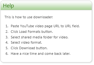
Example of gadget-like block
 Here is the example of custom gadget-like block from the UI of my WHS YouTube Downloader. There is no out-of-box control or some other UI component you can use on different pages that renders you simple area to show some custom content.
I extracted mark-up and styles of gadget and made my own fixes to make block look nice. Although I’m not very happy because of massive use of tables my solution still works and it is simple to use.
Mark-up for gadget-like block
Here is the HTML mark-up for gadget-like block.
<div class="Homepage-GadgetBoxBase Homepage-GadgetBox My-Sidebar">
<table class="Homepage-GadgetTable">
<tbody>
<tr class="Homepage-GadgetTopRow">
<td class="Homepage-GadgetTLCell"/>
<td class="Homepage-GadgetTMCell single-line">
<a title="Title link description">Title</a>
</td>
<td class="Homepage-GadgetTRCell"/>
</tr>
</tbody>
</table>
<table class="Homepage-GadgetTable">
<tbody>
<tr class="Homepage-GadgetMiddleRow">
<td class="Homepage-GadgetMLCell"/>
<td class="Homepage-GadgetMCell">
<div class="My-Gadget-Content">
Content here
</div>
</td>
<td class="Homepage-GadgetMRCell"/>
</tr>
</tbody>
</table>
<table class="Homepage-GadgetTable">
<tbody>
<tr class="Homepage-GadgetBottomRow">
<td class="Homepage-GadgetBLCell"/>
<td class="Homepage-GadgetBMCell"/>
<td class="Homepage-GadgetBRCell"/>
</tr>
</tbody>
</table>
</div>
You can wrap this box to some base user control and output all container mark-up around inherited controls when render method is called.
Fixing styles
To get the gadget-like block to be rendered correctly we need some additional styles. Looking at source of WHS home page we can see that all gadgets organize their own content containers styling. Here are styles I use for gadget-like block shown above.
<style type="text/css">
.youTubeDownloaderButton
{
background-color:rgb(220,227,168);
border: 1px solid green;
color: black;
}
.My-Gadget-Content
{
margin-top: 12px;
margin-right: 12px;
margin-bottom: 0px;
margin-left: 12px;
}
.My-Gadget-Content li
{
margin-left: -20px;
}
tr.Homepage-GadgetTopRow
{
cursor:default;
}
.My-Sidebar
{
float:right;
width:300px;
}
</style>
You can create your own CSS file for style fixes like this and provide with your add-in installer.