The animated featured content box: Critical design issues
I saw this post from Ken Cox about his displeasure with the preview of the new VB developer site, specifically the animated box at the bottom. You've seen these before on a million different sites, where a number of featured content items are previewed.
Putting aside for a moment that this one is particularly non-useful (no single frame hangs out long enough to read it), what do these really accomplish? We can assume that the goal is to get a number of different things in front of the viewer. News sites in particular seem to love using these. I've certainly not conducted a human factors study on the subject, but my gut feeling is that this is completely ineffective.
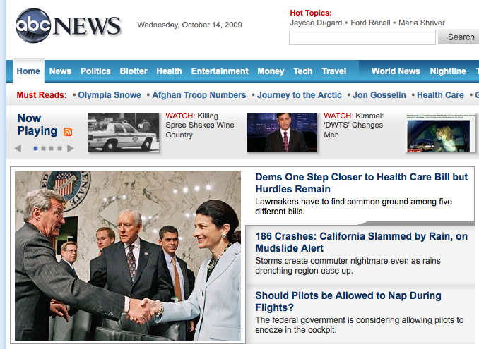
The first flaw is that it's easier to scan a handful of headlines that are all there. My armchair designer mind says that people are drawn to pictures and retained longer by them, but I'm sure not I buy it. ABC News used to have an annoying headline rotator, but they recently switched to something that shows the picture as well as allows for the quick scan of headlines.
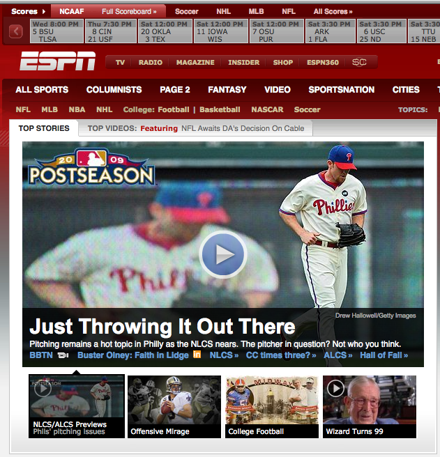
ESPN went a step further, realizing that their strength is the mountains of video they have. They abandoned the rotator entirely for video right there, immediately available.
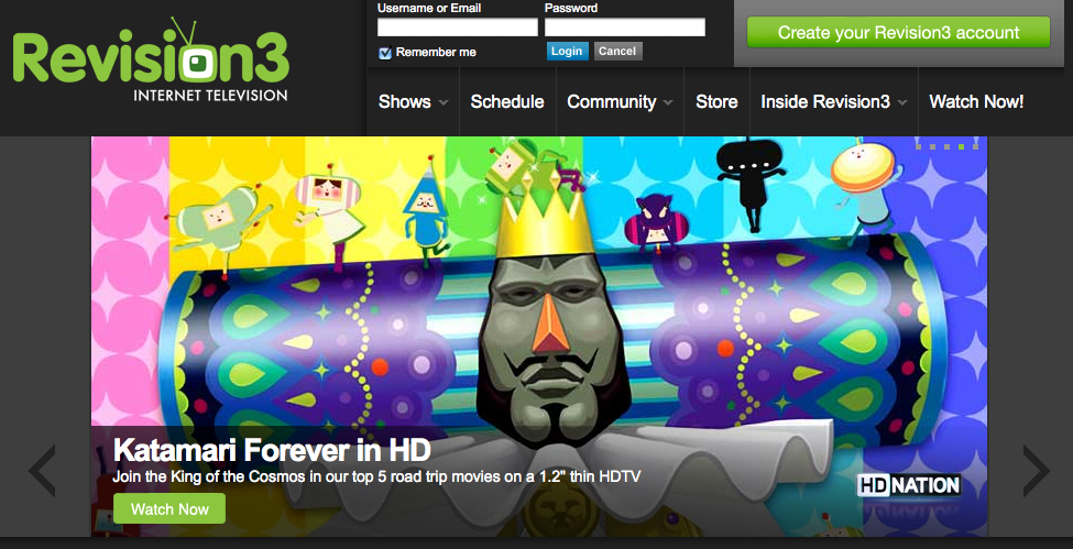
It's funny how the traditional media is doing it better, while new and trendy get it wrong. Revision3 has the classic interpretation of this, and it's a failure. First off, they're using a busy image with text over it that's hard to read. Then they have the goofy "highlighted square" navigation in the top right that you almost miss. I shouldn't even call it navigation, because it doesn't tell you anything other than the number of frames, which is nearly useless information. There's no incentive to hang out and see what's next. It also continues to animate whether you like it or not.
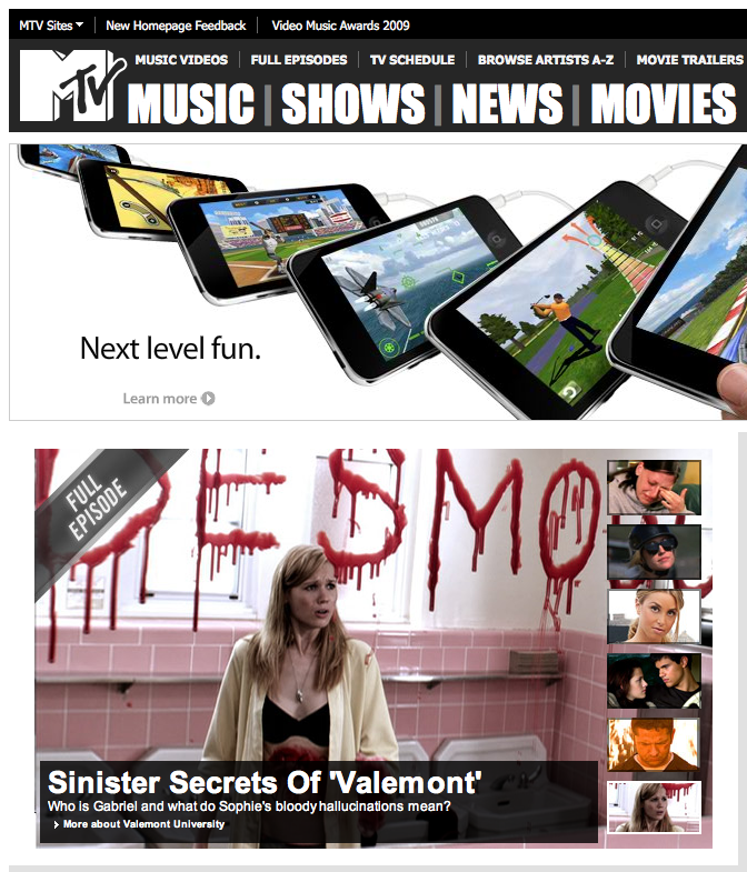
But in my quick survey of things, no one gets it quite as wrong as MTV. They have the good old fashioned mystery meat keyframes at right, and many of the text descriptions are too long to read before the next frame.
Ultimately, I think some of these attempts come from stakeholders who all get in a room and believe that their content is most important. That's a nightmare you'll frequently run into if you do client work in particular. Other attempts at this I think are simply imitation of a trend.
So what would I consider the critical thinking points around these things if I were in charge? In no particular order...
- Is it critical that everything sits above the fold? If not, then why are you trying to cram it all into the first 400 pixels? We live in a Google Analytics world. You can see how often people are clicking down the page.
- Is everything you want to show really that important? If it is, are you sure there aren't other means of discovery? If you're a marketing department and everyone in your company thinks their stuff is most important, rank it yourself or get someone senior to the various departments involved.
- What is your audience looking for? This seems like such an obvious question, and I don't think designers ask it enough. If they're looking for headlines, give them headlines. If you want to pair with images, make sure they don't come at the expense of headlines. If the reverse is true, again, keep in mind that too much compromise may not effectively give your audience what they're looking for.
- If you're convinced you have to show more than one thing in a given space, don't rely on conventions you've seen elsewhere. Mystery meat navigation sucks and it pisses off users. As it is, they're probably not going to hang out for more than a few seconds.
- Animate only if you have to. You're falling into a trap where you have to predict the future in terms of how fast your readers can read, how long the content will be as long as you're using the animation, and you're living on the assumption that the dwell time on the page is long enough to see it all. If the average user sees 1.5 of your frames, you've already failed in getting the rest of that "important" stuff in front of the user.