Automated Chart Generation
It’s late on the Friday afternoon before Christmas week which means things are pretty quiet around the office. This quiet has the net-effect of allowing me to get quite a bit done. The last few days have been very productive with respect to our research project and Azure work (more on that coming soon) which is now in full swing. We are currently working on collecting performance data from our codes running in Azure (and soon in the Amazon cloud) and are also doing some testing of transfer speeds of data both to/from the cloud as well as between compute and storage in the cloud.
I’ve been working to automate much of this testing so we can do things in a repeatable fashion as well has have something that others could run (both other users like ourselves as well as possibly vendors should we come across something that requires a repro scenario). So far, running tests and generating data in CSV or XML format is pretty simple, but I found myself wanting to automatically generate charts/graphs of the data as part of the test process to allow a quick visualization of how the test performed. I spent a good bit of the day looking at old tools for command-line generation of charts (i.e. RDTool, etc.) and none of them were exactly what I was looking for – not to mention my proclivity to using C# and VS.NET tools and my desire to have something that looked refined/polished and not overly raw.
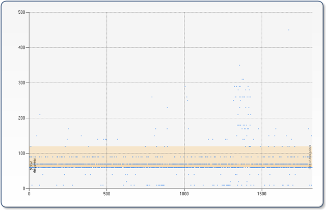
Thankfully, I stumbled upon something I should have remembered existed but simply hadn’t had the need to use before – the System.Windows.Forms.DataVisualization.Charting class. If you aren’t familiar with this assembly, it was released at PDC08 and has a companion Web class for performing similar operations in ASP.NET applications. In my basic testing I was able to build a console application that would ingest the CSV output from my testing harness and then generate some fairly nice looking charts based on that data. The following shows a chart (click the chart to see it full size) generated from ~1800 data points, and automatically generates a 50% band and 90% band allowing the viewer to very easily ascertain the averages and data points. This was generated using a combination of the FastPoint and BoxPlot chart types.
