Get rid of regular buttons, use link buttons
For the past 3 years I have been pushing my managers and especially the teams I work with that the web applications we make need to be visually appealing. The graphics designers I know can do amazing things. My friend Steve Sereda is an amazing graphics designer and he created some awesome skins for me for the time we worked together.
I've done a few posts leading up to this one. It all started with my post on UpdatePanel, FireFox and the Default Button, where I talked about how to get the default button working in FireFox. At this point I was in the process of moving all buttons over to fancy LinkButtons. I then wrote about CSS Pseudo Classes and their uses (which are many), and finally I finished my last post on A LinkButton, DefaultButton, UpdatePanel and FireFox, where I discuss how to get FireFox to use a LinkButton (Anchor tag) as a default button.
So let's talk about Buttons. Buttons provide functionality, and 99% of users know when they click on a button that some sort of action is going to happen. Many buttons look like this:A0
![]()
Now, besides the ugly border my snipping tool puts in, that button isn't that great. But should that matter? Isn't a button there to tell the user that clicking it will invoke some sort of procedure? Correct. By general standards Buttons should invoke functions, while links should be directional. However, who said a button had to be grey and ugly?
ASP.NET has the LinkButton. It gets rendered as an <a /> (anchor) tag, and because of that we can do something like this:
![]()
Wow, that looks way better than regular buttons. What about this:
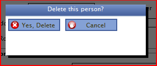
I've grown tired of using JavaScript confirm boxes. I've decided to switch to modal windows. (yes yes I know my spacing isn't right....). You can see the nice presentation, and notice the spacing... isn't that amazing?!
There's a trick to these buttons, and unfortunately you do have to put more work into them. I could make a button like this a userControl/CompositeControl, but for what I need them for, that's too much work.
Let's look at the markup I use for these buttons. This will give you more clarity when you see the CSS.
<div class="button">
A0A0 <asp:LinkButton ID="btnSave" runat="Server" CssClass="bSave" Text="Save User" OnClick="btnSave_Click"A0 ValidationGroup="userDetails"A0 UseSubmitBehavior="false" />
</div>
<div class="button">
A0A0A0 <asp:LinkButton ID="btnCancel" runat="Server" CssClass="bCancel" Text="Cancel" OnClick="btnCancel_Click" CausesValidation="False"A0A0 UseSubmitBehavior="false" />
</div>
<div class="button">
A0A0A0 <asp:LinkButton ID="btnDeleteUser" runat="Server" CssClass="bDelete" Text="Delete" UseSubmitBehavior="false" />
</div>
<div class="clear"></div>
You see that I have 3 div's, and in each div I have a LinkButton. Under the LinkButtons I have a single div with the "clear" class. My clear class does clear:both;. It clears the floats that all of these div's have.
Here's the CSS
.button
{
A0A0A0 background-color:#84A1D6;
A0A0A0 border:solid 2px #415D9B;
A0A0A0 margin:5px;
A0A0A0 min-width:70px;
A0A0A0 height:20px;
A0A0A0 float:left;
A0A0A0 padding-left:3px;
}
A0
A0
.button a
{
A0A0A0 display:block;
A0A0A0 padding:2px 5px 2px 20px;
A0A0A0 min-width:70px;
}
A0
.button:hover
{
A0A0A0 background-color: #a0bdf2;
}
A0
.button a:active
{
A0A0A0 border-top:solid 1px black;
}
A0
A0
/* Button Style */
.button a.bLogin
{
A0A0A0 background-image: url(Images/Login.png);
A0A0A0 background-position:left;
A0A0A0 background-repeat:no-repeat;A0A0A0
}
A0
.button a.bSave
{
A0A0A0 background-image: url(Images/Save.png);
A0A0A0 background-position:left;
A0A0A0 background-repeat:no-repeat;A0A0A0
}
A0
.button a.bCancel
{
A0A0A0 background-image: url(Images/Cancel.png);
A0A0A0 background-position:left;
A0A0A0 background-repeat:no-repeat;A0A0A0
}
You can notice that each .button class is floating left. I need to use Block elements for these buttons so I can apply padding, margin's etc. You cannot do that to an inline element. Seeing they're block, I want them line up, so I float them.A0 You can also see that my .button a contains the same width as the parent .button, this is because I want the entire button to be clickable, not just the link portion.
I am also using pseudo classes for this. You can see the :hover and the :active. This gives my buttons "hover" and "click" styles without having to code any javascript. (IE7 and FF).
And that is all you need to do.
Like I said, it's a tiny bit more markup and some small CSS, however, the outcome of this work is well worth it. It gives a whole new presentation to your application.