Personal VS.Net Editor Color/Font Settings

Roy writes "I was fiddling with the color settings for visual studio, and was trying to get a less eye-straining environment for coding in". What he came up with is definitely a matter of personal taste ;-)


Speaking of personal taste, here's a screenshot of my settings:

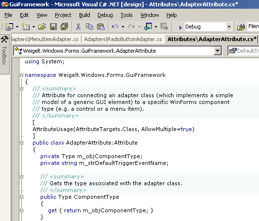
Most important for me (and my eyes) is the use of a proportional-width font. Verdana 8pt is the font I use for virtually every editor I use. Unlike e.g. Arial, you can call it a "developer's font", because you can distinguish the small "L" and the large "i".

Switching to a proportional font wasn't easy for me at first, because I had to break with old habits; most of them (e.g. aligning end-of-line comments running over several lines) were a waste of time, anyway.

3 Comments

  • Heh. I was just testing to see what I can come up with. I don't work with the screenshot I posted, it just reminded my of my happy mIRC days - chatting at night is much more "cool" when you have a black background (*geek*) :)

  • > Heh. I was just testing to see what I can come up with.


    > I don't work with the screenshot I posted


    Yeah, that's what I suspected from the "if I were a black ops agent or something...". ;-)


    > reminded my of my happy mIRC days


    During my diploma thesis I had a couple of nightshifts working at the particle accelerator at the physics department of Bonn university. The control room was full of monitors with black desktops. I suspect because it's easier to see when a green icon turns red (which is typically a bad thing for a particle accelerator...)

  • I ask all of my developers to set the STRINGs to Maroon...this means that you can see the literals popping out of code... not a bad thing when you are doing a code review.

Comments have been disabled for this content.