Silverlight Tutorial Part 2: Using Layout Management
This is part two of eight tutorials that walk through how to build a simple client application using Silverlight 2. These tutorials are intended to be read in-order, and help explain some of the core programming concepts of Silverlight.
<Download Code> Click here to download a completed version of the Bing Image Search version. </Download Code>
<Download Code> Click here to download a completed version of the Digg client sample. </Download Code>
Understanding Layout Management
XAML supports a flexible layout management system that enables developers and designers to easily coordinate how controls are positioned within a UI surface. This layout system supports both a fixed position model where controls are positioned using explicit coordinates, as well as a more dynamic position model where layout and controls can be automatically sized and flowed as the browser resizes.
Developers using Silverlight and WPF use layout panels to coordinate the position and resizing of controls contained within them. The built-in layout panels in Silverlight 2 include three of the most commonly used ones in WPF:
- Canvas
- StackPanel
- Grid
Canvas Panel
The Canvas panel is a pretty basic layout panel that supports positioning controls contained within it using explicit coordinates.
You position elements in a Canvas using a XAML feature called "Attached Properties" - which allow you to specify a control's position relative to its immediate parent Canvas control's Left, Top, Right or Bottom coordinates. Attached properties are useful as they allow a parent panel to extend the property set of a control contained within it. Canvas, by defining an attached property for “Top” and ”Left” basically adds the ability to define left and top attachment on Button (or any other UI element that is added to the Canvas), without any need to actually add a property to the Button class, or modify the Button class in any way.
We could add two buttons to a Canvas container, and position them both 50 pixels from the left of the Canvas, and 50 and 150 pixels from the top using XAML like below (the Canvas.Left and Canvas.Top attributes are examples of the attached property syntax):
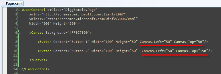
This would then render our buttons like below:
While the Canvas is useful for scenarios where the UI elements contained within it never move, it tends not to be very flexible as you add more controls into it or handle scenarios where the UI needs to resize or move. In cases like these you end up having to manually write code yourself to move things around inside the Canvas (which is a pain). A better solution for these dynamic scenarios is typically to use an alternative layout panel that has built-in semantics to-do this for you - like the StackPanel and Grid.
StackPanel
The StackPanel control is a simple layout panel that supports positioning its contained controls in either a row or column layout. StackPanels are typically used in scenarios where you want to arrange a small subsection of the UI on your page.
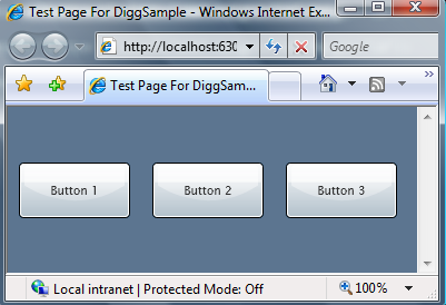
For example, we could use the StackPanel to vertically arrange three buttons on our page using XAML markup like below:

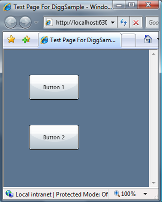
At runtime the StackPanel would then automatically arrange the Button controls in a vertical stack for us like below:
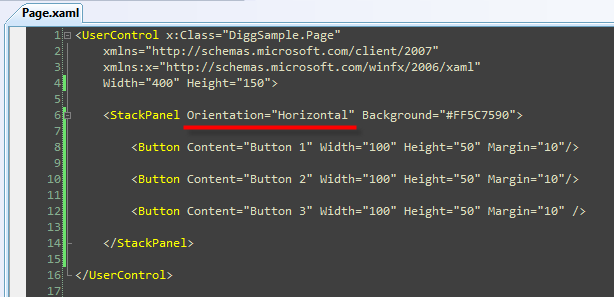
We could alternatively set the "Orientation" property of the StackPanel to be "Horizontal" instead of Vertical (which is the default):
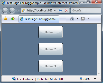
This will then cause the StackPanel to automatically arrange the Button controls in a horizontal row like below:
Grid Panel
The Grid control is the most flexible layout panel, and supports arranging controls in multi-row and multi-column layouts. It is conceptually similar to an HTML Table element.
Unlike an HTML Table, you don't embed controls within column and row elements. Instead you specify a Grid's Row and Column definitions using <Grid.RowDefinitions> and <Grid.ColumnDefinitions> properties that are declared immediately under the <Grid> control. You can then use the XAML "Attached Property" syntax on controls contained within the grid to indicate which Grid row and column they should be populated within.
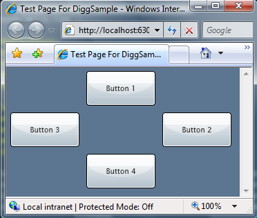
For example, we could declare a Grid layout has three rows and three columns, and then position 4 buttons within it using XAML like below:

The Grid layout panel would then position the Button elements for us like so:
In addition to supporting absolute sizing (for example: Height="60") the Grid's RowDefinition and ColumnDefinition controls also support an AutoSizing mode (Height="Auto"), which automatically sizes the Grid or Row based on the size of the content contained within it (you can also optionally specify maximum and minimum size constraints - which can be very useful).
The Grid's Row and ColumnDefinitions also support a feature called "Proportional Sizing" - which enables the size of a Grid's Rows and Columns to be spaced proportionally relative to each other (for example: you could have the second row grow at 2x the rate of the first one).
You'll find that the Grid provides a ton of power and flexibility - and it will probably be the most common layout panel control you'll end up using.
Using Layout Panels to Arrange our Page
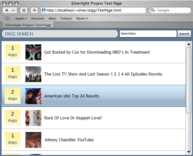
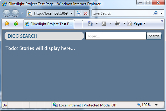
Remember that the goal when building our search sample is to create a page that looks like the one below:
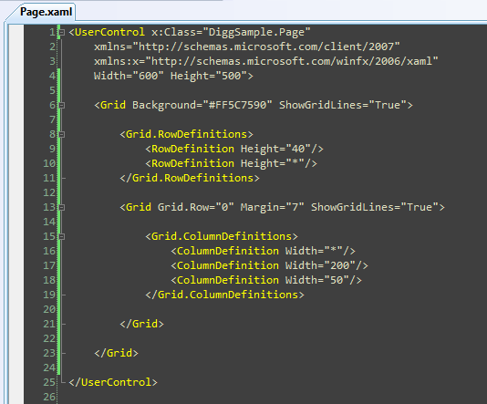
To create this layout we'll begin by adding a root Grid panel that has two RowDefinitions within it. The first Row will be 40 pixels high, and the second will fill the remaining space (Height="*"):
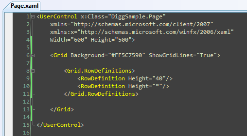
Tip: Notice above how I've set the Grid's "ShowGridLines" property to "True". This will enable us to easily visualize the Row and Column boundaries within the Grid when we test it at runtime:
We'll then embed a second Grid panel control as a child control within the first row of the root Grid panel container, and use it to arrange the top row (the header). We'll create three columns within it - one for the Title, one for the Search TextBox, and one for the Search Button:
Once this is done we have the basic layout arrangement of our search page in place:

Note: As an alternative to nesting Grids, we could have alternatively had one Grid with 3 columns and 2 rows and used the ColSpan/RowSpan feature of the Grid to merge content across multiple columns (similar to how you can do this with HTML tables). I chose to use the nested Grid approach instead because I thought it would be simpler to follow along.
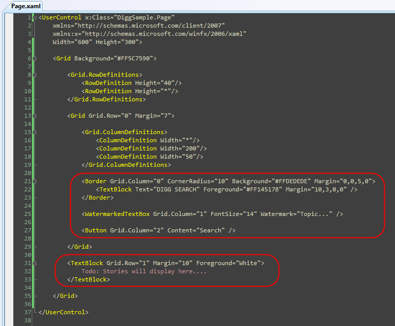
Now that we have the layout setup all we need to-do is add controls to it.
For the header row we'll use the built-in <Border> control (with a CornerRadius of 10 to get a nice rounded edge) and add some text inside it to create the Title. We'll use the <TextBox> control in the second column for the search textbox. And we'll put a search <Button> in the third column. We'll then put some placeholder text in the second row where we are later going to display the search results.
Note: Below I'm embedding style information (FontSize, Colors, Margins, etc) directly on the controls. Later in this tutorial series I'll show how to use Styles to extract and encapsulate these settings in a separate file (ala CSS) which can then be re-used across the application.
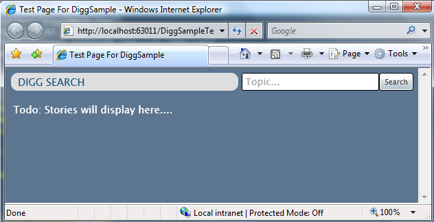
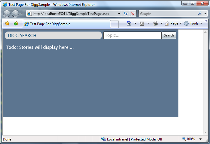
And now when we run our application it looks like below:
Dynamically Resizing our Application
One thing you might have noticed in the XAML above is that our top-level control is currently set to be a fixed width and height:
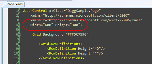
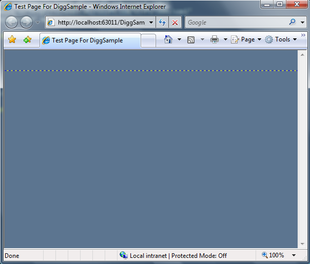
When set this way our Silverlight Application will always remain that fixed size. Expand the browser and this becomes apparent:
While constraining an embedded application to be a fixed size within a region of an HTML page is useful in some scenarios, for our search application we really want the application experience to automatically flow and resize with the browser - just like an HTML page would.
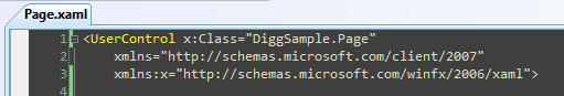
The good news is that this is easy to implement. Just remove the Width and Height attributes on the root control:
Our Silverlight application will then automatically expand (or shrink) to fill the HTML container it is embedded within. Because the SilverlightTestPage.html file that we are testing our Silverlight application within hosts our Silverlight control in a HTML <div> element with a 100% width and height CSS setting on it, our application will now fill the entire browser:
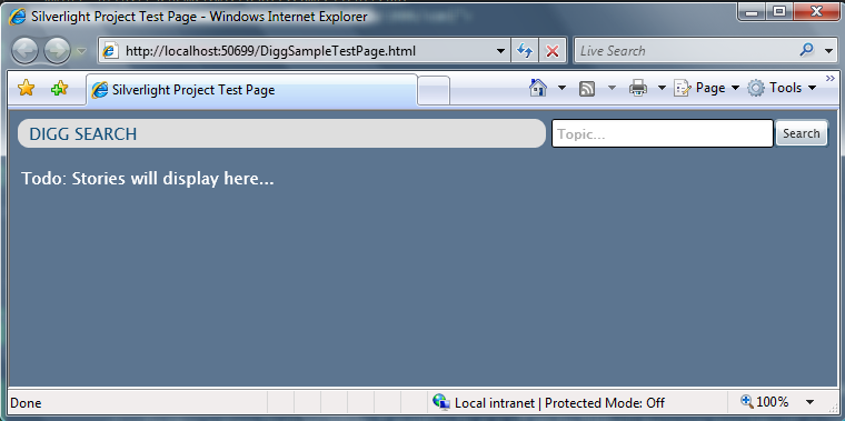
Notice how the content within the header of the application automatically resizes and flows based on the width of the browser:
When we shrink the browser, the watermark textbox and search button stay the same size because their Grid container columns are a fixed width. The <Border> control containing our "Digg Search" title automatically resizes when we shrink the browser because the Grid column it is in is configured to be Width="*".
We did not need to write a single line of code to enable this layout behavior - the Grid container and the layout system took care of dynamically resizing and flowing everything for us.
Next Steps
We now have the basic layout structure of our search application created, and have our header row defined.
Our next step will be to implement the searching behavior of the application - and have it actually retrieve story or image content when an end-user using the application searches on a topic.
To-do that let's jump to our next tutorial: Using Networking to Retrieve Data and Populate a DataGrid.