VisualStateManager - how we can define user interface in WPF and Sliverlight
It is known, that technologies WPF and Silverlight allow to change appearance of the application essentially. However, as it is found out, it is far not all know as it it is possible to do conveniently.
For definition of appearance of controls we usually use ControlTemplate, and dynamics we set via triggers. Undoubtedly, triggers in XAML - the most powerful tool. Nevertheless at construction of difficult interfaces the logic constructed on triggers happens not trivial and opaque, and at times sets restrictions.
Alternative way of construction of the task of appearance of controls is use of object VisualStateManager. I will not go deep into details, I will tell only the most necessary.
VisualStateManager is DependencyObject, with all consequences. We can set behaviour of this object for each control which we wish to operate. Idea of VSM is based on realisation of a state of an control. We can define a set of states (VisualState) in which can there is a controls and to set for each state the appearance. States are packed into groups (VisualStateGroup). Thus, it is possible to define logic groups of states and to define in them transitions.
Each state (VisualState) is Storyboard. State realisation consists that at transition in this condition works set Storyboard, i.e. animation will be starting.
It is possible to present representation of the described structure graphically.

Let's create a small example on the basis of states. Let's create new UserControl in the application WPF with simple structure.
<UserControl x:Class="WpfApplication15.UserControl1"
xmlns="http://schemas.microsoft.com/winfx/2006/xaml/presentation"
xmlns:x="http://schemas.microsoft.com/winfx/2006/xaml">
<Grid>
<Border Name="State1Panel" Background="Red" Opacity="1"/>
<TextBlock Text="Text of control" Foreground="White" HorizontalAlignment="Center" VerticalAlignment="Center"/>
</Grid>
</UserControl>
It is a control with the text and a red background. Let's define two states for this control - State1 and State2. Each of states will visually differ a background. Let's describe two objects VisualState and we will set transition animations.In our case we will simply put against each other two elements Border with a different background. Animation will consist in concealment and display of the necessary element depending on a state.
<UserControl x:Class="WpfApplication15.UserControl1"
xmlns="http://schemas.microsoft.com/winfx/2006/xaml/presentation"
xmlns:x="http://schemas.microsoft.com/winfx/2006/xaml">
<Grid>
<VisualStateManager.VisualStateGroups>
<VisualStateGroup x:Name="Common">
<VisualState x:Name="State1">
<Storyboard>
<DoubleAnimation To="1" Duration="0:00:00.4" Storyboard.TargetName="State1Panel" Storyboard.TargetProperty="(UIElement.Opacity)" />
<DoubleAnimation To="0" Duration="0:00:00.7" Storyboard.TargetName="State2Panel" Storyboard.TargetProperty="(UIElement.Opacity)" />
</Storyboard>
</VisualState>
<VisualState x:Name="State2">
<Storyboard>
<DoubleAnimation To="0" Duration="0:00:00.7" Storyboard.TargetName="State1Panel" Storyboard.TargetProperty="(UIElement.Opacity)" />
<DoubleAnimation To="1" Duration="0:00:00.4" Storyboard.TargetName="State2Panel" Storyboard.TargetProperty="(UIElement.Opacity)" />
</Storyboard>
</VisualState>
</VisualStateGroup>
</VisualStateManager.VisualStateGroups>
<Border Name="State2Panel" Background="Green" Opacity="0"/>
<Border Name="State1Panel" Background="Red" Opacity="1"/>
<TextBlock Text="Text of control" Foreground="White" HorizontalAlignment="Center" VerticalAlignment="Center"/>
</Grid>
</UserControl>
Now, using VisualStateManager, it is possible to switch states of a control and thus to change appearance. For this purpose we will place a control on the form.
<Window x:Class="WpfApplication15.Window1"
xmlns="http://schemas.microsoft.com/winfx/2006/xaml/presentation"
xmlns:x="http://schemas.microsoft.com/winfx/2006/xaml"
xmlns:WpfApplication15="clr-namespace:WpfApplication15"
Title="Window1" Height="300" Width="300">
<Grid>
<Grid.RowDefinitions>
<RowDefinition/>
<RowDefinition Height="40"/>
</Grid.RowDefinitions>
<WpfApplication15:UserControl1 x:Name="Control1" Height="118" VerticalAlignment="Top" Margin="50,12,101,0" />
<StackPanel Orientation="Horizontal" Grid.Row="1">
<Button Name="State1Button" Width="75" Click="State1Button_Click">State1</Button>
<Button Name="State2Button" Width="75" Click="State2Button_Click">State2</Button>
</StackPanel>
</Grid>
</Window>
Also we will create handlers of pressing of buttons.
private void State1Button_Click(object sender, RoutedEventArgs e)
{
VisualStateManager.GoToState(Control1, "State1", true);
}
private void State2Button_Click(object sender, RoutedEventArgs e)
{
VisualStateManager.GoToState(Control1, "State2", true);
}
As a result it is had the following application.
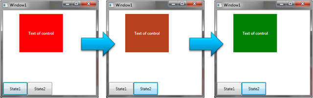
Thus we can create some states of our control and on the basis of it to build the user interface.
Such approach becomes especially useful when we see, that for standard controls there is a set of the predefined states. For example, for the Button - Normal, MouseOver, Pressed, Disabled etc. Such states are and at other elements. Because of such possibility creation of templates for controls essentially becomes simpler. For example, we can describe the button as follows.
<Style TargetType="{x:Type Button}">
<Setter Property="Margin" Value="5"/>
<Setter Property="Width" Value="100"/>
<Setter Property="Template">
<Setter.Value>
<ControlTemplate TargetType="{x:Type Button}">
<Grid>
<VisualStateManager.VisualStateGroups>
<VisualStateGroup x:Name="Common">
<VisualState x:Name="Normal"/>
<VisualState x:Name="MouseOver">
<Storyboard>
<DoubleAnimation To="0" Duration="0:00:00.5" Storyboard.TargetName="NormalBorder" Storyboard.TargetProperty="(UIElement.Opacity)" />
<DoubleAnimation To="1" Duration="0:00:00.3" Storyboard.TargetName="OverBorder" Storyboard.TargetProperty="(UIElement.Opacity)" />
<DoubleAnimation From="0" To="10" AutoReverse="True" Duration="0:00:00.3" Storyboard.TargetName="OverBorderRotateTransform" Storyboard.TargetProperty="Angle" />
</Storyboard>
</VisualState>
<VisualState x:Name="Pressed">
<Storyboard>
<DoubleAnimation To="0" Duration="0:00:00.5" Storyboard.TargetName="NormalBorder" Storyboard.TargetProperty="(UIElement.Opacity)" />
<DoubleAnimation To="1" Duration="0:00:00.3" Storyboard.TargetName="OverBorder" Storyboard.TargetProperty="(UIElement.Opacity)" />
<DoubleAnimation From="0" To="360" AutoReverse="True" Duration="0:00:00.4" Storyboard.TargetName="OverBorderRotateTransform" Storyboard.TargetProperty="Angle" />
</Storyboard>
</VisualState>
</VisualStateGroup>
</VisualStateManager.VisualStateGroups>
<Border Name="NormalBorder" CornerRadius="5" Background="Gray" Opacity="1"/>
<Border Name="OverBorder" CornerRadius="5" Background="Green" Opacity="0">
<Border.RenderTransform>
<RotateTransform x:Name="OverBorderRotateTransform" CenterX="50" CenterY="20" />
</Border.RenderTransform>
</Border>
<ContentPresenter Content="{TemplateBinding Content}" Margin="5" HorizontalAlignment="Center" VerticalAlignment="Center"/>
</Grid>
</ControlTemplate>
</Setter.Value>
</Setter>
</Style>
Now our buttons will look as follows.

Similarly it is possible to adjust appearance in Silverlight applications.
Unfortunately, this time remained without attention a Transitions, but about them next time.
WPF sample:
Silverlight3 sample: