Microsoft Chart Controls for the .Net Framework
I haven't been impressed by any new technology in a long time…until I downloaded and tried out the new Microsoft Chart Controls for the .Net Framework. It contains charts for both Forms and Asp.Net applications. It was easy to put this chart in an Asp.Net page:
The Charts home page is here: http://code.msdn.microsoft.com/mschart
If you want to try it, you need to download these:
Chart Controls for .NET Framework
Chart Controls Add-on for Visual Studio 2008
Chart Controls for .NET Framework Documentation (optional)
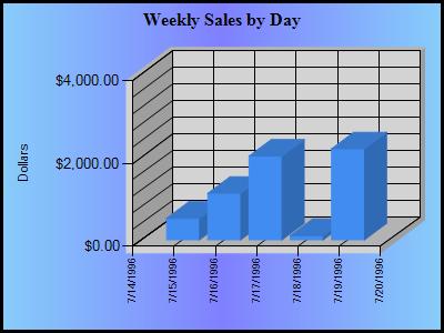
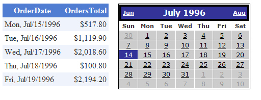
To build the chart, I started with an SQLDataSource connected to the NorthWind database. I used a custom SQL String to sum up the sales for each week (7 days) given a beginning OrderDate. For the OrderDate parameter, I used a Calendar control.
<asp:SqlDataSource ID="SqlDataSource1" runat="server"ConnectionString="<%$ ConnectionStrings:NorthWind %>"SelectCommand="SELECT OrderDate, Sum(Quantity * Unitprice) as OrdersTotalFROM Orders, [Order Details]WHERE Orders.OrderID = [Order Details].OrderID ANDOrderDate BETWEEN @OrderDate AND dateadd(day, 7, @OrderDate)GROUP BY OrderDateORDER BY OrderDate"><SelectParameters><asp:ControlParameterControlID="Calendar1"DefaultValue="7/30/1996"Name="OrderDate"PropertyName="SelectedDate" /></SelectParameters></asp:SqlDataSource>
I dropped a GridView onto the form and fired it up to make sure the data connectivity was working. Clicking dates on the Calendar, causes the GridView to update immediately.
Next, I dropped the Chart control from the Data tab of the ToolBox. I set the DataSourceID to be the same as the GridView's DataSourceID.
The number of settings in the Chart control can be a bit overwhelming at first but if you dig around and drill down, you will eventually find what you need: With power and flexibility comes complexity.
The final Asp markup code was surprisingly short:
<asp:Chart ID="Chart1" runat="server"
BackColor="LightSkyBlue"
BackGradientStyle="VerticalCenter"
BackSecondaryColor="128, 128, 255"
BorderlineColor="Black"
BorderlineDashStyle="Solid"
BorderlineWidth="3"
DataSourceID="SqlDataSource1"
Width="400px" Height="300px"
Style="top: 337px; left: 18px; position: absolute">
<Titles>
<asp:Title Name="Title1"
Text="Weekly Sales by Day"
Font="Times New Roman, 12pt, style=Bold">
</asp:Title>
</Titles>
<Series>
<asp:Series Name="Series1"
XValueMember="OrderDate"
YValueMembers="OrdersTotal">
</asp:Series>
</Series>
<ChartAreas>
<asp:ChartArea Name="ChartArea1">
<Area3DStyle Enable3D="True" />
<AxisY Title="Dollars">
<MinorGrid Enabled="True" />
<LabelStyle Format="{0:C}" />
</AxisY>
</asp:ChartArea>
</ChartAreas>
</asp:Chart>
Of course, I should remove the .00 from the Y Axis, increase the font size of the Y Axis Title, change the format of the X Axis labels to show the day of week, etc. There are tons (and I mean tons) of features with this control….you could spend hours tweaking this thing. But it sure looks good.
I hope you find this useful.
Steve Wellens