How to: Generate semitransparent Stacked Range bar chart
This sample demonstrates one of the ways to generate semitransparent Stacked Range bar chart.
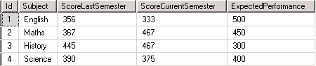
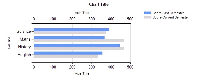
The table consists of following columns and data
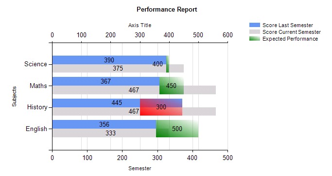
This table data has to be represented in the graphical manner as below
- Gross and net as stacked bar charts,
- ExpectedPerformance to be shown as green/ red block depending on the scores last semester has
- If ExpectedPerformance > ScoreLastSemester display green block
- If ExpectedPerformance < ScoreLastSemester display red block
- Since the ScoreLastSemester and ScoreCurrentSemester are stacked in chart, the ExpectedPerformance on top should be displayed as semitransparent
The solution for the above requirements is as below.
The sample is developed using Microsoft SQL Server 2012->Sql server data tools
Step 1. Create Report server Project
Step 2. Right click Shared Datasource
- Create new datasource pointing to correct database or used shared datasource.
- Test the connection
Step 3. Right click dataset
- Create shared DataSet that uses newly created data source or use existing one
- Write the applicable Select query for the table
Step 4. Right click Reports
- Add->New Item -> Report-> give appropriate name to report and click ok
Step 5. Once the report is open,
- Right click on the design area
- Insert Chart, select the Stacked Bar chart
- Choose the proper dataset
- Drag and drop the chart wherever applicable, resize if needed
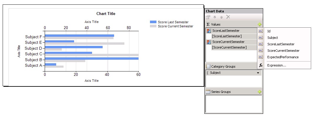
Step 6. To achieve the stacked bar chart for the score last and current semester
- Drag and drop the two fields ScoreLastSemester, ScoreCurrentSemester in the values of Chart Data(you get this option when you click on chart)
- Drag and drop the Subject in the Category groups
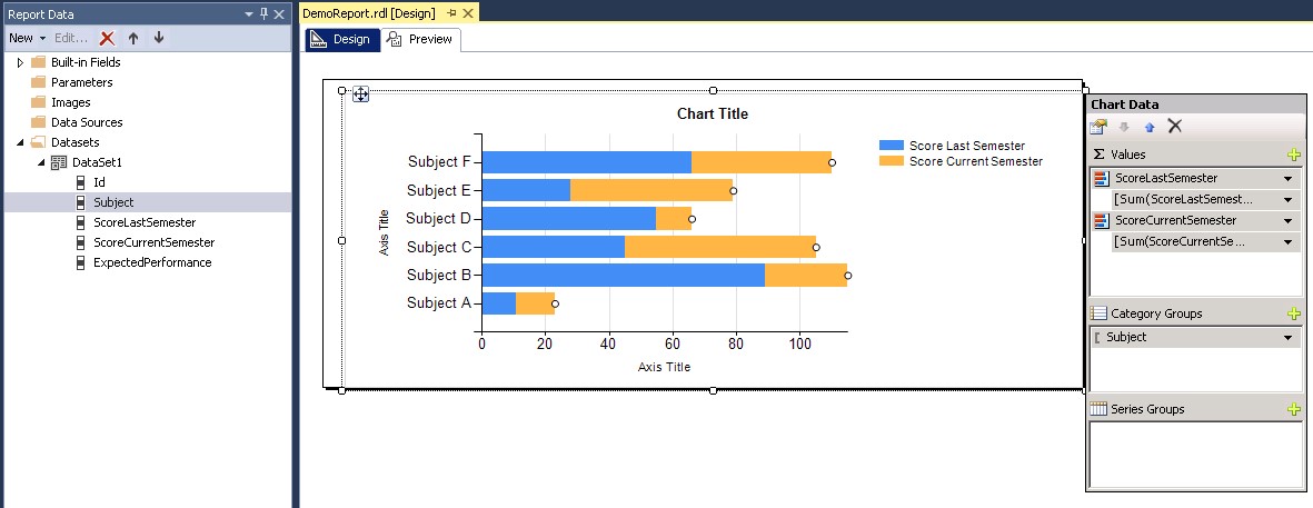
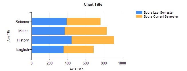
c. Preview the report. By default we get the preview as follows
Step 7. To customize the graph for the values and colors for the scores last and current year
a. Select item from values, right click -> Select series Properties
b. For ScoreLastSemester -> Change value field [Sum(ScoreLastSemester)] to [ScoreLastSemester]
Go to Axes and Chart Area, change the horizontal axis from Primary to secondary
c. For ScoreCurrentSemester -> Change value field [Sum(ScoreCurrentSemester)] to [ScoreCurrentSemester]
d. Click on ScoreLastSemester in the Properties, change the color from Automatic to CornflowerBlue(or any preferred)
e. Click on ScoreCurrentSemester in the properties, change the color from Automatic to LightGrey(or any preferred)
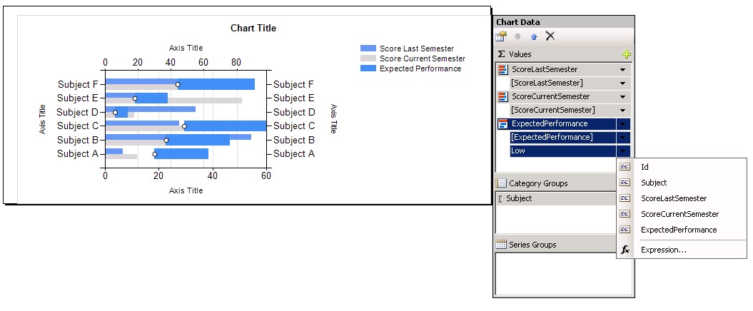
Step 8. To get the Expected performance to display green/red based on the value of score last and current year
a. Select the Chart->Chart Data -> Values Click on + sign to add the ExpectedPerformance column
This is alternative to drag and drop it from the report Data-> dataset section to Chart Data->Values section
Step 9. Go to Series Properties of ExpectedPerformance column
a. For ExpectedPerformance -> Change value field [Sum(ExpectedPerformance)] to [ExpectedPerformance]
b. Go to Axes and Chart Area, change the vertical axis from Primary to secondary
Step 10. While on Series properties of ExpectedPerformance
a. Change the Chart type to Range type
b. Click on the low that got added to the ExpectedPerformance
c. Click Expression and type
=Fields!ExpectedPerformance.Value-(Fields!ExpectedPerformance.Value-Fields!ScoreLastSemester.Value)
d. Set the Color as Expression below
=switch (Fields!ExpectedPerformance.Value - Fields!ScoreLastSemester.Value >0,"Green" , Fields!ExpectedPerformance.Value-Fields!ScoreLastSemester.Value<0,"Red")
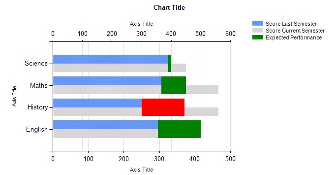
e. Go to preview, the green and red bars overlap the Score values. So there is need to set it semi transparent
Step 11. To get the Semitransparent effect
a. Go to Chart Properties-> Set the Palette property to SemiTransparent
b. Change the ExpectedPerformance color to No Color
The Preview will show default color for ExpectedPerformance with semitransparent effect
c. To set the color back to Green/Red depending on the ScoreLastSemester value,
Set the ExpectedPerformance
BackgroundgradientEndcolor to =switch (Fields!ExpectedPerformance.Value-Fields!ScoreLastSemester.Value >0,"Green" , Fields!ExpectedPerformance.Value-Fields!ScoreLastSemester.Value<0,"Red")
BackgroundGradientType to DiagonalLeft
d. The data labels can be displayed on the chart by using show data labels for respective values
e. The Chart titles and Axis titles can be changed by setting appropriate properties
Preview is as below