Grid Layout In Jquery Mobile
Today I will explain to you how to use Jquery Mobile Grid layout, which allows to build multiple columns ranges between two to five columns .
We need this technique to place small elements side-by-side (like hours, minutes and seconds text box groups).
Jquery mobile provides a block style class called ui-grid, this class is the core of grid layout. It is 100% width, with no borders or backgrounds, and without padding or margins.
To build two columns layout, we can use ui-grid-a. The others can be used as the following:
|
class |
Layout |
Width |
|
ui-grid-a |
Two-column |
50/50% |
|
ui-grid-b |
Three-column |
33/33/33% |
|
ui-grid-c |
Four-column |
25/25/25/25% |
|
ui-grid-d |
Five-column |
20/20/20/20/20% |
For example, we can use ui-grid-a as the following:
<div class="ui-grid-a">
</div>
Inside this two-column layout, we can place the two columns.
<div class="ui-grid-a">
<div class="ui-block-a">
Left Block</div>
<div class="ui-block-b">
Right Block</div>
</div>
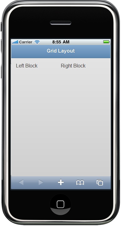
Ui-block-a class says: this is the first column in the grid, and ui-block–b is the second one in the same grid.
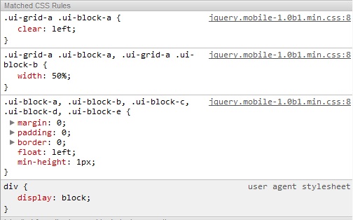
Here you can find that ui-block changes the CSS Clear property to the left. This property specifies the left side of the element, where other floating elements are not allowed.
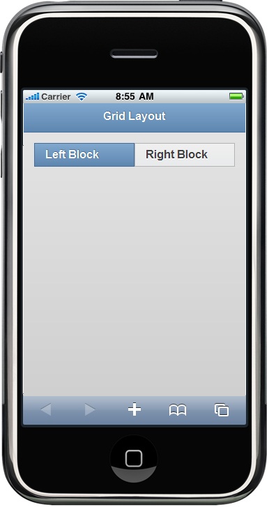
Furthermore, you can give that block a style by using ui-bar class by default without having any style. You can also assign any style to the block (like height, background, etc):
<div class="ui-grid-a">
<div class="ui-block-a">
<div class="ui-bar ui-bar-b">Left Block</div>
</div>
<div class="ui-block-c">
<div class="ui-bar ui-bar-b">Right Block</div>
</div>
</div>
The layout would be like this:
Apply Grid to Content Container:
Grid classes can be applied to any container. In the previous example, I used it with Fieldset and applied the block to the two buttons.
<fieldset class="ui-grid-a">
<div class="ui-block-a">
<button type="button" data-theme="b">Add</button></div>
<div class="ui-block-b">
<button type="button" data-theme="e">Delete</button></div>
</fieldset>
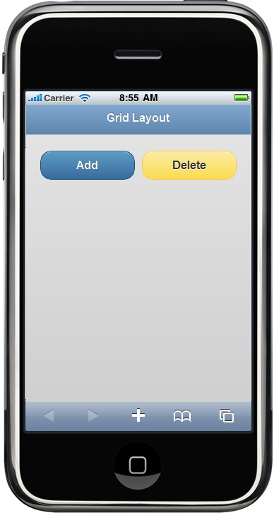
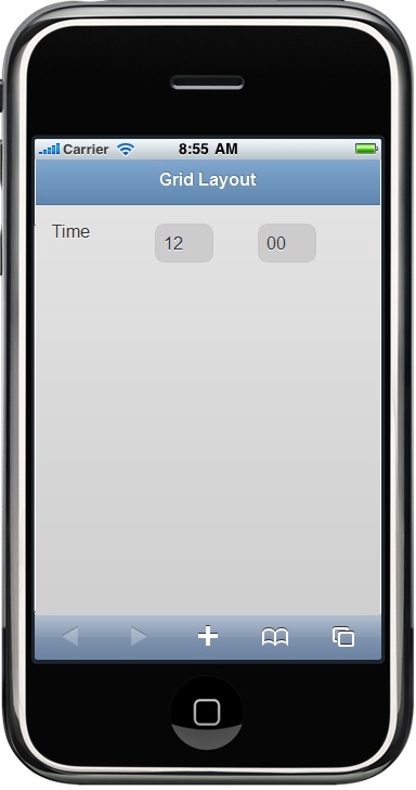
You will find that every block -div- is stretched to 50% of the screen width. In the same way, we can create a three-column layout for time entry: <fieldset class="ui-grid-b">
<div class="ui-block-a">
<label id="Label10" for="txtHours">
Time</label></div>
<div class="ui-block-b">
<input type="text" name="txtHours" id="txtHours" value="12" style="width:40px" maxlength="2" /> </div>
<div class="ui-block-c">
<input type="text" name="txtMinutes" id="txtMinutes" value="00" style="width:40px" maxlength="2" /></div>
</fieldset>
The letters sequence after ui-block
class refers to the column number. So, “a" refers to the fist column,
"b" to the second one, and so on. In this way we can create multiple
rows of items.
There is an important thing by using multiple
rows of items. ui-block-a CSS Class is used to clear the floats and start a new line.
Therefore the sequence is important to build the items.
Here you can find an example of multiple rows of items:
<div data-role="content">
<fieldset class="ui-grid-b">
<div class="ui-block-a">
<img alt="" src="images.jpg" style="width: 80px; height: 80px" />
</div>
<div class="ui-block-b">
<img alt="" src="images.jpg" style="width: 80px; height: 80px" />
</div>
<div class="ui-block-c">
<img alt="" src="images.jpg" style="width: 80px; height: 80px" />
</div>
<div class="ui-block-a">
<img alt="" src="images.jpg" style="width: 80px; height: 80px" />
</div>
<div class="ui-block-b">
<img alt="" src="images.jpg" style="width: 80px; height: 80px" />
</div>
<div class="ui-block-a">
<img alt="" src="images.jpg" style="width: 80px; height: 80px" />
</div>
</fieldset>
The layout would be like this:
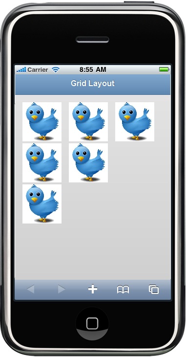
Note that how a new line is started in the third line by using ui-block-a CSS Class.
Hope that helps.