Building elements for Orchard layouts 1
Orchard layouts are great, and they’re extensible. In this series of posts, I’ll show how to write your own layout elements. Custom elements are a great way to encapsulate and re-use common bits of layout. Instead of having to build everything from grids, rows, cells, text and media, you can build your layouts from higher-level semantic constructs that make sense for your particular site. In this first post, we’ll build a very simple element: an “subscription” section that is made of a title, two lines of information, a monthly price, and a yearly price.
Defining the element is as easy as deriving a class from Element, and implementing properties and overrides for data and metadata:
using Orchard.Layouts.Framework.Elements;
using Orchard.Layouts.Helpers;
using Orchard.Localization;

namespace Decent.Sections.Elements {
    public class SubscriptionSection : Element {
        public override string Category {
            get { return "Sections"; }
        }

        public override string ToolboxIcon {
            get { return "\uf0d6"; }
        }

        public override LocalizedString Description {
            get { return T("Subscription Section Element"); }
        }

        public string Title {
            get { return this.Retrieve(x => x.Title); }
            set { this.Store(x => x.Title, value);}
        }

        public string AdditionalInformationLine1 {
            get { return this.Retrieve(x => x.AdditionalInformationLine1); }
            set { this.Store(x => x.AdditionalInformationLine1, value); }
        }

        public string AdditionalInformationLine2 {
            get { return this.Retrieve(x => x.AdditionalInformationLine2); }
            set { this.Store(x => x.AdditionalInformationLine2, value); }
        }

        public double MonthlyPrice {
            get { return this.Retrieve(x => x.MonthlyPrice); }
            set { this.Store(x => x.MonthlyPrice, value); }
        }

        public double YearlyPrice {
            get { return this.Retrieve(x => x.YearlyPrice); }
            set { this.Store(x => x.YearlyPrice, value); }
        }
    }
}
This is analogous to the part class that you have to write when building a content part. The ToolboxIcon property is returning an icon from the FontAwesome collection, that will be used as the element’s icon in the layout editor’s toolbox. The DisplayText property is the localizable text that will appear next to that icon, and the Description property gives a longer form description of the element. The Category property enables grouping of elements in the toolbox.
The Title, AdditionalInformationLine1, AdditionalInformationLine2, MonthlyPrice, and YearlyPrice properties define the data available on the element. Their implementation retrieves and stores the data onto the element’s internal XML representation, similarly to what modern parts do with the Infoset.
By now, you’ve probably understood how elements are closely modeled after parts. It won’t surprise you then that they are managed by drivers. Here is the code for the driver of our about section:
using System.Collections.Generic;
using Decent.Sections.Elements;
using Orchard.Forms.Services;
using Orchard.Layouts.Framework.Drivers;

namespace Decent.Sections.Drivers {
    public class SubscriptionSectionElementDriver : FormsElementDriver<subscriptionsection> {
        public SubscriptionSectionElementDriver(IFormManager formManager) : base(formManager) {
        }

        protected override IEnumerable<string> FormNames {
            get {
                yield return "SubscriptionSection";
            }
        }

        protected override void DescribeForm(DescribeContext context) {
            context.Form("SubscriptionSection", factory => {
                var shape = (dynamic)factory;
                var form = shape.Fieldset(
                    Id: "SubscriptionSection",
                    _Title: shape.Textbox(
                        Id: "Title",
                        Name: "Title",
                        Title: "Title",
                        Classes: new[] { "text", "large" },
                        Description: T("The title for the section")),
                    _AdditionalInformationLine1: shape.Textbox(
                        Id: "AdditionalInformationLine1",
                        Name: "AdditionalInformationLine1",
                        Title: "Additional Information Line 1",
                        Classes: new[] { "text", "large" },
                        Description: T("The first line of additional information that will appear below the subscription price.")),
                    _AdditionalInformationLine2: shape.Textbox(
                        Id: "AdditionalInformationLine2",
                        Name: "AdditionalInformationLine2",
                        Title: "Additional Information Line 2",
                        Classes: new[] { "text", "large" },
                        Description: T("The second line of additional information that will appear below the subscription price. Leave empty if the first line was sufficient.")),
                    _MonthlyPrice: shape.Textbox(
                        Id: "MonthlyPrice",
                        Name: "MonthlyPrice",
                        Title: "Monthly Price",
                        Description: T("The subscription's monthly price.")),
                    _YearlyPrice: shape.Textbox(
                        Id: "YearlyPrice",
                        Name: "YearlyPrice",
                        Title: "Yearly Price",
                        Description: T("The subscription's yearly price."))
                    );

                return form;
            });
        }
    }
}
The driver defines the form to use as the edit UI for the element. We don’t even need to build views for the editor, or how the data is persisted: using the forms API, all we have to do is describe the form, and Orchard will take care of the rest. So far, this is actually a lot easier than writing a content part…
The only thing left to define is the front-end view for the element. This is done by adding the following code to a Views/Elements/SubscriptionSection.cshtml template:
@using Decent.Sections.Elements
@using Orchard.Layouts.Helpers
@{
    var element = (SubscriptionSection) Model.Element;
    var title = element.Title;
    var line1 = element.AdditionalInformationLine1;
    var line2 = element.AdditionalInformationLine2;
    var monthlyPrice = element.MonthlyPrice;
    var yearlyPrice = element.YearlyPrice;
    var tagBuilder = TagBuilderExtensions.CreateElementTagBuilder(Model);
    tagBuilder.AddCssClass("pricing-table");
}
@tagBuilder.StartElement
<div class="pricing-heading bg-primary">
    <h2>@title</h2>
</div>
<div class="content">
    @if (yearlyPrice == 0) {
        <div class="price">
            <span class="one-time amount">@monthlyPrice.ToString("C0")</span>
        </div>
    }
    else {
        <div class="monthly price">
            <span class="amount">@monthlyPrice.ToString("C0")</span>
            <span class="period">@T("monthly")</span>
        </div>
        <div class="yearly price">
            <span class="amount">@yearlyPrice.ToString("C0")</span>
            <span class="period">@T("yearly")</span>
        </div>
    }
    <ul class="pricing-items list-unstyled text-center">
        <li class="item">@line1</li>
        @if (!String.IsNullOrWhiteSpace(line2)) {
            <li class="item">@line2</li>
        }
    </ul>
</div>
@tagBuilder.EndElement
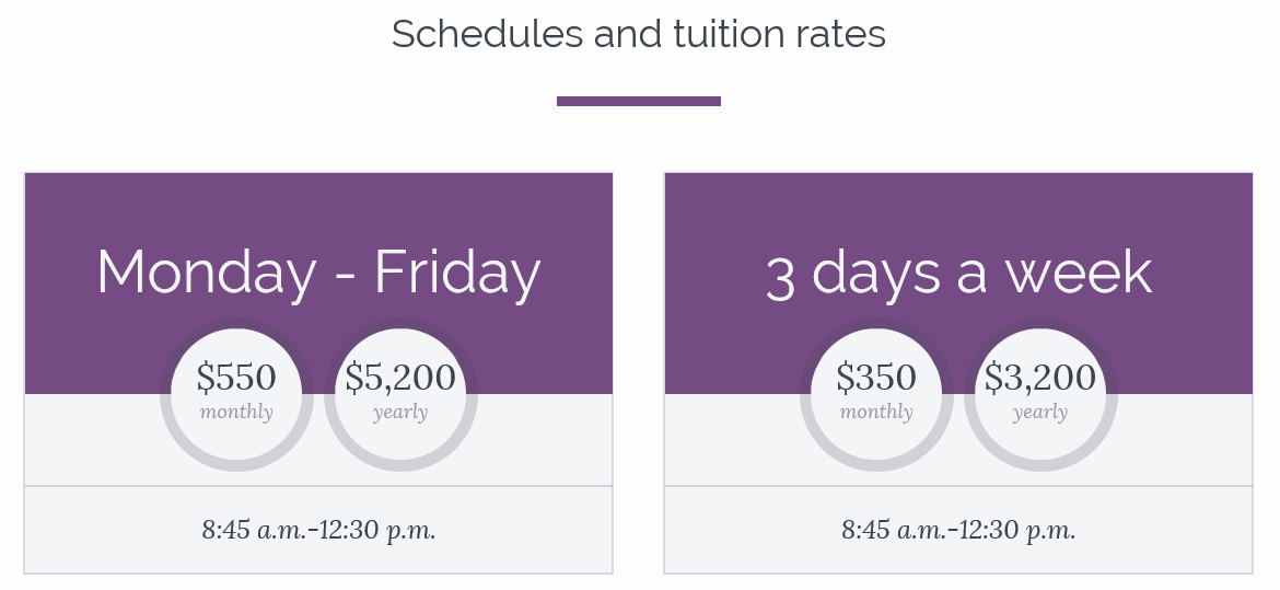
And this is it. We now have a “subscription” section that we can add to a layout, and that once styled, can look like this on the front-end:
This is of course an extremely simple element. In future posts, I’ll show more complex examples, where the edit experience is more customized, and where the model is more elaborate.