Get under the hood with Shadow DOM
When you add an element to your page, it is being added to the Document Object Model (DOM). When added to the DOM, you can use CSS to style it or JavaScript (getElementById, querySelector etc) to get a reference to the element and modify it. There are some cases where this isn´t true though.
Let´s say we want to add a video player to our site. We use the standard <video> element, choose which movie to play and start it. Here we have a standard element doing what it´s supposed to do. But what if we add the controls attribute?
This is what we see in the browser if we are using Internet Explorer 10:

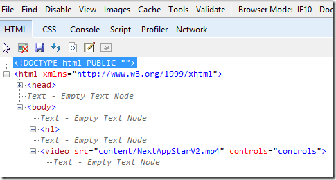
We have got some controls here as expected since we added the controls attribute. BUT..! Where are they in the DOM? If we take a look at the Developer Tools in IE 10 we will see this:

As we can see in the picture above, there are no elements for the play/pause button, the time slider or the other elements. So where are they?
The answer to that question is the Shadow DOM.
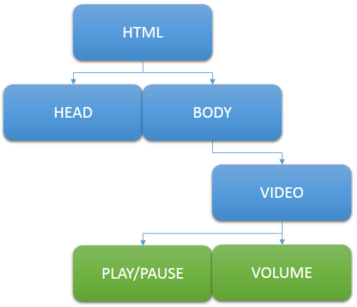
To make it easier to explain how it works I have created this diagram with the current DOM:

The blue elements are what we can see in the DOM through Developer Tools, and the green elements are what is hidden in the Shadow DOM.
So…
Okay, so there is this thing Shadow DOM… But… What does it matter to me as a web developer? If it´s hidden, why would I care about it?
Thanks to a new specification on W3C, called Web Components, we can actually use Shadow DOM to create components that will be visible for the user, but rendered separately from the rest of the page. This means we can use HTML, CSS and JavaScript that is rendered independently from what is being rendered for the rest of the page.
At the moment, there is only one browser that supports Web Components, and that is Chrome Canary (Chrome 25), so I will be using it for the demos.
Creating a Shadow Host using JavaScript
First of all we will need to create a new HTML document. I have created a very simple one which looks like this:
<!DOCTYPE html>
<html>
<head>
<meta charset="utf-8" />
<title>Creating a Shadow Host using JavaScript</title>
<style>
p { color: #0a0; }
</style>
</head>
<body>
<h1>
Shadow DOM
</h1>
<p>This is rendered outside of our Shadow DOM.</p>
<div id="shadowhost"></div>
</body>
</html>
The div element with id “shadowhost” will be the host for our Shadow DOM Tree. The first we will have to do is to create a new Shadow DOM based on that element using JavaScript.
Let´s add these three lines of JavaScript:
var el = document.querySelector('#shadowhost');
var root = el.webkitCreateShadowRoot();
root.innerHTML = '<p>Rendered inside of our Shadow DOM!</p>';
The first thing we are doing here is to get a reference of the div element which will be the host. After that we use the webkitCreateShadowRoot method (when more browsers have support for this you will of course have to use their vendor specific prefixes as well, but for the moment I will only use webkit to save some lines). The next step is to add a p element to the div.
This is no rocket science, and you have probably used the code before (except from the second line). But it is the second line which is creating the magic.
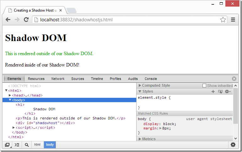
If we take a look at the page in Chrome Canary, we will get this result:

Whoa! Two things are different from how we are used to see things when we are adding elements.
- We added a p element, and we have CSS that is supposed to make the text green, as in the first p element on the page.
- Our shadowhost is still empty! Where is the p element we added and which is apparently added to the page?
First of all, the text is black since our shadow tree is like a whole new document, as if we would have added an iframe. The difference here is that it is on the same page. It is in other words not affected by the surrounding DOM.
And the reason to why we can´t see the element in the DOM is because there are no elements in the DOM, since they are in the Shadow DOM.
Light up the Shadow DOM
In Chrome Developer Tools, there is actually possible to show the Shadow DOM. If we go to settings –> General and active “Show Shadow DOM” we will be able to see what´s inside of the Shadow DOM.
And what about the CSS? You might want the developer using your component to be able to style the elements inside of your Shadow DOM. This is actually possible by enabling applyAuthorStyles for the root variable:
root.applyAuthorStyles = true;
With “Show Shadow DOM” enabled in the Developer Tools, and applyAuthorStyles set to true, we will get this result:

Great! We are now able to add elements that are not (usually) visible in the DOM Tree, and we can choose whether or not our elements will be affected by the styles set by the developer who will be using our component.
Create a separate HTML file for the component
So far, we have been using pure JavaScript and an empty element on the page for our component. But this isn´t probably the most usable way to use it all times. Sometimes you would want to create a separate HTML file for the component which contains all styles, data etc that you would want to use for your component, and later on give the user of your component the ability to add it to their page for a better experience.
The next step here is to create an entirely new HTML page. In this page we will use some new elements; <element>, <template> and <content>, as well as some new attributes to use with them.
But first of all we have to create the document which will be visible for the user, where we will use the component:
<!DOCTYPE html>
<html>
<head>
<meta charset="utf-8" />
<title>Shadow DOM</title>
<link rel="components" href="vip-component.html" />
</head>
<body>
<h1>Persons</h1>
<ul is="vips">
<li class="vip">Mikael Söderström</li>
<li>Boris Jeltsin</li>
<li>Julius Caesar</li>
<li class="vip">Bill Gates</li>
</ul>
<script src="scripts/components-polyfill.js"></script>
</body>
</html>
We have a list with people here, and on two of them we have the vip class (hrm ;-)). In the head you can see something different though. We have a link element that references to a vip-component.html as “components”. In the vip-component.html page we will use markup to create our Shadow DOM, and then apply it on the list. Since all features aren´t implemented in the browser yet, we will have to include a polyfill as well.
You can download the polyfill here:
https://github.com/dglazkov/Web-Components-Polyfill
If we open the page we will see nothing but a list with names, so the next step is to create the vip-component.html page which will look like this:
<!DOCTYPE html>
<html>
<head>
<meta charset="utf-8" />
</head>
<body>
<element name="vips" extends="ul">
<template>
<h2>VIP</h2>
<div>
<ul>
<content select=".vip"></content>
</ul>
</div>
<h2>Other people</h2>
<div>
<ul>
<content></content>
</ul>
</div>
</template>
</element>
</body>
</html>
It looks like an ordinary HTML page, but we are using some new elements that is supported by the Web Components API.
- <element> is the name of our new element, and in this case we are extending the existing ul element. We could create a whole new <vip> element if we want to.
- <template> tolds the browser that this is the template which will be rendered in the Shadow DOM.
- <content> is where the markup will be placed from the original DOM. The select attribute uses ordinare CSS selectors, and in the first content element we want the users who have the class “vip”, and in the other content element we will have the rest.
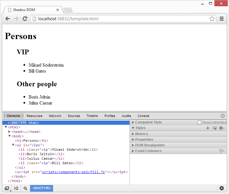
To test this, I disabled “Show Shadow DOM” in the Chrome Developer Tools and reloaded the page. This is what I got:

If we look at the DOM, we still have the original one as before, but if we look at the page, we can see that we have the grouping and headers from our Web Component!
Conclusion
Web Components are extremely useful in a lot of cases where you want to separate your components into other files, and at the same time let them be isolated from CSS in your original page.
I just demonstrated the basics here, but if you want to go one step further, you could add JavaScript methods in your component, that the original page can call to modify your Shadow DOM, like the play() method on the video element. You can also add your own pseudo classes to the CSS for your element, like ul:vip-header { color: #0f0; } in this case.
Have you used Web Components and perhaps have any cool demos? Please let me know!