Archives
-
Confirmations in User Interfaces: Explicit vs. Implicit
Confirmations are a tricky subject in user interface design. As a UI designer, you want to avoid them, but you cannot always implement an undo/redo system. As users, we do not want to be nagged constantly, but if an action has serious consequences and something goes wrong, we angrily ask why there was no confirmation.
In addition to interrupting the flow of our work, confirmations can also introduce a tiny bit of stress. Confirming too fast and losing work is not fun. Even if the action was not permanent and, e.g., files can be brought back from the recycle bin, there is some kind of hassle involved. So, you do want to be sure about what you confirm.
In theory, when you directly look at something and trigger an action, a generic question like “Do you want to do this?” should be sufficient. The context of your action determines what “this” means (I cannot help myself thinking of an old JavaScript joke, but I digress).
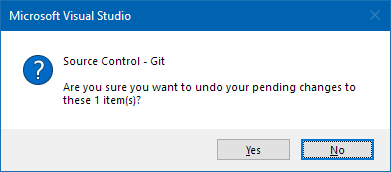
In practice though, in a world full of distractions, sometimes when you see a dialog like this…

…, you may notice that your eye wanders back to the selection of the “item”.
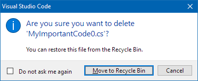
This is why a dialog that explicitly tells you the name is a better solution:

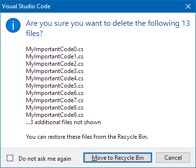
But what about deleting multiple files? Depending on how large the number is, a dialog cannot show all names. The following dialog stops at ten files:

This is far from being perfect. And of course, one could think of a dialog with a scrolling list that allows you to view all files. For certain projects this may important enough to invest the necessary budget. On the other hand, the dialog shown above simply works by concatenating one large string and putting it into a standard dialog. This is a pragmatic solution that does its job well in many cases. Even though you are not told the names of the “3 additional files”, chances are that it is easier for you to remember them by looking at the ten names you can read. This may be less the case as the number of “additional files” grows, but anything is better than just a number like in this dialog.

Confirmation dialogs should contain enough information to work without looking at the rest of the user interface. When you design the dialog, imagine that the user must leave the room for a short moment and comes back to the computer (just a moment, not a lunch break). Make sure he or she can make then an informed decision.