Building mobile web site with ASP.NET MVC and jQuery Mobile
jQuery Mobile is unified UI system that will work on all popular mobile device platforms. Currently alpha version is available to download. In this posting I will show you how to use jQuery Mobile with ASP.NET MVC 3 and how jQuery Mobile pages look on Windows Mobile.
Source code
You can find source code of this example from Visual Studio 2010 experiments repository at GitHub.
| Source code repository GitHub |
Example is located in Experiments.MobileWeb.JqueryMobile project.
Anatomy of jQuery Mobile page
JQuery Mobile pages are made up of div tags that have data-role attribute. Data-role attribute tells jQuery Mobile what is the intended use of given div so it can add styles and modify mark-up inside the div to make it look cool. Here is the basic jQuery Mobile page.
<!DOCTYPE html>
<html>
	<head>
	<title>Page Title</title>
	<link rel="stylesheet" href="http://code.jquery.com/mobile/1.0a1/jquery.mobile-1.0a1.min.css" />
	<script src="http://code.jquery.com/jquery-1.4.3.min.js"></script>
	<script src="http://code.jquery.com/mobile/1.0a1/jquery.mobile-1.0a1.min.js"></script>
</head>
<body>

<div data-role="page">

	<div data-role="header">
		<h1>Page Title</h1>
	</div><!-- /header -->

	<div data-role="content">
		<p>Page content goes here.</p>
	</div><!-- /content -->

	<div data-role="footer">
		<h4>Page Footer</h4>
	</div><!-- /header -->
</div><!-- /page -->

</body>
</html>
Page is divided to smaller pages – and one of them is shown at time. I see here some analogy with WML and cards. Like said before, data-role specifies what is the role of div. You can see from HTML above that page contains header, content and footer divs. All these dives get nice and cool face automagically like we see later.
Master page
We will start with default MVC project where all unnecessary stuff is cleaned out. I don’t have scripts in my project, instead I will include them from jQuery CDN. I added one additional content place holder for page title that is shown on the upper part of device screen. I also added all necessary divs for this example. Here is my master page.
<%@ Master Language="C#" Inherits="System.Web.Mvc.ViewMasterPage" %>
<!DOCTYPE html>
<html>
<head id="Head1" runat="server">
    <title><asp:ContentPlaceHolder ID="TitleContent" runat="server" /></title>
    <link rel="stylesheet" href="http://code.jquery.com/mobile/1.0a1/jquery.mobile-1.0a1.min.css" />
    <script type="text/javascript" src="http://code.jquery.com/jquery-1.4.3.min.js"></script>
    <script type="text/javascript" src="http://code.jquery.com/mobile/1.0a1/jquery.mobile-1.0a1.min.js"></script>
</head>

<body>
<div data-role="page">
    <div data-role="header">
        <h1><asp:ContentPlaceHolder ID="PageTitleContent" runat="server" /></h1>
    </div>
    <div data-role="content">
        <asp:ContentPlaceHolder ID="MainContent" runat="server" />
    </div>
    <div data-role="footer" class="ui-bar">
        <%: Html.ActionLink("About", "About", "Home")  %>
    </div>
</div>
</body>
</html>
You can also add separate content place holder for footer if you like. Although I have simple place holders system here you can still build more complex templates if you need.
Default page
Now we have master page. Let’s put up default page for example site.
<%@ Page Language="C#" MasterPageFile="~/Views/Shared/Site.Master"
         Inherits="System.Web.Mvc.ViewPage" %>
<asp:Content ID="Content1" ContentPlaceHolderID="TitleContent" runat="server">
    Beer Index
</asp:Content>

<asp:Content ID="Content3" ContentPlaceHolderID="PageTitleContent" runat="server">
    Beer Index
</asp:Content>

<asp:Content ID="Content2" ContentPlaceHolderID="MainContent" runat="server">

    <ul data-role="listview" data-inset="true" data-theme="c" data-dividertheme="b">
    <li><%: Html.ActionLink("Heineken", "Heineken", "Home") %></li>
    <li><%: Html.ActionLink("Amstel", "Amstel", "Home")  %></li>
    </ul>

</asp:Content>
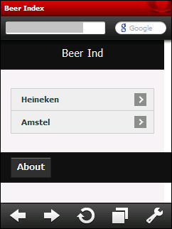
This is the page on Google Chrome.

Seems like nice fit for devices with black cover and dark user interface. And what’s the best -I had to do almost nothing to get done with this beautiful UI.
Pages on mobile
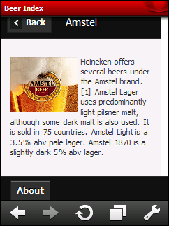
Here are the best results I got on my HTC Touch 2. You can see how Opera Mobile 10 shows our pages. Everything looks pretty okay for alpha version. The only bug you can see here is on the title of left screenshot. But my information view about Amstel is very okay.
 |
 |
What about Internet Explorer? Well, nothing … it is listed as “C – Low Quality” browser that is not capable of utilizing media queries. What it means? Well, plain HTML with default styles that browser provides. Yeah, good old Times New Roman based pages and what is most scary – IE for Windows Phone 7 is listed as C browser too. I still hope that IE that ships with Windows Phone 7 is modern browser and ready for jQuery.
Conclusion
Mobile web is starting getting popular and hopefully this time revolution happens as devices are able to provide better user experience than before and we can use fast mobile internet connections. Mobile browsers have worse compatibility with each other than usual web browsers and jQuery Mobile seems to be the long waited tool that helps easily get over those problems. There are more component available for mobile browser UI-s and I suggest you to take a look at what jQuery Mobile has to offer. I think that something great is happening. :)