ASP.NET MVC 4 Overview - Part 2: Default template changes and Adaptive Rendering using Viewport and CSS Media Queries
This is Part 2 of a series overviewing changes in ASP.NET MVC 4. In Part 1, we looked at installation and new options in creating a new project. In Part 2, we'll look at changes to the default project template and how it uses adaptive rendering to optimize the display for the end user's browser dimensions.
When we left off, we'd just run through the File / New Project / New ASP.NET MVC 4 Web Application / Internet Application and created a new project. Up through this point, the process has looked pretty similar to the ASP.NET MVC 3 experience with a few new options.
When we run the application, though, things start looking significantly different. I'll compare what's different, then explain why this will help you build mobile-ready sites more effectively.
Review: The ASP.NET MVC 3 template
Just in case you need a reminder, the ASP.NET MVC 3 default template looks like this:
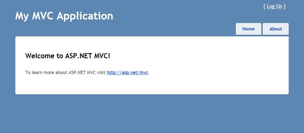
The astute ASP.NET MVC historians among you will note that the ASP.NET MVC 3 default template was very similar to the default template in ASP.NET 1 and 2, with two very subtle changes:
- The corners on the boxes are rounded (subtle - but nice - improvement using CSS 3 border-radius)
- Viewing source source reveals that the page is constructed using HTML5 semantic elements (header, nav, section, footer) which are backwards compatible due to use of the Modernizr library
Overall, I think it's fair to say that the ASP.NET MVC default template has been functional but austere, and perhaps a bit dated. No more!
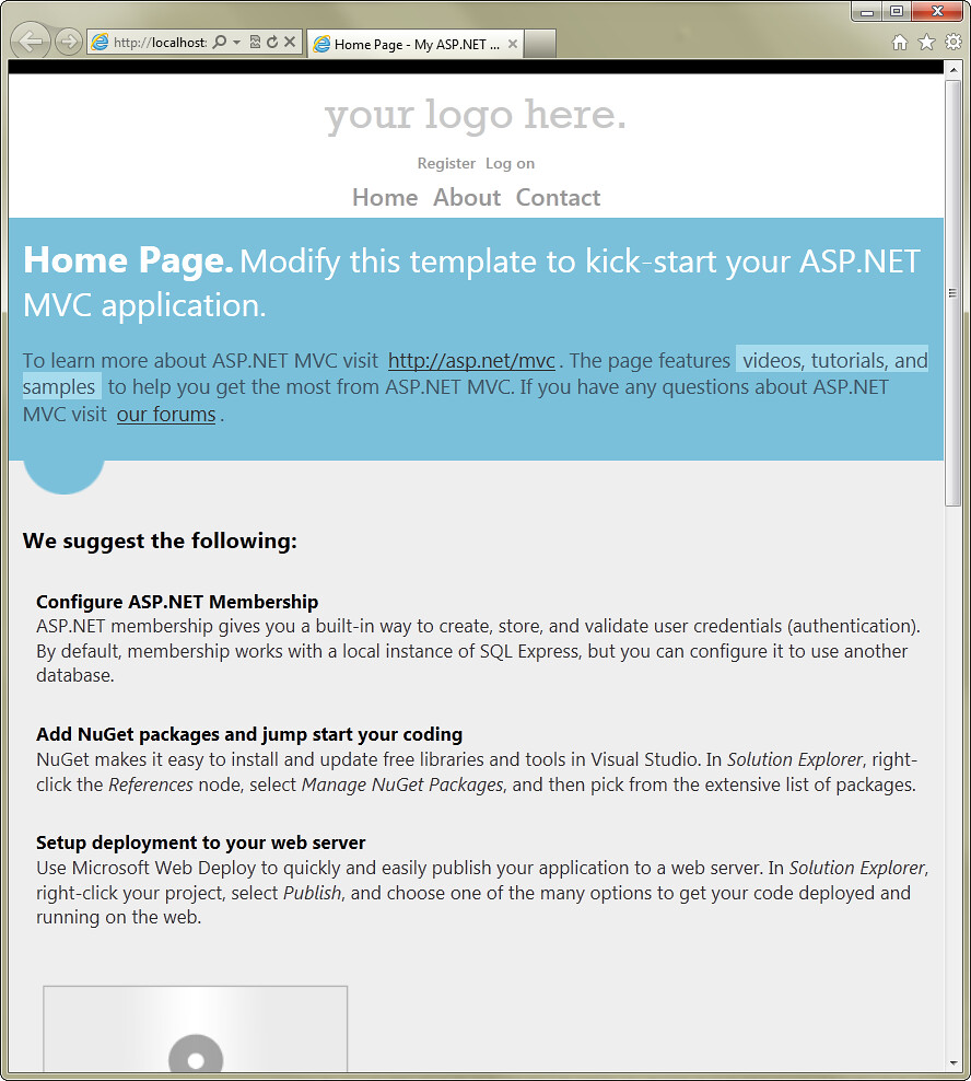
The ASP.NET MVC 4 Default Template: Updated design
There's a completely new design here. It's still relatively simple, but it actually looks like a web page you might see on the public internet.

The obvious - new colors and fonts
This design actually looks like an actual web designer was involved, which is nice. The fonts have improved, too. For example, the preferred body font has changed from Trubuchet MS to Segoe UI.
Look, Mom! Three columns!
I'm personally happy to see some columns in the default template without using a grid system or a table (a.k.a yesteryear's grid system). While you may immediately remove this page most of the time, I'm glad that folks can see a nice, clean implementation of columnar layout.
Hmm... images?
The previous templates have always been CSS-only designs with no images, and I was a little surprised to see images in this default template. I talked to Matthew Osborn, an ASP.NET team member who worked on this new design, at the BUILD conference in September. He told me that the tradeoff there was that doing anything fancy with the CSS - such as creating the numbered bullets using border-radius - would have resulted in CSS that wasn't very reusable. On the other hand, the images are easily removable or replaceable. After talking to him a bit, this makes good sense to me.
Adaptive Rendering using CSS Media Queries
While the new visual design is welcome and interesting, it'll probably get replaced in most real applications. The really interesting bit here is the adaptive rendering. To see how what that means, think about how the ASP.NET MVC 3 (and below) default templates look in a mobile browser (or in this case, the Windows Phone Emulator).
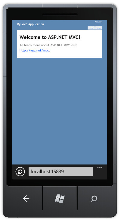
The design's clearly not optimized for a mobile device, and zooming in so you can read the tiny print doesn't help that much since the text doesn't reflow.
Let's take a look at the ASP.NET MVC 4 default template in a mobile browser:
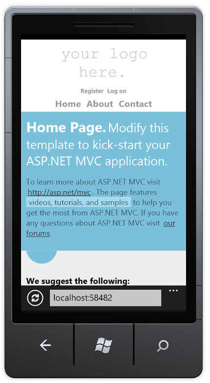
What's immediately obvious is that this page is intelligently scaled to the screen size of the mobile device. Rather than just scaling the page down (shrinking text and all), the page is redrawn so that it's usable at in the device's dimensions.
What might not be immediately obvious is that the page layout actually changes subtly at this smaller size to optimize for the new dimensions. Some examples from the header area:
- The logo is aligned left in the desktop view, centered in the mobile view
- The registration / login links are aligned to the top right in the desktop view, and are both centered and dropped below the logo
- The Home / About / Contact links are aligned
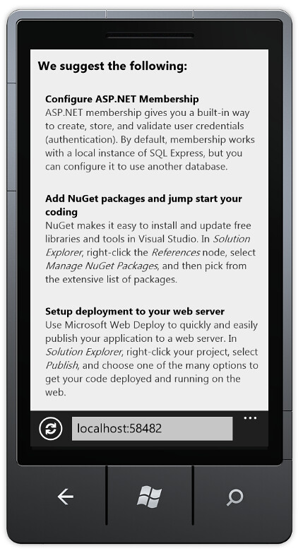
Scrolling down further, you can see the other simplifications to the mobile view to tighten it up and maximize the screen real estate.
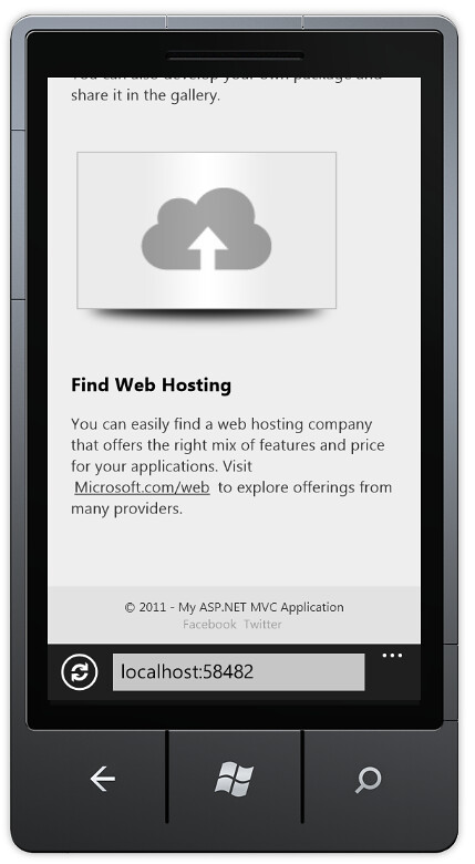
While the changes are subtle, they make a difference. Examples:
- The round bullet icons in the "We suggest the following" list are removed in the mobile view
- The footer is centered, and the Facebook / Twitter logos are replaced by small text
Adaptive Rendering
These templates are using what's known as adaptive rendering to automatically scale the page depending on page width.
Note that I didn't say that the application is scaling the page by guessing if the user's on a mobile device based on headers or other clues. That's known as browser sniffing, and it's generally frowned - it's error prone, and when you guess wrong you irritate your users. Instead, this page is making use of two commonly supported browser features, the viewport meta tag and the use of CSS media queries.
The Viewport Meta Tag
The majority of web pages have been created without any thought to how they'll appear in smaller form factors, and mobile browsers have long struggled with guessing how best to display them. Designs which are primarily focused on semantically structured textual content can be reformatted to make the text readable, but sites with rigid (brittle?) visually oriented designs don't reformat well at all and need to be handled with zooming and panning.
Since the majority of websites weren't designed to scale well, when mobile browsers have to guess how to render your page they'll generally fail safe and go with the zoom and pan style rendering. The solution to this problem is to use to tell the browser what your design dimensions are, so it doesn't have to guess.
Often, Viewport tags are only used in pages which are specifically designed for small form factors, based on browser sniffing or user selection (see the mobile section of my post on about the Microsoft PDC 2008 site for an example). In this case, you'd see a Viewport tag that looks something like this:
<meta name="viewport" content="width=320">
This works for mobile-specific views, but doesn't adapt to larger sizes well.
A better solution is to design your CSS to scale well at all sizes (more on that in a second), then tell the browser that the Viewport is whatever the device supports. Fortunately, that's pretty easy:
<meta name="viewport" content="width=device-width">
Notes for further study on Viewport:
- Jorge Peraza (on the IE Mobile Team) has a really good blog post with lots of screenshots demonstrating how the Viewport tag works.
- Joe Marini (also on the IE Mobile Team) wrote a really interesting blog post detailing the evolution from the HandheldFriendly meta tag (Palm, AvantGo) to the MobileOptimized meta tag (PocketPC) to the current Viewport tag, explaining how it's improved along the way and explaining the different Viewport properties which are commonly accepted. Honest, I'm not getting any kickbacks from the IE Mobile Team blog, I just found their posts really well written.
- The Safari Developer Library has a very thorough article on Viewport, including an excellent introductory section titled What is the Viewport?.
- While the Viewport Meta Tag isn't an official standard (yet), it's definitely an industry wide de-facto standard, supported on all modern mobile browsers.
Adaptive styles using CSS Media Queries
Okay, we've told browsers that our page will look brilliant when scaled to the current device's screen dimensions. That's a bold claim - how will we follow through on that promise? The answer here is CSS Media Queries.
CSS Media Queries allow you to target CSS rules at particular media (display) features. From the W3C spec (er... candidate recommendation):
HTML4 and CSS2 currently support media-dependent style sheets tailored for different media types. For example, a document may use sans-serif fonts when displayed on a screen and serif fonts when printed. ‘
screen’ and ‘A media query consists of a media type and zero or more expressions that check for the conditions of particular media features. Among the media features that can be used in media queries are ‘
width’, ‘height’, and ‘color’. By using media queries, presentations can be tailored to a specific range of output devices without changing the content itself.
TL;DR summary: whereas with CSS2 you could use target media types like screen and print, with media queries you can target a screen display with a certain min or max width.
Remembering that CSS rules are evaluated from top to bottom, this means that we can apply general rules at the top of our CSS file and override them with rules specific to smaller displays later in our CSS, surrounded by a media query so they won't be applied by browsers in larger form-factor displays.
In the following very simple example, the background will be blue on displays wider than 850px and red on displays narrower than 850px.
body {background-color:blue;}
@media only screen and (max-width: 850px) {
    body {background-color:red;}
}
That's exactly how the CSS in the default ASP.NET MVC 4 template works: general rules followed by mobile form-factor rules guarded by an 850px max-width media query.
If you've been paying attention, you'll have guessed that we can test this out just by resizing a desktop browser narrower than 850px, and that guess would be correct:
If you've got ASP.NET MVC 4 Developer Preview installed (and I think you should) you can easily test this out: create a new project, run it, and resize the browser.
Notes for further study on CSS Media Queries:
- If you think specs are awesome, you'll love candidate recommendations. Here's the W3C Candidate Recommendation for CSS Media Queries.
- PPK (over at quirksmode.org) has a nice post that ties together Viewports and CSS Media Queries pretty well.
How does this new template help me create mobile-ready web applications?
As I pointed out earlier, the ASP.NET team knows that you'll be largely replacing this design with one that works for your specific application. Hopefully this design is closer to something that you might use, but I'm guessing that your logo will not be "your logo here."
I see this new design helping in two ways:
- It provides a workable starting point
- It shows some examples that you can hopefully leverage and extend
A workable starting point
Starting with a completely empty page when you begin an application wastes your time in many cases. Rather than focusing on the needs of your application, you're stuck with trivia like setting up some standard CSS resets (clearing HTML and body padding, setting some standard float rules, etc.), resetting link styles, picking some halfway decent fonts and looking up the viewport and media query cheat codes you need to scale the page properly. This is a diversion from solving the problem that caused you to hit File/New to begin with.
Instead, this template will (hopefully) let you get started with a workable design and layout, focus on your business problem, and focus on the design when it makes sense for you.
If you want to start with an empty slate, you can either use the Empty project template (described in the previous post) to start with a minimal project, or you can quickly delete images and styles that you don't need.
Examples
This sample layout, while pretty simple, solves a lot of problems developers are forever fighting:
- Headers with left and right alignment
- Handling multiple columns (without resorting to tables or grid systems)
- Setting style rules that effectively handle differing browser resolutions
So the next time a developer tells me that columns are too hard in HTML and CSS or that it's too much work to set up a layout that adapts to small screen sizes, I'll tell them to open up a new ASP.NET MVC 4 application and take a look.
That wraps up Part 2 of our ASP.NET MVC 4 overview looking at improvements to the default template for adaptive rendering. In Part 3, we'll take a look at using Display Modes to customize output based on server-side logic.