An, Er, ‘Interesting’ Visual Studio 2012 Colour Theme

After confronting the pathetic, grayed-out appearance of Visual Studio 2012 RTM for a few hours, I craved my relaxing VS2010 themes. I recalled Matthew Johnson’s excellent Visual Studio Color Theme Editor and wondered if it might install on VS2012. No go.

While probing inside his VS Studio Extension (.vsix is actually a .zip), I found a manifest file.

Could it be that simple to change the SupportedProducts node to

<VisualStudio Version="11.0">

and the versioning to

<SupportedFrameworkRuntimeEdition MinVersion="4.0" MaxVersion="4.5" />

?

To my surprise, the package installed with those changes!

However, my elation was short-lived and turned to horror. Microsoft’s UX team is double-over in hysterics right now knowing that they got me real good.

I can hear them chortling, “You don’t like our ‘Light’ theme? Then try our colour palette you ignorant b#$^%!”

When I selected the ‘Windows Aero’ theme from the freshly mixed case Theme menu, the resulting screen reminded me of a psychedelic Swedish underground movie from the seventies. If you’ve never seen what an IDE looks like in dayglow and blacklight, here it is. Not sure I can work with this either.
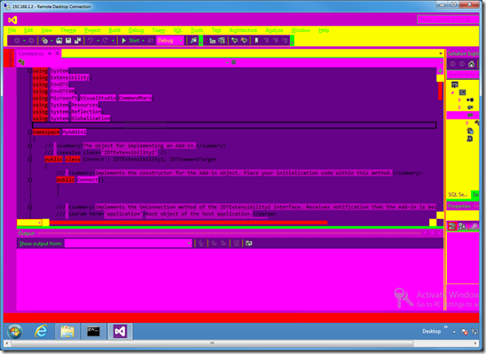
 

vs2012

6 Comments

  • Don't hate it because its new and different, the fine UX people have put many effort into creating this unique experience for you. I bet you complain they removed the start button as well! Just give it some time, it will grow on you.

  • "...Just give it some time, it will grow on you.", so will OS X!

  • Given enough time, mold will grow on you too.

  • Hi Ken,

    I find it helps if you paint your walls pure black or white, and purchase an old black and white television - or at least turn the color on your TV right down.

    If you have any pictures in your house replace them with monochrome ones.

    After you make these changes the new Visual Studio 2012 does fit better into your life.

    In all seriousness - yeah it is nasty isn't it. I will work with it, and I am sure it will grow slightly on me, but overall it is a pain.

    What I don't get is that with Windows 8 and the Metro start screen.....at least that is in lots of color and
    'happy'.

    I do get the idea that the controls are secondary to your code...but I just find it harder to see the right buttons to click now.

  • At least you got rid of the CAPS menu

  • Well... I did complain because they moved the start menu also... me and a lot of others. :D I mean, why should I have to change screens to start a program in a desktop environment.

    I like the gray theme better than the purple theme, but in general I'm kind of tired of change for the sake of change. VS2012 doesn't really do anything additional for me (personally) other than run slower than the previous version.

Comments have been disabled for this content.