Animated Silverlight Panel on top of Html
As promised, here's my article from the "Silverlight: write and win" competition.
A live example of the finished outcome can be viewed here: http://olakarlsson.com/SL2Beta2FlyoutDemo/SL2Beta2FlyoutDemoTestPage.aspx and the source can be downloaded from http://olakarlsson.com/downloads.aspx
Overview
In this article we’ll be looking at the concept of adding interactive Silverlight elements to existing Web pages to provide added rich features. We’ll be looking at creating an animated Silverlight panel which will slide in from the side of the browser window when a button is clicked.
The somewhat tricky bit is that we want the panel to lie on
top on the normal HTML content of the page and when when the
Silverlight UI is slid out we want to be able to interact
with the HTML instead.
Why did I decide on this topic:
Working as an asp.net developer and having a keen interest for web development in general, I find this way of using Silverlight quite interesting but I have also found that it is not covered very much on the web at the moment.
Concepts and tools we’re using
Tools
- Visual Studio 2008 with the Silverlight 2 Beta 2 tools installed
- Blend 2.5 June Preview
- C#
Concepts
- Visual State Manager
- Silverlight/Managed Code - DOM/JavaScript interaction
- XHTML/CSS
- Controlling the SL Plugin
First there was creation
First thing's first, open Visual Studio and create a new Silverlight 2 project/solution to get the full structure including a asp.net test project.
I created a new .Net 3.5, C#, Silverlight project and chose to add a Web Application project to test my Silverlight UI in.
(I only chose “Web Application” because that’s what I’m used to working with, you could as easily use a “Web Site” project.)
Once the IDE has finished loading our new solution, we want to open the page.xaml file in Blend, so we can create the Silverlight UI interface.
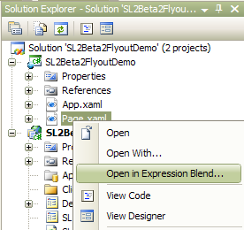
Blending it up
In Blend, we now create our Silverlight interface.
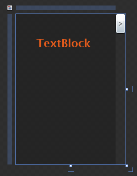
For this demo I will simply use the default LayoutRoot grid and change the size to 200×300. However to create the effect we want, we then set the size of the usercontrol to 220×300.
Next drag on a button which we give a size of 20×40, then drag the button into position just outside the upper right corner of the grid. This is probably not the most elegant layout solution but as this article is about browser interaction and animating with Visual State Manager and not about advanced XAML layout, it’s good enough.
As a bit of a nice touch, we’ll make the background a dark semi transparent colour so that one implemented we’ll still be able to see a hint of the HTML content underneath it. To finish our UI, we also drag on a TextBlock, I then gave the controls the amazingly colourful names of “myText” and “myButton”. I also changed the foreground colour and font properties for the TextBlock so it will stand out a bit. This gave me the following:
<UserControl x:Class="SL2Beta2FlyoutDemo.Page"
xmlns="http://schemas.microsoft.com/winfx/2006/xaml/presentation
xmlns:x="http://schemas.microsoft.com/winfx/2006/xaml
Width="220" Height="300"
xmlns:vsm="clr-namespace:System.Windows;assembly=System.Windows">
<Grid x:Name="LayoutRoot" Background="#35000000" RenderTransformOrigin="0.5,0.5" Width="200" HorizontalAlignment="Left">
<TextBlock Height="35" HorizontalAlignment="Stretch"
Margin="41,42,45,0" VerticalAlignment="Top" FontSize="22"
Foreground="#FFE25B1C" Text="TextBlock" TextWrapping="Wrap"
x:Name="myText" FontWeight="Bold" /><Button HorizontalAlignment="Right" Margin="0,-1,-20,0"
VerticalAlignment="Top" Content=">" Click="myButton_Click" x:Name="myButton"
Width="20" Height="40"/>
</Grid>
</UserControl>
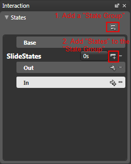
Next we move on to use the new Visual State Manager to create our slide out, slide in effect. The Visual State Manger (VSM) is located in the upper left corner and lets us define visual “states” for our UI elements and group these states into “State Groups”. For our UI I defined a State Group called SlideStates and then added two States name Out and In, to it. Note that in VSM there is always a Base State which defines the default state/view in addition to any states you create.
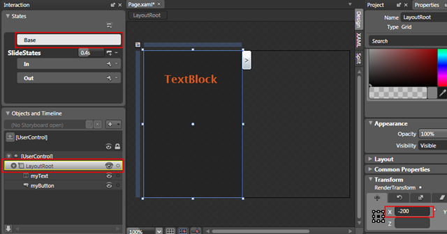
Our next step is to define the base state of our UI, in our case we want create an effect where the UI comes sliding in from the side.
To accomplish this we first select the Base state, then we make sure the correct element is selected (the LayoutRoot grid) and finally we make any necessary adjustments. Since our UI is to slide in from out of view, it needs to start outside the screen, hence we set the x value for the LayoutRoot grid to a minus of its own width (in this case -200). This will set the main section of our UI off the screen but leaves the button on screen.
Next we move on to defining our own states, as the Out state in fact will be the same as the Base state we don’t actually need to make any changes to it.
In the case of the “In” state however, we want the UI to be on screen. As per when we set up the base state, we select the state, then the element and finally make any adjustments. In this case, to bring the LayoutRoot grid back onto the screen we simply set the X value back to 0.

We can now preview the behaviour by clicking on out different states and seeing what happens. However if we were to run this as it currently is, the transition between the states would be pretty much nonexistent, so to get a nice animated transition between the states we use the “Transition Duration” in VSM, here I’ve set it to 0.4 of a second, meaning that, 0.4sec is the time it will take to transition from one state to another.
We could also add more specific transitions of we wanted by using the Add Transition buttons, however for our simply demo, the Default Transition setting works perfectly fine.

Back to where we started (in VS2008)
With those final adjustments in Blend, it’s now time to go back to Visual Studio (VS), so make sure you have saved the changes and go back into VS, when asked if you want to reload the XAML, answer yes. NOTE: When the design surface in VS loads it will display and error message and won’t show the UI we created in Blend, this is a known bug and the good news is that the project will actually still build and when it’s run in the browser it should work fine.
So we now move from the world of XAML into the world of HTML, CSS and JavaScript. For this demo, I’m using the automatically created test page SL2Beta2FlyoutDemoTestPage.aspx, first step is to get the Silverlight plugin on top of the HTML. And to accomplish this we need to edit the default setup somewhat.
We’ll do it in a few steps:
1. To start with I’ve changed the size of the plugin, building a full Silverlight app the size of the Silverlight plugin is usually set to 100% width and height, however if we want to use it together with the HTML, we need to change it to match the actual size of your XAML/Silverlight element. We will also revisit these setting later when creating our slide in, slide out effect. This gives us the following:
<asp:Silverlight ID="Xaml1" runat="server"
Source="~/ClientBin/SL2Beta2FlyoutDemo.xap"
MinimumVersion="2.0.30523" Width="220" Height="300" />
2. Next we add another <div> tag with some HTML content, just after the div that holds the Silverlight plugin. (I’ve also set the background of the page to a gray colour so we can see better what’s happening with our Silverlight plugin).
<body style='height:100%;margin:0;background-color:#CCCCCC'>
<form id="form1" runat="server" style='height:100%;'>
<asp:ScriptManager ID="ScriptManager1" runat="server"></asp:ScriptManager>
<div id="SLDiv" >
<asp:Silverlight ID="Xaml1" runat="server"
Source="~/ClientBin/SL2Beta2FlyoutDemo.xap"
MinimumVersion="2.0.30523" Width="220" Height="300" />
</div>
<div id="contentDiv" >
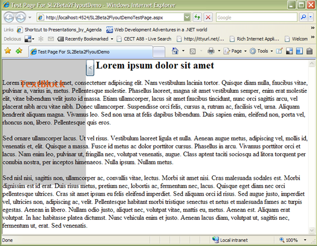
<h2 style='text-align:center;'>Lorem ipsum dolor sit amet</h2>
<p>Lorem ipsum dolor sit amet, consectetuer adipiscing elit. Nam vestibulum lacinia tortor eros.</p>
<p>Sed ornare ullamcorper lacus. Ut vel risus. Vestibulum laoreet ligula et, per inceptos himenaeos. Nulla ipsum. Nullam metus. </p>
<p>Sed nisl nisi, sagittis non, ullamcorper ac, . Aliquam erat volutpat. In hac habitasse platea dictumst. Nunc vehicula enim et justo. </p>
</div>
</form>
</body>
All this will do however is to add some Content text on the page after our Silverlight plugin. You can note thought that we now can see the first part of our UI on the page!
3. To actually get the Silverlight area on top of the other content we turn to the power of CSS, and make the following changes:
<div id="SLDiv" style='position:absolute; left:0; top:0; z-index:2;'>
<div id="contentDiv" style='position:absolute; top:0; left:0; z-index:1;'>
Basically, we’re using CSS to lock the two divs in absolute positions and then we use the z-index attribute to layer them on top of each other (higher number = higher up in the stack). These changes give us quite a different result, where the Silverlight plugin is layered on top of our HTML content.
Now some of you might be saying, “Hey, what happened the
transparency we set back in Blend?”
Well, what we did
in Blend was that we set the XAML to be semi transparent,
but to get the actual plugin transparent there’s a couple of
things we need to change in how we set up the plugin on our
page. Namely we need to add the two new parameters,
Windowless and PluginBackground to the Silverlight control:
<asp:Silverlight ID="Xaml1" runat="server"
Source="~/ClientBin/SL2Beta2FlyoutDemo.xap"
MinimumVersion="2.0.30523" Width="220" Height="300"
Windowless="true" PluginBackground="Transparent" />
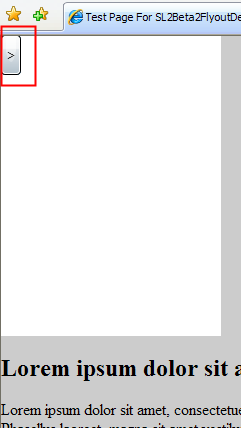
If we now run our page again, you should find that the Silverlight plugin area is no longer visible, so where’s our UI? Well all is as it should, as you might recall, the base state for our XAML UI is actually to start off page, hence we can’t see it!
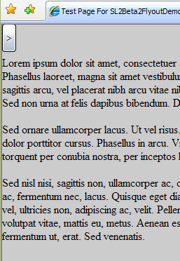
However, to make things a bit easier for ourselves while working with the plugin, we’ll change the PluginBackground to Black for now, so we can see the plugin area.
But I want to see the rest of my XAML UI
Ok fair enough, this is all very exciting but I’m sure by
now most of you want to see if this actually works?!
Well lets get coding! So to prove to you that
this actually works, we’ll go over to VS and open up the
code behind file for our XAML file “Page.xaml.cs”. Just as a
quick test we make the following change to the Page method:
public Page()
{
InitializeComponent();
VisualStateManager.GoToState(this, "In", true);
}
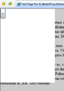
All this does is that it tells the VSM, that our current control (this) should go to the state “In”, the final boolean value decides whether a transition should be used. If you now go ahead and compile the solution and run the page, you should see our XAML UI slide in from the left hand side in all its glory! (Minus the transparency of course but we’ll get back to that later)

So how do we control this? We don’t want it coming in when the page loads! Well head back into code land.
Take control
Step one of taking control of our animated UI is to create a
new event handler for out button, open the XAML view of
Page.xaml, in the tag for the button, add a Click event:
Next right click on the new event and select “Navigate to Event Handler”, this will take us into the code behind file straight to the newly created event handler. Once there, simply move the line for the VSM interaction from the Page method into the new event handler. In the code behind make the changes to make it look like the following code:
public partial class Page : UserControl
{
String state;public Page()
{
InitializeComponent();
state = "out";
}private void myButton_Click(object sender, RoutedEventArgs e)
{
if (state == "out")
{
VisualStateManager.GoToState(this, "In", true);
state = "in";
myButton.Content = "<";
}
else
{
VisualStateManager.GoToState(this, "Out", true);
state = "out";
myButton.Content = ">";
}
}
}
Basically we’ve set up a variable to hold the current state of the control, then we’re using the Click event handler to slide the UI in or out based on the value in out variable. Just as an extra touch I also change the content (text) of the button to reflect which direction it will go when clicked.
So if we now set the PluginBackground to Transparent, we’re done right?!
We’ll, almost, the problem we’ll run into with our project that way it is currently. Is pretty plain to see while we don’t have the PluginBackground set to Transparent, as the Silverlight plugin is layered on top of our HTML, it stops us from interacting with the HTML below. Setting the PluginBackground will let us see what’s underneath, but as I’ve been pointing out to people when discussing these kind of implementations, just because you can see it doesn’t mean you can click it!
So how do we solve this problem? In steps JavaScript to save the day!
Two worlds come together
To solve this issue, we’ll use JavaScript to change the size of the Silverlight plugin container.
First we need to make a couple of adjustments to the Silverlight plugin tag, we’re adding a OnPluginLoaded event which I’ve set up to call the JavaScript function “PluginLoaded”. That function will be used to get a JavaScript reference to the Silverlight plugin object.
We also set the width of the plugin to 20(the width of our button), this so that our button appears but the rest of the Silverlight area isn’t hindering us from interacting with the HTML. As we’re not changing the height there will be a narrow strip left but if we really wanted to we’d just change that as well.

Next we go into our Page.xaml.cs file and add a "using
System.Windows.Browser; " then modify our Click event
handler to what's shown below.
Then once we have
the System.Windows.Browser using statement in place, we can
use HTMLPage.Window to get a reference to the browser window
and thereby interact with it from our managed code!
CreateInstance, simple calls and executes the JavaScript
methods defined.
private void myButton_Click(object sender, RoutedEventArgs e)
{
if (state == "out")
{
VisualStateManager.GoToState(this, "In", true);
HtmlPage.Window.CreateInstance("GrowHorisontal");
state = "in";
myButton.Content = "<";
}
else
{
VisualStateManager.GoToState(this, "Out", true);
state = "out";
myButton.Content = ">";
HtmlPage.Window.CreateInstance("DelayedShrink");
}
}
Next step is to add the necessary JavaScript functions to the header section of out aspx page:
<head runat="server">
<script type="text/javascript">
var slCtl = null;
function pluginLoaded(sender)
{ // Get a refernce to the Silverlight plugin when the page loads
slCtl = sender.get_element();
}function GrowHorisontal()
{
//Grow the width
slCtl.style.width='220px';
}function DelayedShrink()
{
//Delay the call to the actual shrink function to let the animation finish before shrinking the area
setTimeout(ShrinkHorisontal, 500);
}function ShrinkHorisontal()
{ //Shrink the area
slCtl.style.width='20px';
}
</script>
<title>Test Page For SL2Beta2FlyoutDemo</title>
</head>
Pheew, well the good news is, we’re almost done!
The only real thing that remains is to set the
PluginBackground to Transparent and we’re done, if you’ve
made it this far, give yourself a pat on the shoulder from
me, well done for sticking with it.
The final thing I did was to set the background colour of the HTML body back to white to better see the Silverlight UI.
Conclusion
Using the new Visual Sate Manger we were able to very easily
create a animated Silverlight and using JavaScript and CSS
we dynamically slid the Silverlight on top of the HTML
without hindering interaction with the HTML.
References: