Demystifying the Windows 8 Grid Application
If you’re looking to “re-imagine” your apps on the Windows 8 platform in Metro style you can start with the Grid Application template that’s provided in the Visual Studio 2011 preview.
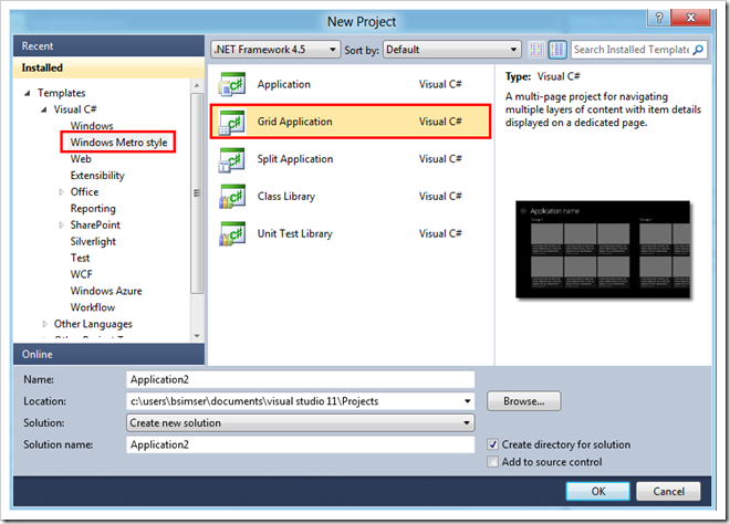
From Visual Studio choose New Project and select Grid Application under Windows Metro Style in the template tree:
When you start you’ll get a fully blown Windows 8 Metro application, ready to begin filling in with your own content.
How did all that stuff get there and where does it go?
First open up the Sample Data folder in the solution. In there you’ll find a file called SampleDataSource.cs. This contains some sample data to work with and is bound to the Xaml pages in the solution at runtime. You’ll of course replace this with runtime data but the sample helps you visualize your app along with understanding where stuff goes on the screen.
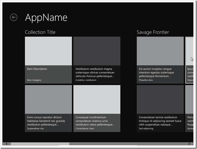
Or does it? The default app is all in Lorem Ipsum speak and while this is great for visualizing a fully populated application, I thought it was a little confusing to know how it fit together. To make it clearer where everything goes I’ve modified the first collection and item in the SampleDataSource.cs calls with more descriptive labels. Here’s a better picture of the GroupedCollectionPage.xaml, the “Home” page in the app:
Note the collection title appears above the group but only the description and category for the item appears for each item. So if you’re relying on users finding things by the item title (maybe it’s the title of a recipe or a newsfeed) then you might want to modify the layout for this to bind the title somewhere. You can get creative for example and overlay the title on top of the image.
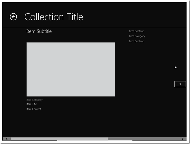
And here’s the DetailPage.xaml, what you see when the users clicks on a single item in the collection:
The Collection Title is the prominent title here but it does show the Item Subtitle. Again this might not be the desired location for titles. For example the Item Title is a small item below the image and category. Personally I would swap out the Item Title and Item Subtitle here or even use the Item Title in place of the Collection Title and leave the Item Subtitle alone (removing the Item Title below the image).
There may be some Metro guidelines coming out to help understand the reasoning behind this positioning and maybe my brain isn’t thinking “Metro” just yet, but it doesn’t make a lot of sense to me the way the default locations are.
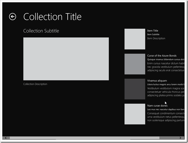
And here’s the CollectionSummaryPage.xaml, you would navigate to this if you clicked on the Back Arrow in the screen above (next to Collection Title).
Interesting to note with this is that the Collection Content isn’t used here, only the Collection Description. I would probably modify this to include the content or drop that property entirely and just use the description.
You don’t necessarily need to follow all of the structures the default Grid Application layout offers but do keep true to the Metro style and keep things consistent. I urge you strongly to watch Jensen Harris’ keynote on the 8 traits of a Metro app and realize that by using the default setup they give you, you’ll achieve a consistent look to your app that will fit harmoniously within the Windows 8 operating system.
Make more sense now?
Enjoy.


