Adopting the Metro Style for Line of Business Apps
Here are some thoughts around adoption the new Metro style look and feel for line of business applications (LOB) in your organization.
I am not a UX expert (is anyone?) but I think I know what looks and feels right and I strive to try to include that in every solution I build. Metro introduces us to some new concepts and as Jensen Harris pointed out, it isn’t just recompiling your app on WinRT. You have to re-imagine it and think about how it’s organized, how users will interact with it, and do some trimming of the fat so to speak as you move into the Metro world.
Good design practices still apply here. Appropriate use of whitespace, good layout, clear typography, and consistent UI patterns make a big difference so remember these and use them. A UI checklist might be in order for any app, not just Metro ones. I’ll state this from my experience. Very few business users know what they need and most can’t visualize past what they already have. Know this and learn to adapt from this perspective and I think you’ll go farther with the success factor with your users. Far too many times users are stuck with what they have, perhaps a spreadsheet-like application (where the one and only screen is 8000 rows of data and 300 columns). Anything you present to them, no matter how effective, is just shadowed by that grid in their mind.
I’m a strong advocate of the task oriented UI and think it works. Try to keep this in mind when designing the system and don’t let your user try to do 80 things at once on the same screen. You’ll just run around like a chicken with your head cut off trying to cater to everyone and in the end deliver a mediocre product that works for all cases rather than separate UX instances that are stellar for each situation.
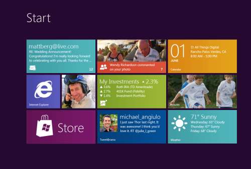
Metro is different. It forces you to think about your application in a different manner. No longer are you trying to get tree view feeding items into list view feeding details into file view. There are still groups and collection of groups and all that but remember your UI now is a functional, breathing, living thing. Minimalism is best here so you want to get out as much information in as effective space as possible. As Microsoft pointed out, a live tile isn’t something you should be posting every detail to. It’s an extension of the application so treat it as a first class citizen, not a UI element that needs to be pretty.
Lists should contain just the right amount of information. Again, go back to your users and push them. Try not to take the route of “What do you need” but rather provide them with a solution that accomplishes the goal they’re aiming for (of course that means you need to establish a goal first). If they’re coming from a giant screen of data saying “We need *this*” then push them to answer what they use it for. What goal are they trying to accomplish? Are they trying to summarize information or are they looking for something (e.g. show me all the users with more than 10GB of storage). If they have a goal, key in on it and that might become the basis of a UI workflow.
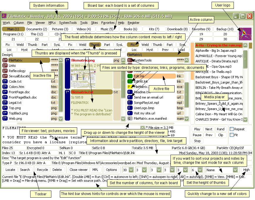
Again keep the focus on the goal. You don’t want this thing to get out of hand or you’ll end up with a Frankenstein monster of a UI like this:
Take them by the hand and show them. Lead by example and show them what is possible. Giving them design documents might not be enough and don’t describe things like “Imagine this window over here with a list of things…”. You’ll probably be met with the deer in the headlight look. You might be thinking that Metro isn’t right for this app and perhaps you’re right. Don’t assume that you *have* to build a new UI in Metro just because it’s there. Photoshop isn’t going to be a Metro app (ever, at least I hope) but your LOB app might. You need to be sure you’re doing the right thing and don’t try to fit a square peg into a non-existent hole. LOB apps *can* be great looking and useful. I highly recommend you check out Billy Hollis’ screencast he did on LOB apps with WPF. While it’s not Metro, it does show that LOB apps can be great looking and functional. A lot of great tips from Billys talk.
Build something. Even if you sit with them in a whiteboard session and draw pictures on the screen it’ll help. Build up the UI using something like Basalmiq is great and easy for them to see quickly. Visio is just too mechanical to fiddle around with and your users will quickly loose interest. Rapid feedback wins over here but then take that back to the development environment and build it. The next day show them it in action on the real website or desktop you’re building it for.
There’s a danger here that I’ve seen of the “It’s done” syndrome. Users will see a mock-up in a website and think that all the work is done. It isn’t so temper your system with that and read your users. Find out if they really believe it’s just some if/then/else statements you have to do to make it work. I would opt to not call this “prototype” or “mockup”. I prefer to call it the working software. It’s what they’ll use in the production release and it’ll just evolve as they provide feedback, new elements are added, and parts of the system become functionally complete.
Look for some re-imaging of “Classic” apps into Metro ones soon as I’m planning on doing a few blog posts about this.
Many thanks to @colinbowern for some great tips on Twitter.