Silverlight 4 Container Control
Today I went looking for a simple skinable container control that I could use in Silverlight 4. I of course checked the framework first, and didn’t find exactly what I was looking for. I then checked the Silverlight Toolkit for Silverlight 4, which has some really cool container controls, but again, nothing specifically like I was looking for.
My requirements weren’t complicated or lengthy:
- Colorable Header
- Header Text Area controllable outside the control
- Flexible content area, capable of hosting other XAML Controls
My first attempt lead me towards a usercontrol, with some clever dependency property binding. This method requires quite a bit of work, but I believe is the most flexible. Capable of hosting templated controls inside it, and able to host a codebehind file capable of responding to custom properties, events, or other goodies specific to the containers interactivity.
Keeping in mind, we could have rolled a fully custom control in a Silverlight Class Library for this requirement, which I’ve done often in the past to extend the framework, this isn't the solution I was looking for in this simple circumstance.
The basic usercontrol gets something something like this. Pretty thin, but thats just the way I like it. no clutter to get in the way of what we are trying to accomplish.
<
Grid x:Name="LayoutRoot" Background="White"> <Grid.RowDefinitions> <RowDefinition Height="40" /> <RowDefinition Height="*" /> </Grid.RowDefinitions> <Border HorizontalAlignment="Stretch" VerticalAlignment="Stretch" CornerRadius="4,4,0,0" BorderThickness="1,1,1,0" BorderBrush="Gray"> <TextBlock Text="Header" Margin="10,0,0,0" Width="Auto" VerticalAlignment="Center" /> </Border> <Border Grid.Row="1" HorizontalAlignment="Stretch" VerticalAlignment="Stretch" BorderThickness="1,0,1,1" BorderBrush="Gray"> <ContentPresenter /> </Border> </Grid>With a few clever dependency properties, and a little binding magic, we enable some “Container Like” functionality.
public static readonly DependencyProperty HeaderTextProperty = DependencyProperty.Register("HeaderText", typeof(string), typeof(Container), null); public string HeaderText{
get { return (string)GetValue(HeaderTextProperty); } set { SetValue(HeaderTextProperty, value); }}
public static readonly DependencyProperty HeaderColorProperty = DependencyProperty.Register("HeaderColor", typeof(object), typeof(Container), null); public object HeaderColor{
get { return (object)GetValue(HeaderColorProperty); } set { SetValue(HeaderColorProperty, value); }}
public static readonly DependencyProperty ContentAreaProperty = DependencyProperty.Register("ContentArea", typeof(object), typeof(Container), null); public object ContentArea{
get { return (object)GetValue(ContentAreaProperty); } set { SetValue(ContentAreaProperty, value); }}
public static readonly DependencyProperty BodyColorProperty = DependencyProperty.Register("BodyColor", typeof(object), typeof(Container), null); public object BodyColor{
get { return (object)GetValue(BodyColorProperty); } set { SetValue(BodyColorProperty, value); }}
These will enable some backend binding in the Usercontrol so we’ll be able to flesh out some functionality, to customize the container, from outside the usercontrol itself.
Now we need to setup some bindings inside the XAML above, so that our Layout Elements conform to the values we’d like exposed to the parent of the usercontrol.
The finished XAML inside the usercontrol looks like this:
Obviously, we could expose as many dependency properties as we’d like, and bind to them inside this control. This would expose them, as we’ll see – when we use the control later.
<Grid x:Name="LayoutRoot" Background="White"> <Grid.RowDefinitions> <RowDefinition Height="40" /> <RowDefinition Height="*" /> </Grid.RowDefinitions> <Border HorizontalAlignment="Stretch" VerticalAlignment="Stretch" CornerRadius="4,4,0,0" BorderThickness="1,1,1,0" BorderBrush="Gray" Background="{Binding HeaderColor, ElementName=userControl}"> <TextBlock Text="{Binding HeaderText, ElementName=userControl, FallbackValue='Header'}" Margin="10,0,0,0" Width="Auto" VerticalAlignment="Center" /> </Border> <Border Grid.Row="1" HorizontalAlignment="Stretch" VerticalAlignment="Stretch" BorderThickness="1,0,1,1" BorderBrush="Gray" Background="{Binding BodyColor, ElementName=userControl}"> <ContentPresenter Content="{Binding ContentArea, ElementName=userControl}" /> </Border> </Grid>Now, out on our mainpage, where we’d like to use this control, we just need to declare a namespace to point it towards the usercontrol in our project, and we’re ready to fly.
xmlns
:local="clr-namespace:CustomContainer"<
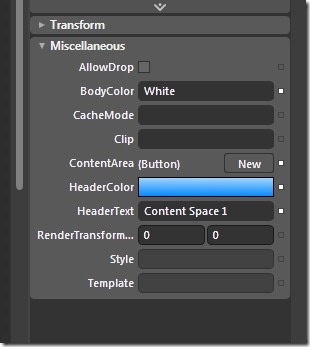
Grid x:Name="LayoutRoot" Background="White"> <local:Container BodyColor="White" HeaderText="Content Space 1"> <local:Container.HeaderColor> <LinearGradientBrush> <LinearGradientBrush.RelativeTransform> <TransformGroup> <ScaleTransform CenterY="0.5" CenterX="0.5"/> <SkewTransform CenterY="0.5" CenterX="0.5"/> <RotateTransform Angle="90" CenterY="0.5" CenterX="0.5"/> <TranslateTransform/> </TransformGroup> </LinearGradientBrush.RelativeTransform> <GradientStop Color="#FFA6D6FF" Offset="0" /> <GradientStop Color="#FF0088FF" Offset="1" /> </LinearGradientBrush> </local:Container.HeaderColor> <local:Container.ContentArea> <Button Width="100" Height="100" Content="My Button inside" /> </local:Container.ContentArea> </local:Container> </Grid>As you can see, the dependency properties we exposed, become available in the XAML, but we also get access to them in the designer.

Which is cool that Blend (And Visual Studio) will inspect the property bag and enumerate over custom dependency properties behind the scenes.
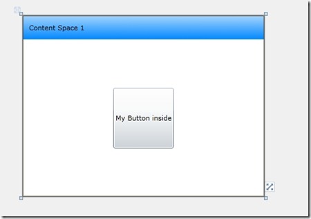
Our finished object:

Since I started writing this, I’ve also found a lightway to use the ContentControl which is provided in the Silverlight Framework. It’s harder to work with, and isn’t nearly as configurable as a usercontrol. You use TemplateBinding inside a style property (ContentControls allow you to set a template). I like this method, and it seems to work well. I can see a case for each.
Hope this makes someones day a little easier.
--Bryan