Getting Started Building Windows 8 Store Apps with XAML/C#
Technology is fun isn’t it? As soon as you think you’ve figured out where things are heading a new technology comes onto the scene, changes things up, and offers new opportunities. One of the new technologies I’ve been spending quite a bit of time with lately is Windows 8 store applications. I posted my thoughts about Windows 8 during the BUILD conference in 2011 and still feel excited about the opportunity there. Time will tell how well it ends up being accepted by consumers but I’m hopeful that it’ll take off.
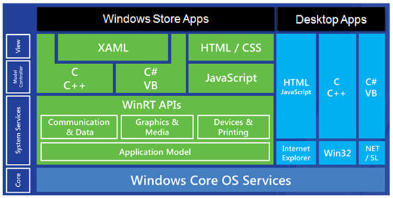
I currently have two Windows 8 store application concepts I’m working on with one being built in XAML/C# and another in HTML/JavaScript. I really like that Microsoft supports both options since it caters to a variety of developers and makes it easy to get started regardless if you’re a desktop developer or Web developer. Here’s a quick look at how the technologies are organized in Windows 8:
In this post I’ll focus on the basics of Windows 8 store XAML/C# apps by looking at features, files, and code provided by Visual Studio projects. To get started building these types of apps you’ll definitely need to have some knowledge of XAML and C#. Let’s get started by looking at the Windows 8 store project types available in Visual Studio 2012.
Windows 8 Store XAML/C# Project Types
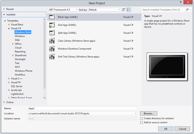
When you open Visual Studio 2012 you’ll see a new entry under C# named Windows Store. It includes 6 different project types as shown next.
The Blank App project provides initial starter code and a single page whereas the Grid App and Split App templates provide quite a bit more code as well as multiple pages for your application. The other projects available can be be used to create a class library project that runs in Windows 8 store apps, a WinRT component such as a custom control, and a unit test library project respectively.
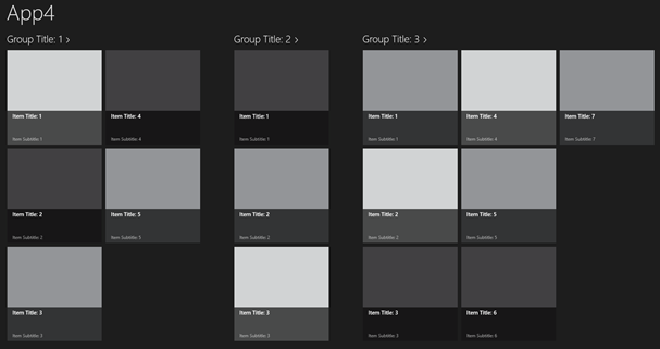
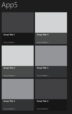
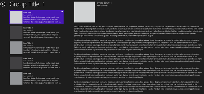
If you’re building an application that displays data in groups using the “tile” concept then the Grid App or Split App project templates are a good place to start. An example of the initial screens generated by each project is shown next:
Grid App
Split View App
When a user clicks a tile in a Grid App they can view details about the tile data. With a Split View app groups/categories are shown and when the user clicks on a group they can see a list of all the different items and then drill-down into them:
For the remainder of this post I’ll focus on functionality provided by the Blank App project since it provides a simple way to get started learning the fundamentals of building Windows 8 store apps.
Blank App Project Walkthrough
The Blank App project is a great place to start since it’s simple and lets you focus on the basics. In this post I’ll focus on what it provides you out of the box and cover additional details in future posts. Once you have the basics down you can move to the other project types if you need the functionality they provide.
The Blank App project template does exactly what it says – you get an empty project with a few starter files added to help get you going. This is a good option if you’ll be building an app that doesn’t fit into the grid layout view that you see a lot of Windows 8 store apps following (such as on the Windows 8 start screen). I ended up starting with the Blank App project template for the app I’m currently working on since I’m not displaying data/image tiles (something the Grid App project does well) or drilling down into lists of data (functionality that the Split App project provides).
The Blank App project provides images for the tiles and splash screen (you’ll definitely want to change these), a StandardStyles.xaml resource dictionary that includes a lot of helpful styles such as buttons for the AppBar (a special type of menu in Windows 8 store apps), an App.xaml file, and the app’s main page which is named MainPage.xaml. It also adds a Package.appxmanifest that is used to define functionality that your app requires, app information used in the store, plus more.
The App.xaml, App.xaml.cs and StandardStyles.xaml Files
The App.xaml file handles loading a resource dictionary named StandardStyles.xaml which has several key styles used throughout the application:
<Application
    x:Class="BlankApp.App"
    xmlns="http://schemas.microsoft.com/winfx/2006/xaml/presentation"
    xmlns:x="http://schemas.microsoft.com/winfx/2006/xaml"
    xmlns:local="using:BlankApp">

    <Application.Resources>
        <ResourceDictionary>
            <ResourceDictionary.MergedDictionaries>

                <!--
                    Styles that define common aspects of the platform look and feel
                    Required by Visual Studio project and item templates
                 -->
                <ResourceDictionary Source="Common/StandardStyles.xaml"/>
            </ResourceDictionary.MergedDictionaries>

        </ResourceDictionary>
    </Application.Resources>
</Application>
StandardStyles.xaml has style definitions for different text styles and AppBar buttons. If you scroll down toward the middle of the file you’ll see that many AppBar button styles are included such as one for an edit icon. Button styles like this can be used to quickly and easily add icons/buttons into your application without having to be an expert in design.
<Style x:Key="EditAppBarButtonStyle" TargetType="ButtonBase" BasedOn="{StaticResource AppBarButtonStyle}"> <Setter Property="AutomationProperties.AutomationId" Value="EditAppBarButton"/> <Setter Property="AutomationProperties.Name" Value="Edit"/> <Setter Property="Content" Value=""/> </Style>
Switching over to App.xaml.cs, it includes some code to help get you started. An OnLaunched() method is added to handle creating a Frame that child pages such as MainPage.xaml can be loaded into. The Frame has the same overall purpose as the one found in WPF and Silverlight applications - it’s used to navigate between pages in an application.
/// <summary>
/// Invoked when the application is launched normally by the end user.  Other entry points
/// will be used when the application is launched to open a specific file, to display
/// search results, and so forth.
/// </summary>
/// <param name="args">Details about the launch request and process.</param>
protected override void OnLaunched(LaunchActivatedEventArgs args)
{
    Frame rootFrame = Window.Current.Content as Frame;

    // Do not repeat app initialization when the Window already has content,
    // just ensure that the window is active
    if (rootFrame == null)
    {
        // Create a Frame to act as the navigation context and navigate to the first page
        rootFrame = new Frame();

        if (args.PreviousExecutionState == ApplicationExecutionState.Terminated)
        {
            //TODO: Load state from previously suspended application
        }

        // Place the frame in the current Window
        Window.Current.Content = rootFrame;
    }

    if (rootFrame.Content == null)
    {
        // When the navigation stack isn't restored navigate to the first page,
        // configuring the new page by passing required information as a navigation
        // parameter
        if (!rootFrame.Navigate(typeof(MainPage), args.Arguments))
        {
            throw new Exception("Failed to create initial page");
        }
    }
    // Ensure the current window is active
    Window.Current.Activate();
}
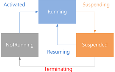
Notice that in addition to creating a Frame the code also checks to see if the app was previously terminated so that you can load any state/data that the user may need when the app is launched again. If you’re new to the lifecycle of Windows 8 store apps the following image shows how an app can be running, suspended, and terminated.
If the user switches from an app they’re running the app will be suspended in memory. The app may stay suspended or may be terminated depending on how much memory the OS thinks it needs so it’s important to save state in case the application is ultimately terminated and has to be started fresh. Although I won’t cover saving application state here, additional information can be found at http://msdn.microsoft.com/en-us/library/windows/apps/xaml/hh465099.aspx.
Another method in App.xaml.cs named OnSuspending() is also included that can be used to store state as the user switches to another application:
/// <summary>
/// Invoked when application execution is being suspended.  Application state is saved
/// without knowing whether the application will be terminated or resumed with the contents
/// of memory still intact.
/// </summary>
/// <param name="sender">The source of the suspend request.</param>
/// <param name="e">Details about the suspend request.</param>
private void OnSuspending(object sender, SuspendingEventArgs e)
{
    var deferral = e.SuspendingOperation.GetDeferral();
    //TODO: Save application state and stop any background activity
    deferral.Complete();
}
The MainPage.xaml and MainPage.xaml.cs Files
The Blank App project adds a file named MainPage.xaml that acts as the initial screen for the application. It doesn’t include anything aside from an empty <Grid> XAML element in it. The code-behind class named MainPage.xaml.cs includes a constructor as well as a method named OnNavigatedTo() that is called once the page is displayed in the frame.
/// <summary>
/// An empty page that can be used on its own or navigated to within a Frame.
/// </summary>
public sealed partial class MainPage : Page
{
    public MainPage()
    {
        this.InitializeComponent();
    }

    /// <summary>
    /// Invoked when this page is about to be displayed in a Frame.
    /// </summary>
    /// <param name="e">Event data that describes how this page was reached.  The Parameter
    /// property is typically used to configure the page.</param>
    protected override void OnNavigatedTo(NavigationEventArgs e)
    {
    }
}
If you’re experienced with XAML you can switch to Design mode and start dragging and dropping XAML controls from the ToolBox in Visual Studio. If you prefer to type XAML you can do that as well in the XAML editor or while in split mode. Many of the controls available in WPF and Silverlight are included such as Canvas, Grid, StackPanel, and Border for layout. Standard input controls are also included such as TextBox, CheckBox, PasswordBox, RadioButton, ComboBox, ListBox, and more. MediaElement is available for rendering video or playing audio files. Some of the “common” XAML controls included out of the box are shown next:
Although XAML/C# Windows 8 store apps don’t include all of the functionality available in Silverlight 5, the core functionality required to build store apps is there with additional functionality available in open source projects such as Callisto (started by Microsoft’s Tim Heuer), Q42.WinRT, and others. Standard XAML data binding can be used to bind C# objects to controls, converters can be used to manipulate data during the data binding process, and custom styles and templates can be applied to controls to modify them. Although Visual Studio 2012 doesn’t support visually creating styles or templates, Expression Blend 5 handles that very well.
To get started building the initial screen of a Windows 8 app you can start adding controls as mentioned earlier. Simply place them inside of the <Grid> element that’s included. You can arrange controls in a stacked manner using the StackPanel control, add a border around controls using the Border control, arrange controls in columns and rows using the Grid control, or absolutely position controls using the Canvas control.
One of the controls that may be new to you is the AppBar. It can be used to add menu/toolbar functionality into a store app and keep the app clean and focused. You can place an AppBar at the top or bottom of the screen. A user on a touch device can swipe up to display the bottom AppBar or right-click when using a mouse. An example of defining an AppBar that contains an Edit button is shown next. The EditAppBarButtonStyle is available in the StandardStyles.xaml file mentioned earlier.
<Page.BottomAppBar>
    <AppBar x:Name="ApplicationAppBar" Padding="10,0,10,0" AutomationProperties.Name="Bottom App Bar">
        <Grid>
            <StackPanel x:Name="RightPanel" Orientation="Horizontal" Grid.Column="1" HorizontalAlignment="Right">
                <Button x:Name="Edit" Style="{StaticResource EditAppBarButtonStyle}" Tag="Edit" />
            </StackPanel>
        </Grid>
    </AppBar>
</Page.BottomAppBar>
Like standard XAML controls, the <Button> control in the AppBar can be wired to an event handler method in the MainPage.Xaml.cs file or even bound to a ViewModel object using “commanding” if your app follows the Model-View-ViewModel (MVVM) pattern (check out the MVVM Light package available through NuGet if you’re using MVVM with Windows 8 store apps). The AppBar can be used to navigate to different screens, show and hide controls, display dialogs, show settings screens, and more.
The Package.appxmanifest File
The Package.appxmanifest file contains configuration details about your Windows 8 store app. By double-clicking it in Visual Studio you can define the splash screen image, small and wide logo images used for tiles on the start screen, orientation information, and more. You can also define what capabilities the app has such as if it uses the Internet, supports geolocation functionality, requires a microphone or webcam, etc. App declarations such as background processes, file picker functionality, and sharing can also be defined Finally, information about how the app is packaged for deployment to the store can also be defined.
Summary
If you already have some experience working with XAML technologies you’ll find that getting started building Windows 8 applications is pretty straightforward. Many of the controls available in Silverlight and WPF are available making it easy to get started without having to relearn a lot of new technologies. In the next post in this series I’ll discuss additional features that can be used in your Windows 8 store apps.
Subscribe to my Free FlipBoard Magazines: | ||||
 |  |  |  |  |

