Getting started with Microsoft design language (ex Metro)
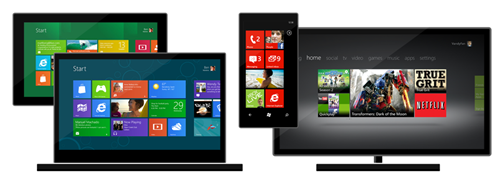
The Microsoft design language (formerly known as Metro) is the touch-and-tile UX language that Microsoft designed to create an interface focused on content, information, and movement. It is designed to embrace those principles: clean, light, fast, open aesthetics; dynamic, moving transitions and interactions; embrace the beauty of typography; content-focused interface; and authentically digital design. This new tiles interface is now on Windows 8, Windows Phone and XBOX.
Microsoft has finally realized its 3-screen strategy and this is a game changer; if you plan to work on creating software for the Microsoft platform, you need to become familiar with those UX principles. Find below some links that will be helpful:
MSDN:
UX guidelines for Windows Store apps
http://msdn.microsoft.com/en-us/library/windows/apps/hh465424.aspx
MSDN:
Windows Phone General Design Principles
http://msdn.microsoft.com/en-us/library/windowsphone/develop/hh202906(v=vs.92).aspx
And as soon as you become serious about building your
first app (for you or a customer), you NEED to read this
document if you want your app to get certified with less
trouble:
Windows 8 UX Guidelines for Windows Store apps
(316 pages of detailed user experience guidelines!!!)
http://www.microsoft.com/en-us/download/details.aspx?id=30704
The touch guidance and links on my previous post are still
valid:
http://weblogs.asp.net/lduveau/archive/2012/02/24/design-guidelines-for-windows-8-metro-apps.aspx

