Archives
-
I Snapped My Chrome!
One of the more interesting features in Google’s new Chrome browser is “Application Shortcuts”. These are web site links that Chrome places on your Start menu, Desktop and/or Quick Launch bar. When launched they open with a trimmed down UI, giving the web application a decidedly “desktop” feel. I’ve created shortcuts for a number of applications, including my GMail account.
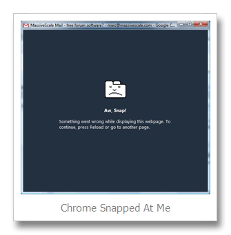
Today, while responding to an email, I got what is best described as a “black screen of death”. Chrome informed me that “Ah, Snap! Something went wrong while displaying this webpage. To continue, press Reload or go to another page”.
Aside from being a rather silly error message, it tells me nothing of value. I don’t know what went wrong. It doesn’t help me diagnose if it was Chrome that failed or the site it was viewing. And the methods suggested for resolving this error are not valid in “shortcut mode” as there are no toolbar items to press or URL boxes to navigate with.
One aspect of this message that I like is that it assumes the user isn’t an expert. It doesn’t shove a bunch of technical information at the poor user who cannot do anything with it anyway. Why needlessly make things confusing?
The problem is that they didn’t give any obvious way to get at the technical information for those who can make use of it. And if you’re going to go with the simplicity route then you need to make sure your error message gives a working resolution to the user. That novice user isn’t going to make the same assumption that I did and press F5 to reload the page.
-
My First Chrome Experience
My inbox has been flooded with emails asking me to blog about my opinion of Chrome. That is if you consider "flooded" to be one more than zero. And you include the email I sent to myself from work as a reminder to give it a shot...
Ok fine. No one asked. And even less likely care. But guess what, you're getting it anyway.
What I liked...
The download is a wonderfully small 475 KB. The same cannot be said for either IE or Firefox.
I was impressed with how quickly Chrome opened for me. Both IE and Firefox take between 3 and 5 seconds to load on my Vista machine. Chrome however opens instantly.
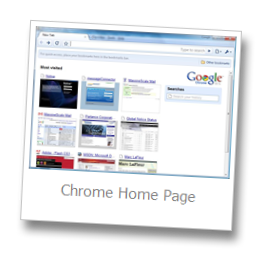
One feature that sticks out is the default home page. Rather than a search page like Firefox or that bloated MSN page from IE, you get a slick UI with personalized content on it. The "Most visited" site section is reminiscent of the XP and Vista start menu's listing of most commonly used applications. And having bookmarks displayed is also a nice touch.
Overall I'd have to say that Chrome is very quick and responsive. Pages render quickly and (from my limited testing) without any major issues.
What I didn't...
One major flaw in my view is that the default home page, while innovative, lacks any control over what gets displayed. If you search Monster regularly for example then it is going to show up on your home page. While convenient in some circumstances, imagine your manager walking past your desk and seeing a screen shot of Monster at the top of your list. And I've been told that some people have been known to use the net for more "adult" activities. Wouldn't that go over well when you open your browser during your quarterly sales presentation....
As a research project Chrome has some real value. If the benchmarks they present are accurate they have made some major improvements to JavaScript processing. But they are talking about it in much grander terms than just a research project. They seem to be positioning it as a first-class browser to replace IE, Firefox and the rest.
I'm still not sure why I should care. I've never felt an overwhelming desire to get a new browser. I use Firefox and IE and find very little difference between the two. I don't really see what market need Google is trying to fill here.

