Preview of MSDN Library Changes

The MSDN team has been working some potential changes to the online MSDN Library designed to help streamline the navigation experience and make it easier to find the .NET Framework information you need.

To solicit feedback on the proposed changes while they are still in development, they’ve posted a preview version of some proposed changes to a new MSDN Library Preview site which you can check out.  They’ve also created a survey that leads you through the ideas and asks for your opinions on some of the changes.  We’d very much like to have as many people as possible people take the survey and give us feedback.

[In addition to blogging, I am also now using Twitter for quick updates and to share links. You can follow me at: twitter.com/scottgu]

Quick Preview of Some of the Changes

Below are some examples of a few of the changes being proposed:

Streamlined .NET Namespaces Navigation

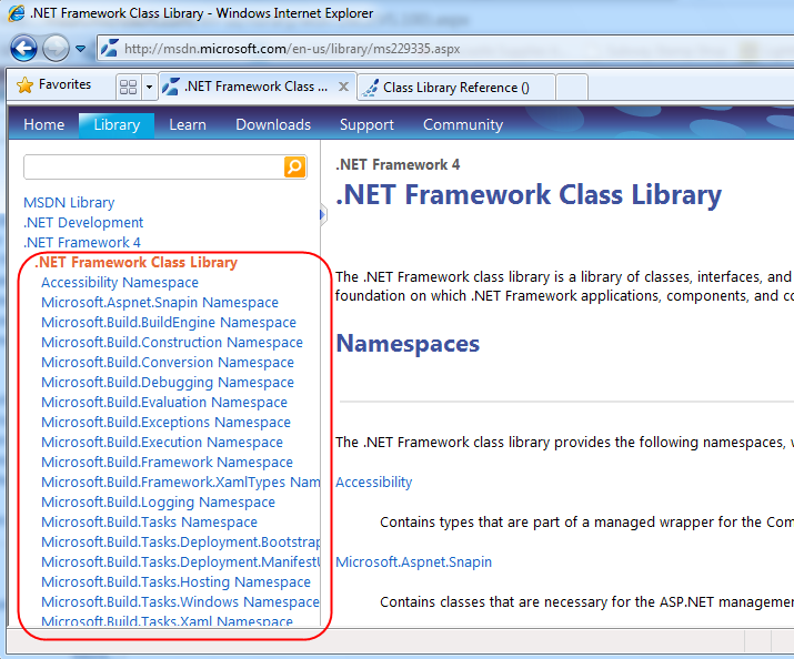
The current MSDN Class Library lists all .NET namespaces in a flat-namespace (sorted alphabetically):

image

Two downsides of the above approach are:

  • Some of the least-used namespaces are listed first (like Microsoft.Aspnet.Snapin and Microsoft.Build.BuildEngine)
  • All sub-namespaces are listed, which makes the list a little overwhelming, and page-load times to be slow

The new MSDN Library Preview Site now lists “System” namespaces first (since those are the most used), and the home-page lists just top-level namespace groups – which makes it easier to find things, and enables the page to load faster:

image 

Class overview and members pages merged into a single topic about each class

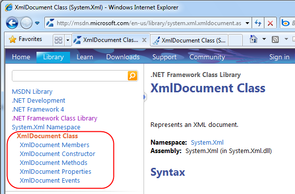
Previously you had to navigate to several different pages to find member information about types:

image

Links to these are still available in the MSDN Library Preview Site TOC – but the members are also now listed on the overview page, which makes it easy to quickly find everything in one place:

image

Commonly used things are nearer the top of the page

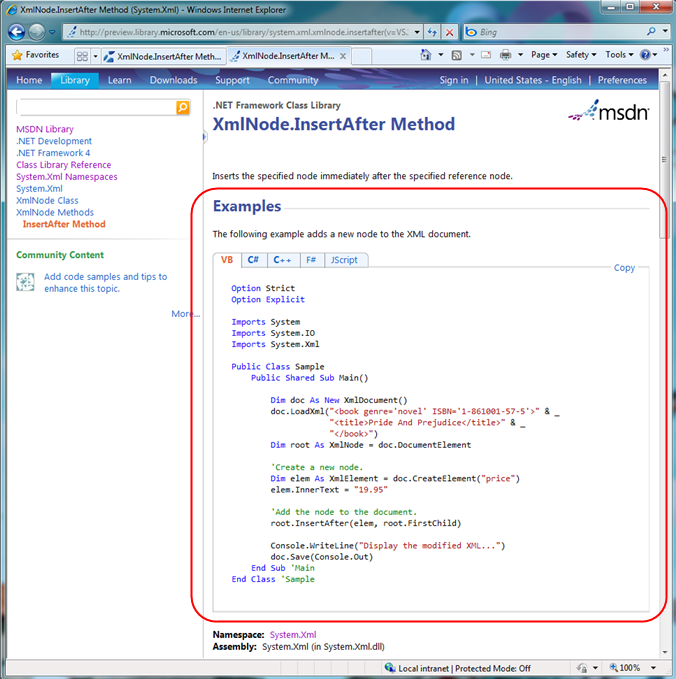
One of the other usability improvements with the new MSDN Library Preview Site is that common elements like “Code Examples” and “Inheritance Hierarchy” (for classes) are now listed near the top of the help page – making them easy to quickly find:

image

Give Us Feedback with a Survey

Above are just a few of the changes made with the new MSDN preview site – there are many other changes also rolled into it.  The MSDN team is doing usability studies on the new layout and navigation right now, and would very much like feedback on it.

If you have 15 minutes and want to help vote on which of these ideas makes it into the production MSDN site, please visit this survey before June 30, play with the changes a bit, and let the MSDN team know what you think.

Important Note: the MSDN preview site is not a fully functional version of MSDN – it’s really only there to preview the new ideas themselves, so please don’t expect it to be integrated with the rest of MSDN, with search, etc.  Once the MSDN team gets feedback on some of the changes being proposed they will roll them into the live site for everyone to use.

Hope this helps,

Scott
38 Comments

  • cool..great ux improvement

    one thing i missed from the old msdn is to toggle between the different versions of .net but stay on the same class/method/what have you. a lot of times, when googling (with bing!) a method or class, the msdn result will be for framework version 1.1 or 2.0, and I would like a nice way to swap to 3.5 or 4.0 at a click like I used to

  • I second @puffpio. Usually I'm using google custom search to search for some info and google sometimes shows links to wrong version of .Net. So it will be great to have somewhere links to other versions of .Net frameworks

  • Frankly, I really don't like the new MSDN library (and the new VS2010 local help)... Three main reasons for that :

    - NO INDEX ! for me it was the main way of finding what I was looking for, and it has entirely disappeared

    - the search results are unclear : if you search "control class", there's something like 7 results, and no way to distinguish between them... you have to visit each link to see if it's the one you're looking for. Just showing the namespace would solve the problem...

    - the member filters have disappeared : no way to hide inherited/protected members, which is VERY unconvenient for classes with many members (like WPF controls)

    The only benefit is that the pages are lighter and load faster.

    In this preview version, the only improvement I see is the new namespace presentation. Everything else makes it worse :

    - showing the members on the class' main page could be a good idea, but AT THE END ! Now I have to go to the end of the page to see the remarks...

    - perhaps some people want to see the example first, but not me : I want to see the declaration first. Now I have to scroll 2 pages down to see it !

    Seriously, this new help system is a BIG step backwards... please, give me back the old VS2005/2008 document explorer !

  • @SittenSpynne -

    Funny, I have the opposite problem re: switching languages. Everything I see is in C# and clicking any other language does not work!

    Scott... I know it's a long shot, but the content on MSDN is positively awful. Too much advanced information is buried in blogs instead of being in the docs, especially with stuff like "why do it like this, and not like that." For example, yesterday I read a blog on MSDN about the Big O stuff in HashSet and SortedSet. That MUST be in the docs, so anyone sees it up front. The discussions on MSDN are fine, but I have no way of verifying the credibility of the commenters. If someone says, "don't do it like this, because of an issue" are they from Microsoft, a really smart third party, or some kid who's best friend on IRC mentioned it while they were playing Quake?

    J.Ja

  • BTW, there is no confirmation at the end of the survey, just a blank page. So I'm not even sure my answers were taken into account...

  • Scott, thanks for linking to the survey.

    I'm still amazed that anyone contemplating changing a "programmer's reference" type of documentation would actually consider placing examples in front of syntax usage. The examples in the Managed Reference doc are extremely simplistic. The reason I'm consulting the help in the first place is usually because I need help on intermediate or advanced usage.

  • Can we just have the tree-view back please? I know the old one was rubbish, but I'm sure it's not beyond the capabilities of Microsoft to write a good one, maybe in Silverlight?

    Oh, and why do the language tabs for the samples reload the whole frickin' page?

  • Can you make the pages work for Firefox?

    Can you also make the pages printable in either IE/Firefox?

  • Please, bring back the downloadable version. I use it a lot on the train where I do not have online access.

  • Echoing much of the above...

    - Let me choose which language to display examples in, and REMEMBER that choice.
    - Allow the 1st level topics to be collapsed, esp Version Information and Platforms -- it's just noise for a lot of us, as we scroll down to the See Also section.
    - Bring back the index.
    - PLEASE give me a way to just see the members added by this class, filtering out all the inherited ones.
    - Put the parameters and return values first, not the examples.
    - Give me a "print" button.

    -mpg

  • I have to pretty much agree 100% with the comments of Thomas Levesque above. I used the index with prior VS versions and the new "improved" 2010 help is a HUGE step backwards insofar as I'm concerned.

    The examples should stay at the end - in using help I completely ignore them 98% of the time. Throwing them upfront just makes things that much more awkward to use.

  • I support Thomas Levesque's proposal entirely.I miss the previous MSDN for local that had index and member filters.

  • Nice

  • Switching between different .net frameworks is the main problem. can you add those links or add a drop down.

  • Hi Scott,

    Is it possible to make the splitter between navigation and content to be dragable, just like the old MSDN style? I think it would be more flexible to users to adjust the width.

  • Hello Scott,
    What about mobile version of MSDN. Sometimes I really want to use my iPhone to see some MSDN documentation.
    Thanks
    Shail

  • Now is the time to cleanup the Examples pane!

    Microsoft - just stop pretending VB.NET is on the same level of popularity as C#. It is not!
    Given this simple fact. Make C# the first/default option. Benefit of it is simple - you will stop anoying majority of developers.

    That said - I see an improvement from previous version of MSDN where we were forced to use a checkbox list to DESELECT (!!!) all unwanted languages. Needles to say cookie stored setting wasn't very persistent.

  • It's good start.
    Though MSDN is usually the last place I go for help anymore. If only the content of MSDN would be more useful. Perhaps in plain English and not the "look at how smart I am and how many techie words I can get in one sentence" language.
    Many of the examples are lazy and usually not very helpful.

  • Totally agree with Michal ...
    C# should be the default language for the syntax viewer.
    And it would be nice to be able to "select" the language via the URL, so there's no dependency on cookie persistence.
    (ex. http://.../en-us/csharp/... )

  • How about you stop breaking the damn thing and give me a proper JavaScript tree view that doesn't require a frigging full page refresh just to navigate.

    And bring back dexplore for god's sake.

  • (not that I ever imagined in a million years that I'd actually be championing dexplore)

  • Exceptions thrown would certainly be a 'must-have' feature.

  • I'm a beginner to intermediate developer and any improvement to MSDN library is a step in the right direction I did the survey I like the way they laid out the whole class out on one page I don't have to bounce around the site until I'm totally lost and confused I think advanced developers forget how easy it was to get confused in the beginning I think no matter what you do it is still take effort on our part to make sure we do it right and develop good software thanks for the good work any help is appreciated

  • Filled out the survey also.
    My suggestions for improvements:
    1. What puffpio said about previous versions links. I really miss them.
    2. Wouldn't it be nice if the search used the current site as a scope? So your top results most likely be what you're looking for? (Ofcourse the results can be extended with the rest of MSDN topics that match the query, but not the scope).

  • Well, gee, all of this is swell, but there's still no way to PRINT !!!

    I want to be able to select a node, at any level in the hierarchy, and print descendant content in a readable fashion. The content of MSDN help is great; reading it on the web, click-click-click drives me nuts. Sure, if I'm looking up a class member, that's fine. But, for reading development overviews, guides, etc, it's a terrible experience

    I should be able to print to a file (PDF/XPS/ETC) or get a hard-copy. Why this feature is lacking after SO MANY YEARS is mind-boggling.

  • great!i am new in SEO business and have small business but with this toolkit, the work has become so easier, after reading all your comments i was forced to try it once. thanks to all!

  • My thoughts about the new MSDN beta:
    - Access to MSDN Library from Visual Studio should be LOCAL and WITH AN INDEX (as in prior versions).
    - C# should be the default language.
    - Examples should be AT THE END.
    - Sections (such as examples, declaration, descendants, etc.) should be Expandable/Collapsable.
    - Show/Hide of inherited members should be available (think about big classes).
    My two cents.

  • I like all the new features but it will be cool if there is a option to minimize the displayed information.

  • As others have mentioned, C# would be a much better default language choice for the examples. Some recent surveys/polls have C# usage outnumbering VB by as much as 3 to 1. Surely it wouldbe better to have the majority case be the default? Or to be more impartial, the tabs should be ordered alphabetically: C#, C++, F#, VB

  • Maybe its just me, but does every single line need to say "Namespace" at the end?

    Brought to you by the Department of Redundancy Department

  • Took the survey, but one thing I forgot to mention in the survey is about the default font used (Segoe UI). When ClearType is turned off the font used looks horrible / hard to read. The font on this site (Arial) and most sites on the Internet looks good with either CT on or off. Would be nice to have Arial as a default.

  • Agree completely with Thomas Levesque, and really loathe and despise most of the changes between VS 2008 and VS 2010. Since installing it I've wasted hours searching the internet for fixes and work-arounds to their idiotic design and implementation decisions.

    Right now VS/MSDN 2010 is the equivalent of Vista. Really hoping these projects are put under adult supervision and a service pack that fixes these abominations is released post-haste.

  • C# as a default language: yes that would improve MSDN-UI for the lot of people. But MSFT first needs to decide which language is the "default one" ?

    Otherwise, at few points in SG's text I had a strong "deja vu" experience. All this html/web/ui discoveries, are they not already "discovered" elsewhere? WordPress coomunity has sorted (all of) this years ago. If copying WordPress public domaon solutions is not politicaly correct, one could look elsewhere, for example in the general direction of BING UI solutions...

  • Export (to pdf for example) or print the topic in view. This is very lacking till now.

  • Definitely a step in the right direction. Just please make sure that they don't use a "definition to define a definition", such as, the help for property Foo "sets the Foo property True or False," without telling us just what the heck Foo is :)

  • Could you do less so that we had also less problems!?!

  • To those of you who are asking for the VS/.NET version selector and collapsible headings in the reference pages, please note that these features are still available right now on the "live" MSDN site. You just need to switch your MSDN view to Classic. If you're currently in Lightweight view, you can change this by clicking on Preferences in the upper-right and then choosing Classic. If you're currently in Scriptfree view, you can change this by clicking on Classic in the upper-right.

  • Thanks a lot...

Comments have been disabled for this content.