Silverlight Tutorial Part 7: Using Control Templates to Customize a Control's Look and Feel
This is part seven of eight tutorials that walk through how to build a simple search client application using Silverlight 2. These tutorials are intended to be read in-order, and help explain some of the core programming concepts of Silverlight.
<Download Code> Click here to download a completed version of the Bing Image Search sample. </Download Code>
<Download Code> Click here to download a completed version of the Digg Search sample. </Download Code>
How to Customize the Look and Feel of Controls
One of the most powerful features of XAML is the ability to completely customize the look and feel of the controls used within it. This allows developers and designers to sculpt the UI of controls in both subtle and dramatic ways, and enables a tremendous amount of flexibility to create exactly the user experience desired.
In this tutorial segment we'll look at a few ways you can customize controls, and then close out by polishing up the user interface of our search application using these techniques.
Customizing the Content of Controls
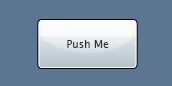
In Part 1 of our tutorial we added a simple button control to the page and demonstrated how to set a custom "Push Me!" text string for its content. We then wired up a "Click" event handler that executed code when it was clicked:

This caused the button to render like below within the browser:
One of the things that might surprise you about the Button control is that its "Content" property does not have to be a simple string like "Push Me!". We can in fact set the "Content" property to be any sequence of Shapes or Controls we want.
For example, we could embed a StackPanel with an <Image> and <TextBlock> control within it:
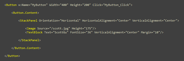
This will cause our Button to look like below at runtime. Note that it still retains the same functionality behavior (push it and the button will still depress, and the click event handler will fire like before):

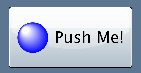
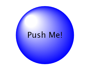
We could alternatively use Shape controls (like the Ellipse control below) to create custom vector graphics inside the button.
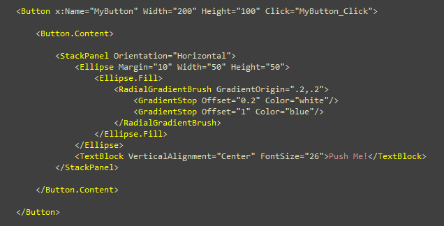
Notice above how I'm filling the Ellipse control with an offset RadialGradientBrush to add a nice reflective polish to it:
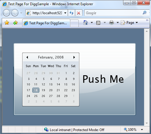
We could even get wacky and embed interactive controls like a Calendar control within the Button:
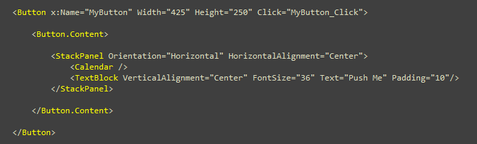
In the above sample the Calendar is fully interactive - meaning end-users can actually page back and forward through the months and choose a date on the Calendar, and then push its containing button to trigger the "Click" event handler: (note: I'm not sure why this would be a good user experience - but it does show off the flexibility of what you can do!).
These types of content customization scenarios I outlined above work not just for Button controls, but likewise for all other controls that derive from the ContentControl base class.
Customizing Controls using Control Templates
The control model enabled by XAML allows you to go much further than just customizing the inner content of a control. It optionally allows you to completely replace a control's visual tree with anything you want - while still keeping the control behavior intact.
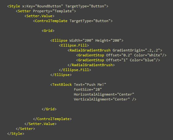
For example, let's say we don't want our buttons to have the default rectangle push button look, and instead we want them to have a custom round button look like below:
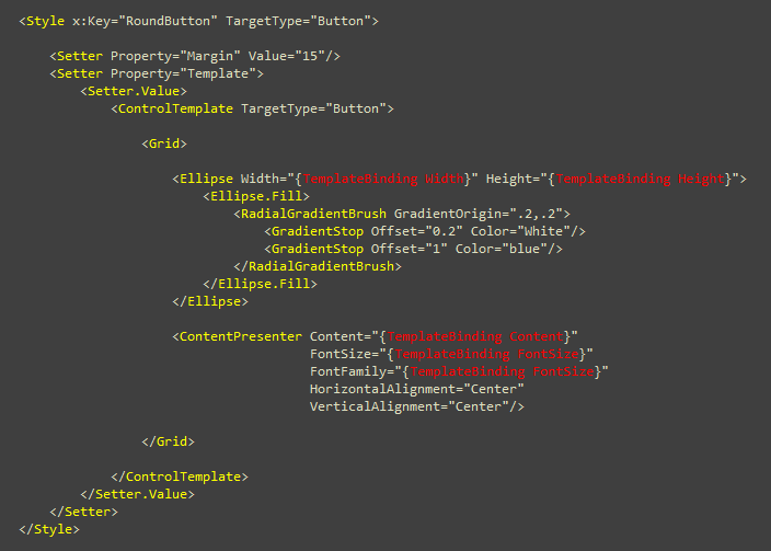
We could accomplish this by creating a "RoundButton" style in our App.xaml file. Within it we'll override the Button's "Template" property, and provide a ControlTemplate that replaces the Button's default Rectangle visual with an Ellipse control and a TextBlock inside it:
We can then have a <Button> control reference this Style resource to use this "RoundButton" look and feel:

Incorporating Content within Our Control Templates
One thing you might have noticed in our "RoundButton" control template above is that the size of the Button, and the Content displayed within it, are hard-coded (it always says "Push Me!").
The good news is that XAML makes it possible for us to have these settings be customizable as well. We can do this using a {TemplateBinding ControlProperty} markup extension syntax inside the control template to bind to properties of the control. This will allow our control template to adapt as properties are set on the Control by an external developer:
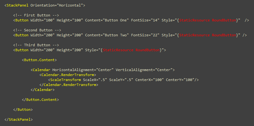
Notice above how instead of adding a <TextBlock> control to display the content, we are instead using the <ContentPresenter> control. That will enable us to have the button display not just text strings, but any custom content as well (just like we did earlier in this tutorial).
We can then use the above Style on three buttons below (each with different content and property settings):
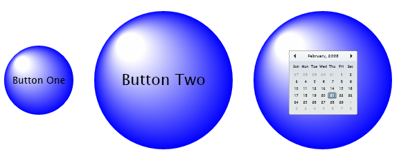
The above Buttons will then display like below (and yes - the scaled Calendar control still supports paging and date selection!):
If we wanted to go further we could optionally add states to the ControlTemplate (to handle button states like "hover", "focus" and "pushed"). This capability enables us to create really polished user interaction scenarios, and enable scenarios not possible with HTML. It also allows designers to nicely integrate animation and other powerful concepts within the experience.
Developers working with controls in an application can remain oblivious to all of this style and control interaction customization. They can handle events off of the controls and manipulate the control's object model as normal, and have a designer own sculpting and customizing the look and feel separately using styles and templates.
Polishing up our Search Application
Now that we've covered some of the basics of how Control Templates work, let's use them in a few places to add a bit more UI polish to our search application.
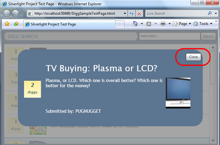
Right now there is one obvious place in the application that clearly needs some work - the "Close" button on our User Control:
The good news is that this is easy for either us (or a designer working with us) to fix. We could add a ControlTemplate to the "CloseButton" style in our App.xaml file and add some custom vector shapes to provide a more attractive close button (note: a more competent designer than me could also add hover and animation behavior to the vector graphic shapes and make it look even better):
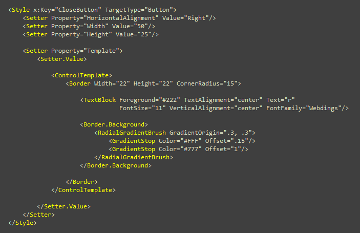
When we run the application again the button will now look like it does below:
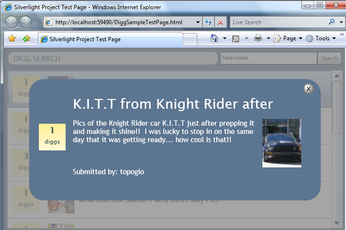
What is cool is that we did not have to change any code in our application, nor modify the XAML markup on our actual controls, in order to make this look and feel change. This code/design separation enables a great developer and designer workflow when working on XAML based applications. Expression Blend and the overall Expression Studio products take these control design capabilities to the next level, and will deliver a rich designer toolset that makes this customization easy.
Next Steps
We've now finished implementing our search application in Silverlight.
Our last step will be to implement a desktop application version of it as well. The good news is that doing this is not too difficult - since Silverlight is a subset of the full WPF and .NET Framework, and so the concepts, code, and content are pretty easy to move.
To see this in action let's jump to our next tutorial: Creating a Digg Desktop Application Using WPF.