Archives
-
Metro Style Site Directory for SharePoint Using EMCAScript
I’ve always been trying to come up with a useful and clever way to allow users to navigate around SharePoint sites. Recently I put together an “Application Directory” which basically displayed a menu system to navigate around apps. Using the JavaScript Class Library for SharePoint to pull values out of SharePoint I quickly put together something that normally would be a lot of C# code and a web part.
The EMCAScript object model is powerful in that you can quickly pull data out of SharePoint sites and lists and make a pleasant user experience with just a little JavaScript, CSS, HTML, and jQuery. It still will make a call back to the server to fetch the data but it’s done asynchronously so the perception to the user is almost seamless.
This post walks you through building a site directory of sorts. It could be used as a landing page on a top level site collection or as a web part sitting on a team site (to show the contents below the site). It’s up to you but the net result is a nice navigation system (done with a little “Metro” styling) all done in a hundred lines of JavaScript.
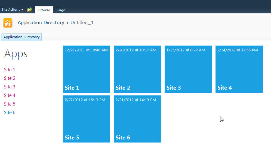
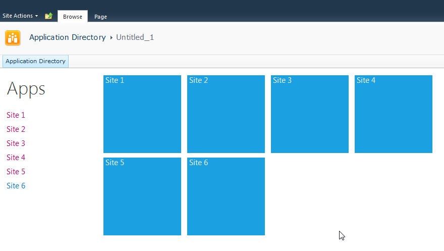
Here’s what we’re building:
Let’s start with the simplest thing possible. A script that we’ll insert into the page using the Content Editor Web Part via a Content Link. This is my preferred way of doing lightweight adds to SharePoint (like JavaScript or even just raw HTML). The Content Link points to a file in my SiteAssets library in the site and since it’s a link it just gobbles up the content and serves it up. If you try adding HTML to a Content Editor Web Part you’ll find a nice message after saving “Your HTML may have been modified”.
WTF?
Yeah, SharePoint deliciously will go in after you save your nicely formatted content and do some neat things like rename your CSS entities. Oh yeah, it’ll also strip away your JavaScript if it doesn’t like it.
Trust me. Just include the file and you’ll be much better off in the end. Having the file located in the SiteAssets library also lets me just crack it open in SharePoint Designer and while the editor isn’t the greatest, it does give you some Intellisense but the real advantage is saving it in SPD then hitting refresh on your page to see the effect. The file will contain the CSS, JavaScript, and HTML markup. I like putting everything together so I don’t have to worry about files all over my system but you can just as easily use multiple files if you want.
Alright, back to business. Create a new file in your SiteAssets library (you get a SiteAssets library when you create a new site regardless of what template you use or what feature you activate, it’s always there and accessible through SharePoint Designer).
Name the file SiteDirectory.js or something. Doesn’t really matter and you can call it ISavedTheWorldUsingPork.HowAboutThat if you want, but leaving it with a .js extension will give you some semblance of Intellisense inside of SPD.
Drop a Content Editor Web Part on the home page of your site (or wherever you want to put this). This could be a Wiki Page (the Home.aspx page is a wiki page if you activate the Wiki Home Page Feature on a site) or a Web Part Page. There are a few small tweaks you should do depending on what type of page you put this on but just adjust the CSS we’ll be building as you see fit.
Starting simple we're going to just enumerate the child sites and display them in an unordered list. The list is easy to style and works well with jQuery later to be able to animate or attach plugins to.
Here’s the initial code that we’ll put into the SiteDirectory.js file:
Like I said, all this is doing is a) enumerating through the list of subsites then b) spitting them out into an unordered list. Here’s a breakdown of how this works:
Line 1-2: We’ll include some CSS styles here later
Line 4: We include jQuery so we can a) make it easy to replace elements on the page and b) support plugins later. You can choose to use pure JavaScript or omit this if your site already includes jQuery.
Line 8: We declare a variable we’re going to use to hold the list of sites
Line 10: We wait until the core JavaScript files are loaded by SharePoint. This ensures the ClientContext is setup for us when we need it.
Line 12-23: This is the function that calls the Client Object Model to get our web then get the subwebs for the current user. Finally on lines 19-21 we execute the call (which is where we talk to the server) and define the success and failed methods.
Line 25-46: We define the success function to call with our list of subwebs. Here we’re getting an enumerator to the web collection and iterating through them, grabbing the url and title of the site then creating our unordered list using regular HTML markup. Finally on line 45 we find the DIV tag we’re replacing and substitute the HTML we just created.
Line 55-57: This is the HTML markup we’re going to replace in our JavaScript. We initially set the text to “Loading…” so users will see this when the page loads then *magically* it’ll get replaced with our content.
Here’s the result:
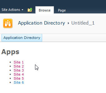
Looks good and lets us know we’re on the right track. If there are any failures you’ll see them here because our failed function will get called and output the error message. This could be anything from a JavaScript error to not calling a known method. Also note that this is already security trimmed since we’re using the getSubwebsForCurrentUser method so we’ll only see sites the user has access to.
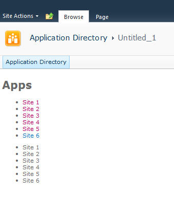
Let’s add another list and DIV tag so we have two lists to use:
Not much to explain here, just added a new DIV tag and built up the HTML just like the original. Now we have two unordered lists. We also wrapped up each list in its own DIV tag.
Now we’ll do some simple styling by floating the list of sites down the left hand side and the second list on the right and applying a little styling to the text.
Here’s the updated output:
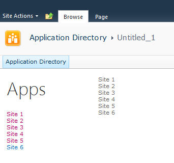
Now it’s starting to look like our target. Let’s style the menu list with a larger font. We’ll also just make one line of code change in our markup in the onSuccess method. Find the line that says menuNavContent += ‘<ul>’ and change it to read menuNavContent += ‘<ul class=”apps”>’. This will style just the unordered list of items on the left.
Here are the new styles to add to the CSS
Now that we have the list done lets focus on the second list which will form our tiles. They’re not as live and vibrant as they could be but they do show some metadata from the site so are at least a little more informative than just navigation boxes.
First we’ll apply some styles to the list to make them into boxes and space them apart. It’s just CSS markup here to add and a couple of small changes in the construction of the HTML for the second list.
We’re just adding some new styles here. There’s a class called theme_blue set to the Metro blue (#1ba1e2) which we set as the background colour for each tile. In addition we set the entire tile to be clickable to the same url as the site. This lets the user click anywhere on the tile (or the list one the left) to launch the site rather than having to click on the title.
Here’s the updated output.
Now that we have our tiles we can add some dynamic metadata to them. This will be pulled from the website itself and give us a navigation system that’s more information than just links.
We wrap the title in a DIV tag with a class of tileTitle which lets us style it to place it at the bottom of the tile and give it a larger font. You do need to be careful of the length of the titles of your sites as this doesn’t work for all scenarios but just adjust it to fit your needs.
We also pull the last modified item date from the web properties. Every site tracks whatever the last item that was modified is and holds onto the date for that item. So now users can see when some content on the site was last changed.
Also we parse out the date from SharePoint into a JavaScript Date object and build a formatted date to display on the tile.
The final image:
That’s it! You now have a single script that you can just drop onto any site to create a Metro style navigation to the subsites. New sites can be added and will automatically show up and users can see when the content on the site was last modified and be able to click on the site to visit it.
Here’s the full source code for the page for you play with.
Remember, this is just a start. There are some fun things you can do with this. For example create custom styles for different colours (for example blue for team sites, red for wikis, etc.) and style them accordingly. Other ideas are to pull other data from the site like description, etc. and put that on a bigger tile. Enumerate the number of subsites in a site and display that. There are other properties you can access off the Web object like if RSS is enabled, etc. so you might want to display different icons on the tile to reflect that. The list of properties on the SP.Web class can be found here.
If you’re following the “Metro” style then remember to keep the UI light and simple. Content over chrome. You don’t want to be dumping all kinds of information here, just enough that your users need to make it useful.
Enjoy!
InstaCam MetroMakeover - Spacing, Margins, and Polish for your Windows Phone App
In the spirit of a recent article that Jeff Wilcox posted on his blog about the MetroRadio app, I thought I would do something similar for the InstaCam app.
InstaCam is a 3rd party app written by Dmitry Manayev to bring Instagram functionality to the Windows Phone platform. I contacted Dmitry about this post to get his permission. Here are a few tweaks that you can keep an eye out for in your own apps.
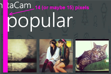
First up is the Popular Page. This has small square images of the most popular pictures currently posted on Instagram. The page is built on the Panorama control so the title is the default. It’s the pictures that are off a bit here. If they were indented 14 (or maybe 15) pixels then the edge of the pictures would line up with the pano title. Part of Metro is about lining things up and keeping it clean. You should see an invisible line down the left side of your pages that align things up. I saw the same margin issue on the search results page.
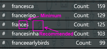
Next up is the search results page. I found the spacing to be a little tight so after measuring it I found that the spacing was in line with the minimum recommended target size from Microsoft, 7mm (check the guidelines here for target sizes). In the recommendations they suggest a target size of 9mm rather than the minimum of 7mm. The idea with Metro is to open up the design and make liberal use of white space. Don’t crowd things together if you can avoid it. There's plenty of space so hitting the target of 9mm (with perhaps a larger font) might open up the page a little more.
On the feed page there are a few little tweaks I would look at. First is the title for the app. The unwritten rule is that a page title should be in all CAPS. Hey, it’s a style. Check out (most) of the core apps and you’ll see the style applied there. Next is spacing. Jeff Wilcox mentioned there’s no hard and fast rule with vertical spacing (I really wish there was so we could all follow it, hint, hint) but he does say he tends to use 4, 6, 12, or 24 pixels. The default vertical on some of the initially generated XAML you get from Microsoft pegs some vertical space at 17 pixels so the message here can be confusing. For the title spacing I thought a 14px top margin would work here (but 12 would be fine too).

The thing about spacing is be consistent! I don’t think it matters if it’s 12, 17, or 24 but keep it the same on every page. That should be your mantra. Consistency. With vertical spacing (and especially page titles) watch out for the top margin where the system indicators are. If you leave them turned on, you lose 22 pixels. If you turn them off you get that back but remember to turn them on or off across your entire app (or compensate for pages where you have it turned on). For example Panorama pages have the system tray turned off by default so if your app goes from a Pano to a single page (or a pivot) then you might notice a slight “jump” with the title as it moves from a page without the system tray to one with.
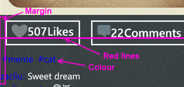
Down in the details for a single picture it shows the user who took it, some information about them, and the likes and comments for that photo.
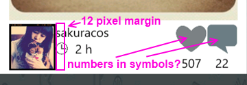
The name and when the picture was taken is a little crowded here and butts up against the profile picture. The suggestion here is to apply a 12 pixel margin to the left of the name (or the right of the picture) to open things up. In addition I would personally put the like and comment counts inside of the symbols (using white to offset the colour). That’s just a personal preference but it might make it a little tighter and gives you more space to be able to use larger symbols. There is a gotcha here of course with numbers inside of symbols. Some images will have 0 comments, other will have 10,000. I have seen a situation where the font scaled based on the width of the number so that might be an option. For sure when testing something like this you should consider ranges like this and try out the extremes. You might not be able to catch every scenario but don't just design for say 4 digits when the possibility of 8 exists for example.
When you view a single image I noticed a few things that a slight adjustment would fix. Again, a lot of these changes here are just minor tweaks to the UI, nothing major. I think this is the case for a lot of applications out there. A couple of hours going over things and moving a few items around goes a long way.
Here again the margin issue rears it’s ugly head. The margin for the Like button is fine (and bleeding the picture itself to the edge of the phone is a nice touch, lets you see more of the image). It’s the tags and detail labels. The colour doesn’t work against a dark background. Whenever you’re looking to highlight something consider using the PhoneAccentBrush colour (but use it sparingly). Dmitry did mention in the latest update that he fixed the colour to the blue phone accent colour. I took these sceenshots from the marketplace so maybe that hasn't been updated. On my phone the text does look better than here but again, watch out for themes when deciding on using accent colours, especially with fixed colour or image backgrounds.
As for the buttons, they’re a little off so as your eye moves horizontally across you see text jump up or down. It’s only a few pixels but a design technique mentioned by Arturo Toledo, a Senior User Experience Designer at Microsoft. On his UX blog he recently talked about the design process for Metro apps. In it he talks about Redlines, marked up screenshots of your app with lines drawn across and up to show alignment and spacing. This is something everyone should incorporate into their release process. Yes, my lines are magenta but that was just for clarity. Red, yellow, magenta, whatever works for you.
For the buttons themselves I would consider doing something with the extra space. Split the buttons (either using a Grid or a StackPanel with the Orientation set to Horizonal) so they’re evenly distributed (Width = 0.5* in the case of a grid). Then regardless of how much the content takes up, they’re consistent and not as jarring to the eyes. Again here I might consider putting the counts inside the symbols (to be consistent with the other views if you did that) but leave the words “Likes” and “Comments” so people know what it refers to. Here the words work because you’ve got the entire width of the phone to display them (vs. the previous image where there’s only room for the symbol).
Finally the user profile page. I would suggest a few small changes here just like the other pages.
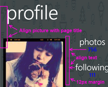
For this page:
- Align the profile picture with the page title
- Align the counts and count labels (photos, following, etc.) on the left. This tends to be the norm rather than centered text which sometimes looks like its floating without an anchor. Again refer to the core apps for some guidance here, for example take a look at a persons profile page (your own or someone else). They’re a good model to follow.
- The colours here are awkward again and hard to read. If you use the PhoneAccentBrush colour then pay attention to how the light and dark themes work against your backgrounds. Sometimes when using background images you need to adjust the Opacity dynamically. When testing, just go through all of the Theme colours in both light and dark mode. It takes an hour or so with a few screens and all of the combos but you’ll cover all the bases.
That’s it. Hopefully that helps you in your own application development and gives you a few little things to look out for. They’re all minor tweaks but things that you can add to a final checklist of things to go over before you submit your app to the marketplace. Thanks for Dmitry for letting me write this post and perhaps he’ll put some of these suggesting in a future release.
Calgary! SharePoint! Workflows! Pigs! Action!
Join me and a cast of thousands as we do an interpretive dance version of Lord of the Flies.

Oh yeah, and Jason Kaczor will also be presenting on custom workflow actions and SharePoint.
From the marketing blurbage:
This presentation is about Custom actions which are .NET components. I will also be presenting some best practice framework code as well for trace logging/etc. I will also talk about Event Receivers – they tie closely to the concept of “something executing based on something else changing” like workflows, but are occasionally the better choice to use.
Registration is preferred for this event. Those that register will be given an extra cookie. Please register at either EventBrite or Microsoft ClickToAttend.
Does the world really need "official" apps?
The "buzz" exploded a few days ago with this site. "Official" application requests for Windows Phone 7, vendors and services that don't have a presence (an official one anyway) on the Microsoft phone platform. I have to ask though, do we really need an "official" app?
Okay, let's take a few steps back before we go forward. What exactly is an "official" app. I would say it's a) an app written by the service owner (Instagram, Pinterest, Twitter, etc.) or maybe b) an app officially endorsed by the service owner. In any case it's considered sanctioned, blessed, whatever. Foursquare, Flickr, Groupon, Twitter, YouTube, etc. all have apps like this. In the case of apps like YouTube and Twitter you'll see the application publisher is Microsoft. These guys might have deferred the creation of the apps to Microsoft or the publishing or both.
People see these apps as *the* app they should get if they want to use that service on their phone. Apps turn into verbs and users are told to use Evernote to use their service on their phone. With the moniker of being an official app I suppose it carries a bit of levity as far as stability and reliability.
Or does it?
In the case of longevity it might be the case. As long as ESPN is on the air, they'll have an ESPN ScoreCenter app. Or will they? Budgets come and go so if I was a manager and looked at "trimming the fat" I might consider lopping off the mobile developers and abandoning that early. After all, how much revenue does a free app on a phone get you? I do think once the genie is out of the bottle that organizations will at least try to keep that division running and we haven't seen too many apps fall by the wayside. So yeah, it's probably a safe bet that "official" apps will stay around as long as the service is there.
On the reliability side it's a different story. What's the number #1 request on the user voice site right now? Facebook. Wait, that has an "official" app doesn't it? It was built by Clarity Consulting but looking at the comments on the uservoice site and on the marketplace you see things like "They need to fix this", "Add some new features", and "Need a lot of work!!". The Twitter app, IMHO, is another fine example of an "official" app generally gone wrong. No live tiles, it's been out for 16 months and it's only on version 1.3 and last time I used it I couldn't even do a "reply all" on a tweet. Frustrating.
Official apps may be no better than 3rd party ones out there so don't be fooled by the "official" title. Indie apps are built by developers with a passion, official apps might in some cases be considered an IT expense.
The first thing you have to look at, does the vendor or service have an app? On any platform. If they don't then the next question (besides should they) might be, is there a way to get one on there? Are there any data sources available. Obviously if they have a web presence then they have data but it may not be publicly consumable. If they do have an app, is it good enough. What are the reviews like? Is it meeting the needs of the many and providing a way to access their services to do everything. Is that the purpose of the app? Sometimes apps are supplements to the on-site services they have available and not a substitute. Aside from services, does the app work correctly, doesn't crash, is quick to respond, is updated frequently to align to new features the service offers, etc.
If they do have an API is it a) publicly consumable and b) is it full featured? One stumbling block I hit with producing an Instagram app for Windows Phone was that they didn't provide a way for users to register new accounts or upload photographs, a cornerstone to the service itself. This can be frustrating so before you embark on perhaps building something check to see if you can do it.
So what's the value-add for you building an application, either as the only application on that platform or a supplement to a broken or limited-functional "official" app? Are you making it better or filling in the gaps the official app is missing? What happens when the official app maybe catches up and delivers that functionality. Now you're playing a game with the official team and you might not win that battle. Something interesting with something like Foursquare is that the reviews are not too horrible (some good, some bad) but looking at the reviews and functionality of something like 4th & Mayor is that the official app came out long after Jeff Wilcox's version. Was it too little and too late? Jeff constantly updates the app not only for stabilization but new features. The reviews, UX, and stability of this "unofficial" app outweighs the popularity of the "official" one, although I think this an exception to the rule. Again, this is a good example of a labor of love vs. an IT project.
I think it's great we have the official apps on the Windows Phone but I think it's even better that we have public APIs, a nice development platform, and a passionate community that wants to do better. If all we do is accept the official apps then we're not pushing the envelope. Sometimes that's just not good enough and we as a community deserve better. Support it by showing your voice on sites like the Marketplace Request site, by blogging about it, and by pushing services to provide the ability for developers to step in and help out.
As for vendors and service owners, please do us a favor by exposing your APIs and letting developers do what they do best, develop. Focus on your service if you want and put it out there for others to pick up the ball and run with it. Keep on top of what's out there, help us by helping you, and you might be surprised in what we might be able to accomplish. It's like I tell game studios, focus on building your game. The development community will stand up and provide the supplemental tools that will build the community for you, you just have to give us the tools to do what we're passionate about.