Getting Started with CSS Media Queries
If you've ever printed a page and noticed that it looks different than the actual page displayed in the browser you've more than likely witnessed a CSS media type in action. By using CSS media types such as "print", backgrounds, navigation bars, and other items can be hidden as a user prints which makes the printed page look much more readable. An example of changing styles through a CSS media type as a page is printed is shown next. This type of code can be placed directly in a <style> element in a given page or in an external style sheet.
@media print
{
    body {
        background-color: white;
    }

    nav {
        display: none;
    }
}
The print media type is one of many that can be used. A list of the different media types available to target various scenarios is shown next:
|
Media Type |
When is it used? |
|
3d-glasses |
3D scenarios |
|
all |
All media types |
|
braille |
Braille tactile devices |
|
embossed |
Paged Braille printers |
|
handheld |
Handheld devices |
|
|
Printed materials |
|
projection |
Projected presentations |
|
screen |
Different types of screens |
|
speech |
Speech synthesizers |
|
tty |
Teletypes and terminals |
|
tv |
Television devices |
Media types can be defined in a web page using several different techniques. When a media type is identified (such as when a print operation occurs in the browser), the style sheet associated with the media type is applied dynamically by the browser. One of the easiest ways to get started using media types is to add the media attribute of the <link> element as shown next:
<link type="text/css" media="print" href="Styles/print.css" />
This code will cause the style sheet to be applied only when the specific media type ("print" in this case) is identified by the browser. You can also combine the media attribute with @import in an HTML page to cause a style sheet to be applied (note that the @import rule is ignored in older browsers though):
<style type="text/css" media="print">
    @import "Style/print.css";
</style>
If you'd prefer to load a specific style sheet from within another style sheet, @import can be used along with the media type. For example, if you have a style sheet named styles.css and want print styles to be included in it, the following can be added in the file to define the print style sheet along with the media type that it applies to:
@import url('print.css') print;
Finally, @media can be used directly in a style sheet as shown earlier to identify a specific media type section:
@media print
{
    /* custom print styles go here */
}
While media types definitely fill a direct need, they can't be used to perform more involved runtime logic. That's where CSS media queries come into play.
Adding CSS Media Queries into the Mix
CSS media types can be combined with CSS media queries to dynamically change styles and provide a responsive layout that adapts to different screens. While media types target a specific type of media such as print, you can add more control into your pages and even adjust the overall layout by adding CSS media query expressions. Expressions provide a way to associate logic with a given media type. It's important to note that although CSS media queries can be used to dynamically change the layout of a page, they don't optimize a page for smaller devices. Page optimization normally involves the server transmitting smaller images, minimizing the HTML payload that is sent, and performing other types of optimization tasks. Although CSS media queries can be used to load different types of images, they don't have any effect on the overall HTML that is loaded.
You can use CSS media queries to target a variety of properties:
- Screen height and width
- Aspect ratio
- Color
- Orientation (portrait versus landscape)
- Visit http://www.w3.org/TR/css3-mediaqueries for a complete list
Let's take a look at how media types and media expressions can be used together to create a CSS media query. The following shows a simple example of some HTML that will be rendered in different devices:
<body>
    <div id="wrapper">
        <article class="clearfix">
            <section>This is section 1</section>
            <section>This is section 2</section>
            <section>This is section 3</section>
        </article>
    </div>
</body>
The following CSS is applied to the HTML for styling purposes:
#wrapper
{
    width: 980px;
    margin: 0 auto;
}

section
{
    border: 1px solid black;
    height: 50px;
    width: 31%;
    margin: 0px 0px 10px 5px;
    padding: 5px;
    font-weight: bold;
    background-color: green;
    color: white;
    float: left;
}

.clearfix:before, .clearfix:after { content: ""; display: table; }
.clearfix:after { clear: both; }
.clearfix { *zoom: 1; }
When the HTML and CSS is rendered the following output is displayed in the browser:
What happens when the page is rendered on a phone with a small screen? Although most modern smart phones will display the page fine, the user will likely have to zoom in to read the content and swipe left or right to view specific areas. The experience can be made much better by using CSS media types combined with CSS media queries.
Let's look at how to target devices that have a max width of 480 pixels and reformat the green boxes shown earlier so that they display vertically instead of horizontally. By stacking the boxes vertically and adjusting their widths the user won't have to zoom in and swipe from left to right to see all of the content. An example of defining a media type of "screen" along with a max-width media query expression is shown next:
@media screen and (max-width:480px) {
    /* custom styles go here */
}
This code targets any screen that has a maximum width of 480 pixels using the (max-width:480px) expression and triggers styles defined in the media query's brackets to be applied. A more complete example of checking for a specific max-width and then applying custom styles to the page when the expression returns true:
@media screen and (max-width:480px)
{
    #wrapper
    {
    width: 98%;
    margin: 0 auto;
    }

    section
    {
    width: 98%;
    margin: 0px 0px 10px 0px;
    background-color: red;
    color: white;
    float: none;
    }
}
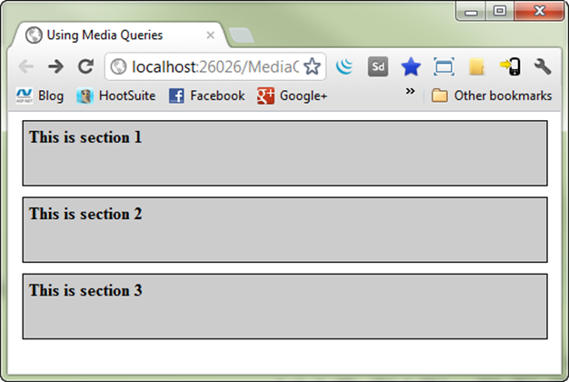
When the expression is true the custom #wrapper and section element styles are applied dynamically causing the floats to be removed. The result is shown next:
To target widths between 481 and 979 the following CSS can be written. Looking through the code you'll see that 2 expressions are used.
@media screen and (min-width: 481px) and (max-width:979px) {
    #wrapper
    {
        width: 98%;
        margin: 0 auto;
    }

    section
    {
        width: 98%;
        margin: 0px 0px 10px 0px;
        background-color: #ccc;
        color: black;
        float: none;
    }
}
Each expression is wrapped in parenthesis and separated with the "and" keyword. Although the code only changes each section's background and text color, additional modifications to the styles could certainly be made. The following image shows the screen that's rendered in the browser.
Additional media queries can certainly be added to target smaller devices such as iPhone and Android phones. For example to target a max-width of 320 pixels the CSS shown next can be added.
@media screen and (max-width: 320px)
{
    #wrapper
    {
        width: 98%;
    }

    section
    {
        width: 98%;
        margin: 0px 0px 10px 0px;
        background-color: #000;
        color: white;
        float: none;
    }
}
CSS Media Query Testing
Although CSS media queries are fairly straightforward to add, how do you test that they're actually working? You can certainly resize the browser window yourself to do some basic testing but if you want to know exact sizes it's better to take advantage of tools designed for that task.
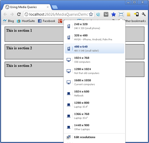
Chrome has an extension called Windows Resizer that allows specific resolutions to be targeted easily. After installing it, an icon shows in the Chrome browser that you can select to pick a target as shown next. Custom resolutions can be added easily.
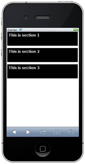
You can also use device emulators if you have them installed or do testing on real devices which is of course highly recommended if you have them. If you don't want to install an emulator, a nice (and reasonably priced) tool that can be used to test iOS devices on Windows is available at http://www.electricplum.com. It provides a way to test what web pages look like on iPhone and iPad devices as shown next:
In this post you've seen the role that CSS media types and CSS media queries play in providing more responsive web pages. In a future post I'll walk through how a more robust site can benefit from CSS media queries to render pages that look good on a variety of devices. You can download the sample code from this post as well as a more robust example that I’ll blog about later here.
Subscribe to my Free FlipBoard Magazines: | ||||
 |  |  |  |  |


