Getting Started with the ASP.NET 3.5 Chart Control
I think it’s safe to say that charting is a key part of many applications run on company Intranets. People like to see data visually as opposed to viewing it in rows and columns sometimes (especially higher level managers). While there are many 3rd party solutions available that provide charting solutions, you now have access to a very powerful solution from Microsoft that won’t set you back any $$ at all. Translated…it’s free! Sure, some of you may think that “free” products aren’t good but that’s not the case here. The new Chart control can generate visually stunning 2D and 3D charts without a lot of work on your part. In fact, there are over 25 different chart types that you can select for use in your ASP.NET or Windows Forms applications.
To get started using the Chart control you’ll need to download and install the following:
- Microsoft Chart Controls (for ASP.NET and Windows Forms)
- Visual Studio 2008 Tool Support for the Chart Controls
Once you’ve installed the chart controls you’ll see a System.Web.DataVisualization.dll assembly in the Global Assembly Cache. Within the assembly’s System.Web.UI.DataVisualization.Charting namespace you’ll find the new ASP.NET Chart control. Here’s a step by step look at getting started with the Chart control and binding it to data in a database using the good old SqlDataSource control.
1. Drag the Chart control from the VS 2008 Toolbox onto the design surface. You’ll see the following in the designer. Change the control’s Height and Width properties to 400 and 600 respectively in the Property window.

2. Click the Chart control’s smart tag and and bind it to a data source. I’ll use a basic SqlDataSource for this example and display the number of customers in each country from the Northwind database:
3. Right-click on the Chart and select Properties from the menu. Locate the ChartAreas property and click the ellipse (…) button.
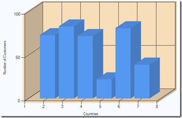
4. A single chart area named ChartArea1 should show in the ChartArea Collection Editor window. Expand Area3DStyle and set (Enable3D) to True. This causes a 3D version of the chart to be generated which is cool if you’re trying to impress friends, family or your boss! You can change the perspective, rotation, plus more by tweaking properties.
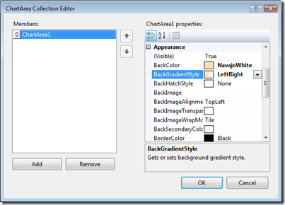
5. If you want to change the background locate the Appearance section (still in the ChartArea Collection Editor) and choose a value for the BackColor and BackGradientStyle (if you want a gradient) properties:
6. Locate the Axes property and open the collection editor by clicking the ellipse (…) button. Within the X axis locate the Title property and change it to Countries. Within the Y(Value) axis locate the Title property and change it to Number of Customers.
7. Close the property editor windows and locate the Chart control’s Series property. Click the ellipse (…) button to open the property editor.
8. For the Series1 member locate the Data Source section and change the XValueMember to Country and YValueMembers to Column1 (or the name of the field returned from the query if you don’t use the one shown above in the SqlDataSource wizard). This tells the Chart control which fields to bind to based on what it gets back from the SqlDataSource.
9. Save the page and run it to see the chart in action:
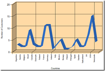
10. Notice that not all of the countries are shown on the X axis. If you’d like to see all of them go back to the ChartAreas property, select Axes and locate the X axis, LabelStyle section. Change the Angel property to –90 and the Interval to 1. Doing that will cause the following output to be generated:
Here’s what the ASPX code looks like at this point:
<asp:Chart ID="Chart1" runat="server" Width="600" Height="400" DataSourceID="SqlDataSource1">
    <series>
        <asp:Series Name="Series1" XValueMember="Country" YValueMembers="Column1"
            ChartType="Column">
        </asp:Series>
    </series>
    <chartareas>
        <asp:ChartArea BackColor="NavajoWhite" BackGradientStyle="LeftRight"
            Name="ChartArea1" ShadowOffset="5">
            <AxisY Title="Number of Customers">
            </AxisY>
            <AxisX Title="Countries" IsLabelAutoFit="True">
                <LabelStyle Angle="-90" Interval="1" />
            </AxisX>
            <Area3DStyle Enable3D="True" />
        </asp:ChartArea>
    </chartareas>
</asp:Chart>
<asp:SqlDataSource ID="SqlDataSource1" runat="server"
    ConnectionString="<%$ ConnectionStrings:NorthwindConnectionString %>"
    SelectCommand="SELECT COUNT(*),Country FROM Customers GROUP BY Country">
</asp:SqlDataSource>
You can show a lot of different types of charts by simply changing the Series ChartType to a different value. Here are examples of Point, Pie and Line charts:
There’s much, much more than can be done including adding multiple series (think of charts on top of charts). Check out the Chart control samples located here to learn more!

Interested in .NET development training? Visit Interface Technical Training’s website for more information about their courses.
Subscribe to my Free FlipBoard Magazines: | ||||
 |  |  |  |  |


