Silverlight Toolkit Overview and Samples
Controls are where it’s at these days in the programming world. By using them you maximize re-use, enhance productivity and avoid building custom functionality. Plus, when you need a control to do something different you can always extend it rather than writing everything from scratch.
If you’ve used ASP.NET AJAX then you’ve likely used controls from toolkits such as the ASP.NET AJAX Control Toolkit in your applications. Microsoft has also released a Silverlight Toolkit with new controls and functionality that can be used in Silverlight 2 applications. The controls are grouped into “quality bands” with the existing controls currently fitting into either the “Preview” or “Stable” bands. Additional information about quality bands and the toolkit controls can be found on Shawn Burke’s blog.
Controls included in the Silverlight Toolkit include:
- AutoCompleteBox
- ButtonSpinner
- Chart
- DockPanel
- Expander
- HeaderedItemControl
- HeaderedContentControl
- ImplicitStyleManager
- Label
- NumericUpDown
- TreeView
- ViewBox
- WrapPanel
The new controls live in the Microsoft.Windows.Controls.dll assembly which contains several namespaces such as Microsoft.Windows.Controls (where most of the controls live) and Microsoft.Windows.Controls.DataVisualization.Charting (where the charting control and related classes live). To get started using them you’ll need to reference the Microsoft.Windows.Controls assembly provided in the toolkit and then add the controls to your Visual Studio 2008 Toolbox by right-clicking on it and selecting “Choose Items”. Select the Silverlight Components tab, browse to the assembly and then check the checkbox next to the controls you’d like to add and then drag them into a Silverlight 2 XAML file. This will add the proper namespace onto the UserControl root element as shown next:
<UserControl
  xmlns="http://schemas.microsoft.com/client/2007"
  xmlns:x="http://schemas.microsoft.com/winfx/2006/xaml"
  xmlns:controls="clr-namespace:Microsoft.Windows.Controls;assembly=Microsoft.Windows.Controls"
  x:Class="...">

</UserControl>
In this post I’ll discuss a few of the new controls that I personally find quite useful and show what they’re are capable of doing. Future posts will drill into different controls and demonstrate additional details about how they can be used.
Managing Silverlight Styles with ImplicitStyleManager
In a previous post I wrote about how styles can be defined and assigned to controls. While the default technique of defining and applying styles works, it certainly can be a pain to add Style=”{StaticResource YourStyleKey}” to all of the controls needing to pick-up a specific style in an application. WPF provides a way to “implicitly” apply styles to controls but this functionality isn’t available in Silverlight 2 unfortunately. Enter the ImplicitStyleManager provided by the Silverlight Toolkit. By using ImplicitStyleManager styles that target a specific control type can be applied without manually adding a Style attribute to each control. The class lives in the Microsoft.Windows.Controls.Theming namespace (Microsoft.Windows.Controls assembly) which needs to be referenced in the XAML file as shown next:
<UserControl x:Class="..."
    xmlns="http://schemas.microsoft.com/winfx/2006/xaml/presentation"
    xmlns:x="http://schemas.microsoft.com/winfx/2006/xaml"
    xmlns:controls="clr-namespace:Microsoft.Windows.Controls;assembly=Microsoft.Windows.Controls"
    xmlns:theming="clr-namespace:Microsoft.Windows.Controls.Theming;assembly=Microsoft.Windows.Controls.Theming"
>
Here’s an example of using ImplicitStyleManager within a control that has styles defined locally within its Resources section:
<StackPanel>
    <Border BorderBrush="Green" BorderThickness="2" Padding="5" Margin="5" theming:ImplicitStyleManager.ApplyMode="OneTime">
        <Border.Resources>
            <Style TargetType="Button">
                <Setter Property="Foreground" Value="Green" />
            </Style>
            <Style TargetType="TextBox">
                <Setter Property="FontSize" Value="10.5"/>
                <Setter Property="FontFamily" Value="Trebuchet MS"/>
                <Setter Property="Foreground" Value="#FF00FF00" />
            </Style>
        </Border.Resources>
        <StackPanel>
            <Button Content="Button inside border" />
            <TextBox Text="TextBox inside border"></TextBox>
        </StackPanel>
    </Border>
    <Button Content="Button outside border" />
</StackPanel>
This example applies the styles to the appropriate controls (a Button and a TextBox in this case) automatically. The theming:ImplicitStyleManager.ApplyMode attribute makes this possible. Looking at the control definitions in the StackPanel you’ll see that no Style attribute is added. Instead, the styles are “implicitly” applied based on the Style element’s TargetType. You may also note that no x:Key is defined on the Style elements since it’s not needed.
ImplicitStyleManager can also be used to apply styles defined in a theme file (a XAML file containing a ResourceDictionary section) as shown next:
<Border
    BorderBrush="Green"
    BorderThickness="2"
    Padding="5"
    Margin="5"
    theming:ImplicitStyleManager.ApplyMode="OneTime"
    theming:ImplicitStyleManager.ResourceDictionaryUri="Theming/CustomTheme.xaml">
    <StackPanel>
        <Button Foreground="White" Content="This is a button" Width="200" />
        <CheckBox></CheckBox>
        <TextBox Text="Are you hungry?" />
        <ListBox Height="40">
            <ListBoxItem Content="This is an item" />
            <ListBoxItem Content="This is an item" />
            <ListBoxItem Content="This is an item" />
            <ListBoxItem Content="This is an item" />
            <ListBoxItem Content="This is an item" />
            <ListBoxItem Content="This is an item" />
            <ListBoxItem Content="This is an item" />
            <ListBoxItem Content="This is an item" />
        </ListBox>
    </StackPanel>
</Border>
A portion of the CustomTheme.xaml file referenced by the code above is shown next:
<ResourceDictionary xmlns="http://schemas.microsoft.com/winfx/2006/xaml/presentation" xmlns:x="http://schemas.microsoft.com/winfx/2006/xaml" xmlns:vsm="clr-namespace:System.Windows;assembly=System.Windows" xmlns:d="http://schemas.microsoft.com/expression/blend/2008" xmlns:mc="http://schemas.openxmlformats.org/markup-compatibility/2006" mc:Ignorable="d"> <Style TargetType="Button"> <Setter Property="IsEnabled" Value="true"/> <Setter Property="IsTabStop" Value="true"/> <Setter Property="Background" Value="#FF003255"/> <Setter Property="Foreground" Value="#FF313131"/> <Setter Property="MinWidth" Value="5"/> <Setter Property="MinHeight" Value="5"/> <Setter Property="Margin" Value="0"/> <Setter Property="HorizontalContentAlignment" Value="Center"/> <Setter Property="VerticalContentAlignment" Value="Center"/> <Setter Property="Cursor" Value="Arrow"/> <Setter Property="FontSize" Value="11"/> <Setter Property="Template"> <Setter.Value> <ControlTemplate TargetType="Button"> <!-- Template Code --> </ControlTemplate> </Setter.Value> </Setter> </Style>You can see that by using the ImplicitStyleManager you can more easily create different themes that can be applied to controls without having to explicitly declare a Style attribute on each control. This allows for much greater flexibility than is available out of the box in Silverlight 2.
<!-- Additional Control Styles –>
</ResourceDictionary>
AutoCompleteBox Control
The AutoCompleteBox controls acts much like the AutoCompleteExtender control found in the ASP.NET AJAX Control Toolkit. It allows data to be displayed under a TextBox as users type characters. The XAML code that follows defines an AutoCompleteBox control named acCountries that displays data after a user types a single character:
<controls:AutoCompleteBox x:Name="acCountries"
   MinimumPopulateDelay="200"
   MinimumPrefixLength="1"
   Width="260"
   HorizontalAlignment="Left" />
You can bind auto complete data to the control using the ItemsSource property:
private void BindData()
{
    acCountries.ItemsSource = new List<string>() { "USA", "Spain", "Mexico", "Canada", "Costa Rica" };
}
Here’s what the end user would see as they type “c” into the text box:
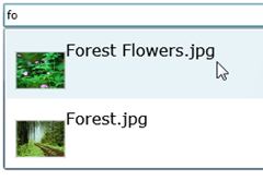
The AutoCompleteBox supports filtering auto complete data using Lambdas, exposes a rich set of properties and events and allows templates to be defined. Here’s an example of applying a custom template to the control’s ItemTemplate property to display pictures and text as the user types:
WrapPanel Control
The WrapPanel control is one of those controls that you’ll find yourself using frequently especially if you need to display a collection of objects in a user interface without resorting to a grid-style layout. Although the standard StackPanel built-into Silverlight 2 provides a way to display controls in a horizontal or vertical manner, any content that exceeds the bounds of the control will be clipped. This presents a problem with images or any other types of data that need to be wrapped rather than clipped. Although there are a few 3rd party WrapPanel controls floating around on the Web, the one available in the Silverlight Toolkit gets the job done quickly and efficiently. Here’s an example of using the WrapPanel control within an ItemsControl to define the parent container for images:
<ItemsControl x:Name="icPhotos" Grid.Row="1" VerticalAlignment="Top">
    <ItemsControl.ItemsPanel>
        <ItemsPanelTemplate>
            <controls:WrapPanel x:Name="wpImages" Margin="10" Orientation="Horizontal" VerticalAlignment="Top" />
        </ItemsPanelTemplate>
    </ItemsControl.ItemsPanel>
    <ItemsControl.ItemTemplate>
        <DataTemplate>
            <Rectangle Stroke="LightGray" Tag="{Binding Url}" Fill="{Binding ImageBrush}" StrokeThickness="2"
                       RadiusX="15" RadiusY="15" Margin="15"
                       Height="75" Width="75" Loaded="Rectangle_Loaded" MouseLeave="Rectangle_MouseLeave"
                      MouseEnter="Rectangle_MouseEnter"  MouseLeftButtonDown="rect_MouseLeftButtonDown">
                <Rectangle.RenderTransform>
                    <TransformGroup>
                        <ScaleTransform ScaleX="1" ScaleY="1" CenterX="37.5" CenterY="37.5" />
                    </TransformGroup>
                </Rectangle.RenderTransform>
            </Rectangle>
         </DataTemplate>
    </ItemsControl.ItemTemplate>
</ItemsControl>
An example of using the WrapPanel control to display a series of images in a “wrapped” manner is shown next:
TreeView Control
Nearly every time I’ve given a talk or taught a workshop on Silverlight 2 I’ve been asked if a TreeView control was available to use. I’ve always had to say “no” up until now since Silverlight 2 doesn’t ship with a TreeView control out of the box. That’s changed with the release of the Silverlight Toolkit since it does contain a TreeView control that can be used to display a hierarchy of data. The TreeView controls looks and acts much like any standard tree view that you’ve seen although it can be styled and customized just about anyway you’d like in Silverlight. An example of using the TreeView control is shown next:
<controls:TreeView Margin="5">
    <controls:TreeViewItem Header="ACME Corporation Employees">
        <controls:TreeViewItem Header="Mike James">
            <controls:TreeViewItem Header="Fred Stel" />
            <controls:TreeViewItem Header="Heedy Taft" />
            <controls:TreeViewItem Header="Seth Johnson" />
            <controls:TreeViewItem Header="Dan Williams" />
            <controls:TreeViewItem Header="Ted Thompson">
                <controls:TreeViewItem Header="Daine Rivers" />
                <controls:TreeViewItem Header="Gillian Pierson" />
            </controls:TreeViewItem>
        </controls:TreeViewItem>
    </controls:TreeViewItem>
</controls:TreeView>
Here’s what the TreeView looks like once rendered in Silverlight:
The sample code included in the Silverlight Toolkit also provides an example of binding a TreeView to an ObjectCollection instance (a new object also available in the toolkit) to display a hierarchy. Here’s what the ObjectCollection looks like. The Domain, Kingdom and other related elements are based on custom classes included in the toolkit samples. They can of course be substituted with your own data classes and built-up dynamically.
<controls:ObjectCollection x:Key="TreeOfLife" xmlns="http://schemas.microsoft.com/client/2007">
    <common:Domain Classification="Bacteria">
        <common:Kingdom Classification="Eubacteria" />
    </common:Domain>
    <common:Domain Classification="Archaea">
        <common:Kingdom Classification="Archaebacteria" />
    </common:Domain>
    <common:Domain Classification="Eukarya">
        <common:Kingdom Classification="Protista" />
        <common:Kingdom Classification="Fungi" />
        <common:Kingdom Classification="Plantae" />
        <common:Kingdom Classification="Animalia">
            <common:Phylum Classification="Arthropoda">
                <common:Class Classification="Insecta">
                    <common:Order Classification="Diptera">
                        <common:Family Classification="Drosophilidae">
                            <common:Genus Classification="Drosophila">
                                <common:Species Classification="D. melanogaster" />
                            </common:Genus>
                        </common:Family>
                    </common:Order>
                </common:Class>
            </common:Phylum>
            <common:Phylum Classification="Chordata">
                <common:Class Classification="Mammalia">
                    <common:Order Classification="Primates">
                        <common:Family Classification="Hominidae">
                            <common:Genus Classification="Homo">
                                <common:Species Classification="H. sapiens" />
                            </common:Genus>
                        </common:Family>
                    </common:Order>
                </common:Class>
            </common:Phylum>
            <common:Phylum Classification="Ctenophora" />
            <common:Phylum Classification="Porifera" />
            <common:Phylum Classification="Placozoa" />
        </common:Kingdom>
    </common:Domain>
</controls:ObjectCollection>
The TreeView can be bound to the TreeOfLife ObjectCollection using the TreeView’s ItemsSource property as shown next:
<controls:TreeView x:Name="tvTreeOfLife" Margin="5" ItemsSource="{StaticResource TreeOfLife}" >
    <controls:TreeView.ItemTemplate>
        <controls:HierarchicalDataTemplate ItemsSource="{Binding Subclasses}">
            <StackPanel>
                <TextBlock Text="{Binding Rank}" FontSize="8" FontStyle="Italic" Foreground="Gray" Margin="0 0 0 -5" />
                <TextBlock Text="{Binding Classification}" />
            </StackPanel>
        </controls:HierarchicalDataTemplate>
    </controls:TreeView.ItemTemplate>
</controls:TreeView>
Notice that the ItemsSource property is bound to the “TreeOfLife” key defined on the ObjectCollection and that each value in the tree view is generated by using a HierarchicalDataTemplate that binds to Rank and Classification properties and displays them using a StackPanel.
Here’s what the TreeView looks like once the different life classifications are rendered:
Chart Control
Charting is an important part of many applications. In the past developers have relied upon custom code, reporting solutions or 3rd party controls when they needed to embed different types of charts in applications. The Silverlight Toolkit includes a Chart control that can be used to display different types of data. It’s located in the Microsoft.Windows.Controls.DataVisualization assembly and Microsoft.Windows.Controls.DataVisualization.Charting namespace. By using it you can display line charts, pie charts, scatter charts, plus more. Here’s an example of defining a bar chart that binds to an ObjectCollection filled with PugetSound objects:
<charting:Chart Title="Typical Use">
    <charting:Chart.Series>
        <charting:ColumnSeries
            Title="Population"
            ItemsSource="{Binding PugetSound, Source={StaticResource City}}"
            IndependentValueBinding="{Binding Name}"
            DependentValueBinding="{Binding Population}"/>
    </charting:Chart.Series>
</charting:Chart>
The code that fills the ObjectCollection that is bound to the chart is shown next:
ObjectCollection pugetSound = new ObjectCollection();
                pugetSound.Add(new City { Name = "Bellevue", Population = 112344 });
                pugetSound.Add(new City { Name = "Issaquah", Population = 11212 });
                pugetSound.Add(new City { Name = "Redmond", Population = 46391 });
                pugetSound.Add(new City { Name = "Seattle", Population = 592800 });
The output generated by the chart is shown here:
An example of defining a pie chart that binds to the same data is shown next:
<charting:Chart Title="Typical Use">
    <charting:Chart.Series>
        <charting:PieSeries
            ItemsSource="{Binding PugetSound, Source={StaticResource City}}"
            IndependentValueBinding="{Binding Name}"
            DependentValueBinding="{Binding Population}"/>
    </charting:Chart.Series>
</charting:Chart>
Summary
The Silverlight Toolkit provides a lot of great controls that can be used in Silverlight 2 applications. In this post I highlighted a few of the new controls and showed how they can be used but there’s much more that can be done. Check back as I’ll be diving deeper into the controls in the near future.
Subscribe to my Free FlipBoard Magazines: | ||||
 |  |  |  |  |


