A Simple Bootstrap Radio Button for MVC
A Simple Bootstrap Radio Button for MVC
In a previous blog post I talked about a simple push button style of radio buttones. This sample push button style can be applied to radio buttons too. This style of button is very easy to do with just some built-in Bootstrap styles and a little extra CSS.
Simple Radio Button
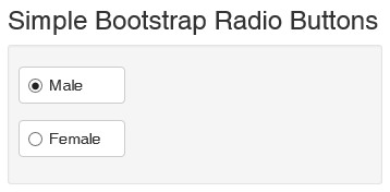
As a way to get a better looking radio button, you can wrap a radio button into a button as shown in Figure 1. What is nice about this style of radio button is it wraps the label together with the radio button. In addition, on a mobile device it is much easier to press as the whole button area is clickable.

Figure 1: Radio buttons wrapped into a button
To create these radio buttones you wrap the radio button within the normal Bootstrap class “checkbox”. You then add a label element with the classes “btn btn-default” around the radio button as shown in the following code:
@using (Html.BeginForm())
{
<div class="well well-sm">
<div class="form-group">
<div class="radio">
<label class="btn btn-default">
@Html.RadioButton("gender", "Male",
true, new { id = "IsMale" })
Male
</label>
</div>
</div>
<div class="form-group">
<div class="radio">
<label class="btn btn-default">
@Html.RadioButton("gender", "Female",
new { id = "IsFemale" })
Female
</label>
</div>
</div>
</div>
}
To make it appear correctly, you have to add the following CSS to align the radio button and the text correctly within the button. That is all there is to it!
<style>
.radio .btn,
.radio-inline .btn {
padding-left: 2em;
min-width: 7em;
}
.radio label,
.radio-inline label {
text-align: left;
}
</style>
Summary
Creating better looking controls for your web page is sometimes very simple and just involves combing a couple of elements together along with a tiny bit of CSS.
Past Blog Content
Blog Archive
-
2015
-
2014 (18)
-
2013 (11)
-
2012 (19)
-
2011 (29)
-
2010 (19)
-
2009 (28)
-
2008 (0)
-
2007 (14)
-
2006 (6)