Creating Radio Buttons using Bootstrap and MVC
As I previously published, the normal HTML check boxes and radio buttons just do not look good in bootstrap. Yes, bootstrap has a CSS class that will attempt to at least let render a radio button consistently across browsers, but it still is just the default HTML look. In addition, trying to hit a radio button on a mobile phone can sometimes be a little challenging.
In an MVC project we are doing for a client, they wanted the radio buttons to look more like buttons. Since we were already using bootstrap for this project we were able to create our own radio buttons using the “btn-group” class from bootstrap. Let’s walk through how we created these.
Normal Radio Buttons
As most of you know, creating normal radio buttons in MVC is easy to do with the Radio Button HTML helper class. The code below is what you write for creating standard HTML radio buttons in MVC:
@using (Html.BeginForm())
{
<div>
@Html.RadioButton("gender", "Male",
new { id="IsMale" }) Male
@Html.RadioButton("gender", "Female",
new { id = "IsFemale" }) Female
</div>
}
NOTE: You must add the new { id=”UNIQUE ID” } in order to have a unique ID, but the ‘name’ attribute should be the same for each radio button. In this way you get a group of radio buttons that are mutually exclusive.
Bootstrap Radio Buttons
Using bootstrap, add a <div> with a class of either “radio” or “radio-inline” around your radio buttons. You may optionally also add a <label> element around the radio button in order to use bootstrap’s styling of labels. If you use a label you will see a bolder font for the text of the radio button.
@using (Html.BeginForm())
{
<div class="form-group">
<div class="radio-inline">
@Html.RadioButton("gender", "Male", true,
new { id = "IsMale" }) Male
</div>
<div class="radio-inline">
@Html.RadioButton("gender", "Female",
new { id = "IsFemale" }) Female
</div>
</div>
}
Both of the above pieces of code will produce some output that looks like the radio buttons shown in Figure 1.
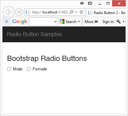
Figure 1: Normal HTML Radio Buttons
Use Button Groups
One of the classes that bootstrap supplies is “btn-group”. This class combined with the attribute data-toggle=”buttons” gives you the ability to create radio buttons that look like standard buttons but will toggle when pressed. What is nice about radio buttons expressed this way is you can really tell that the label is a part of the radio button. When you click on one of the buttons you will see it change color. A nice side benefit is these buttons are much easier to see and press on a mobile device.
@using (Html.BeginForm())
{
<div class="form-group">
<div class="btn-group" data-toggle="buttons">
<label class="btn btn-primary active">
@Html.RadioButton("gender", "Male", true,
new { id = "IsMale" }) Male
</label>
<label class="btn btn-primary">
@Html.RadioButton("gender", "Female",
new { id = "IsFemale" }) Female
</label>
</div>
</div>
}
Use the “active” class on one of the radio buttons in order to make it the “selected” button (see Figure 2).
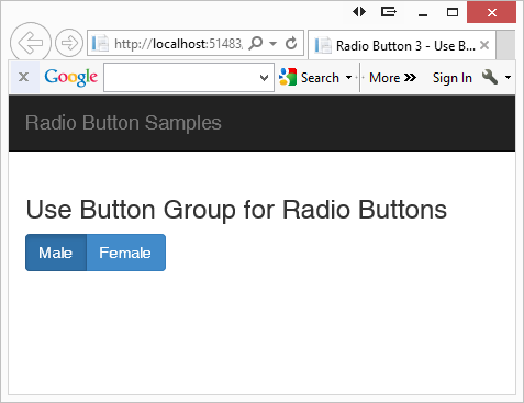
Figure 2: Radio buttons displayed as button groups.
Add Glyphs
Users are used to seeing a circle with a dot in it or an empty circle next to the label for radio button controls. So, you should add those into your design. Use the built-in glyphs in bootstrap to display a filled in circle or an empty circle. Below is the code to do this:
@using (Html.BeginForm())
{
<div class="form-group">
<div class="btn-group" data-toggle="buttons">
<label class="pdsa-radiobutton btn btn-primary active">
<span class="glyphicon glyphicon-record"></span>
@Html.RadioButton("gender", "Male", true,
new { id = "IsMale" }) Male
</label>
<label class="pdsa-radiobutton btn btn-primary">
<span class="glyphicon glyphicon-unchecked"></span>
@Html.RadioButton("gender", "Female",
new { id = "IsFemale" }) Female
</label>
</div>
</div>
}
Take a look at the “Male” radio button. There are two modifications to this radio button. First, you add the “active” class on the <label> element. This makes it a different color from the other radio button. You also change the glyph in the <span> element from “glyphicon-unchecked” to “glyphicon-record” to make it a circle within a circle.
NOTE: Feel free to use whatever icons you want. Font Awesome (www.fontawesome.io) has a lot of different CSS glyphs that you can use instead of the limited ones in bootstrap.
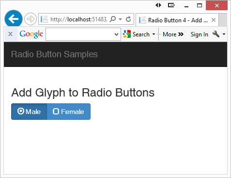
Figure 3: Add glyphs to make the buttons look more like radio buttons.
Change Glyphs Dynamically using jQuery
When the user clicks on a radio button you should toggle the glyph. Luckily when you click on the radio button, bootstrap takes care of toggling the “active” class on the <label> elements for you. All you need to do is to write some jQuery to toggle the glyphs. Below is the jQuery code you add at the bottom of the .cshtml MVC page to toggle the glyphs.
<script>
$(document).ready(function () {
$("#gender > .pdsa-radiobutton").on('click', function () {
pdsaToggleRadioButtons("#gender", $(this));
});
});
function pdsaToggleRadioButtons(groupName, current) {
// Find currently checked radio button in the group
var chk = $(groupName +
" .pdsa-radiobutton .glyphicon-record");
// Remove 'record' glyph
// Add 'unchecked' glyph
$(chk).removeClass('glyphicon-record')
.addClass('glyphicon-unchecked');
// Remove the 'unchecked' glyph, add the 'record' glyph
$(current).find(">:first-child")
.removeClass('glyphicon-unchecked');
$(current).find(">:first-child")
.addClass('glyphicon-record');
}
</script>
Remember that you may have more than one group of radio buttons, so for this sample I added an “id” attribute of “gender” to the <div> element that contains the “btn-group” class. In the jQuery function that connects to the click event on the radio buttons I pass in the id of the button group I want to affect.
I created a function called pdsaToggleRadioButtons that accepts two parameters. The first parameter is the id of the group of buttons I want to work within. The second parameter is the control that was just clicked.
The JavaScript function, pdsaToggleRadioButtons, is fairly straightforward. Locate the current button that has the class ‘glyphicon-record’ and remove that class. Add the class ‘glyphicon-unchecked’ to this button so it now appears unchecked to the user. Next, remove the class ‘glyphicon-unchecked’ from the currently selected button and add the class ‘glyphicon-record’ so it will appear checked to the user.
Summary
In this blog post you learned how to present radio buttons just a little differently. While it is not necessary to do this, I like the way these radio buttons look and feel. With just a little use of built-in bootstrap CSS and jQuery you can get something that looks a little different from the traditional web look.
Past Blog Content
Blog Archive
-
2015
-
2014 (18)
-
2013 (11)
-
2012 (19)
-
2011 (29)
-
2010 (19)
-
2009 (28)
-
2008 (0)
-
2007 (14)
-
2006 (6)