Additions on a Bootstrap Panel
Additions on a Bootstrap Panel
The Bootstrap panel classes allow you to create a bordered area on your web page. The panel classes give you a title area, a body area and a footer area. Most designers add buttons within the footer area to perform different actions on the information within the panel. Sometimes they add additional drop-downs or buttons within the body of the panel to reload the data or take action. While these work, sometimes you don’t want to take up that real estate with those actions. Instead you can use the title area of the panel for these additions. This blog post will show you how to accomplish this.
Add a Reload Button
The first example you will learn is how to add on a ‘reload’ button to the right-most area of the panel as seen in Figure 1.
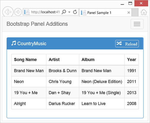
Figure 1: Add a Reload Button to the Panel’s Title area
To add this new button to the title, create an anchor tag within the <h1> or whatever HTML element you use for the panel title. I added a glyph from Bootstrap and the word “Reload” within this anchor tag. I then added one additional class called panel-right to that anchor tag as shown in the following code.
<div class="panel panel-primary">
<div class="panel-heading">
<h1 class="panel-title">
<span class="glyphicon glyphicon-music">
</span>
CountryMusic
<a href="#"
class="panel-right glyphicon glyphicon-random">
Reload
</a>
</h1>
</div>
<div class="panel-body">
// Other HTML here
</div>
</div>
The “panel-right” class is very simple and is responsible for the look and feel of the button on the right side of the panel. You first add a border around the button and modify the border radius. Add a margin-top to position the button in the correct location. Modify the padding and font-size as appropriate. Finally set the float to right so the button stays on the right side of the panel. Turn off all text-decoration on the anchor tag so you don’t get any underline on the button. All of the styles shown below will be placed into a .CSS file that you can then add to any page where you wish to use panel additions.
.panel-right {
border: 0.05em solid lightgray;
border-radius: 0.25em 0.25em;
margin-top: -0.2em;
padding: 0.3em;
font-size: 0.9em;
float: right;
}
.panel-title a,
.panel-title a:active,
.panel-title a:visited {
text-decoration: none;
}
Drop Down in Panel
Another example of an addition you could add to a panel would be a drop-down selector as shown in Figure 2.
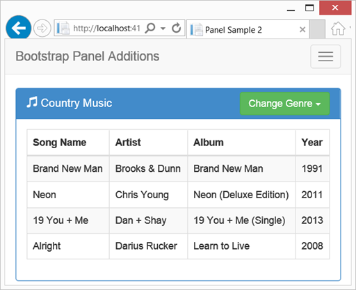
Figure 2: Adding a Drop-Down in the Panel Title Area
Adding a drop-down is a little different from a simple button as shown in the last example. You need a little more room within the panel-title so instead of an <h1> element use a <div>. This gives just a little more room within the panel-title. In addition you can’t nest a div tag within an h1, so we are forced to use this outer div element. Within the <div> element, place another <div> to contain the Bootstrap class ‘dropdown’ and the panel-right class. Create your normal drop-down button as shown in the example that follows:
<div class="panel panel-primary">
<div class="panel-heading">
<div class="panel-title">
<span class="glyphicon glyphicon-music">
</span>
<span id="genre">Country Music</span>
<div class="dropdown panel-right">
<button class="btn btn-success"
id="selectButton"
data-toggle="dropdown">
Change Genre
<span class="caret"></span>
</button>
<ul class="dropdown-menu" id="ulGenres">
<li><a href="#">Jazz</a></li>
<li><a href="#">Country</a></li>
<li><a href="#">Rock</a></li>
</ul>
</div>
</div>
</div>
<div class="panel-body">
// Other HTML here
</div>
</div>
The style you use for the panel-right is a little different from the previous example. You need a different margin-top and you need to turn off the border. So on this page you will include the .CSS file you created with the previous styles, then after this <link> you add the following styles to override the ones in the .CSS file.
<link href="~/Content/pdsa-panel-additions.css"
rel="stylesheet" />
<style>
.panel-right {
border: none;
margin-top: -0.65em;
}
</style>
When you select an item from the drop-down selector you should change the title on the panel. You can use a little jQuery code to accomplish this. Add the following script at the bottom of your page to modify the text within the panel title when the user clicks on an item in the drop-down selector.
<script>
$(document).ready(function () {
$("#ulGenres li a").on("click", function () {
var text = $(this).text();
$("#genre").text(text + ' Music');
});
});
</script>
Summary
In this blog post you learned how to add some additions to the Bootstrap panel classes. Using the right side of the panel is a great way to allow your user to perform actions within the panel without taking up valuable real estate within the panel itself.
Past Blog Content
Blog Archive
-
2015
-
2014 (18)
-
2013 (11)
-
2012 (19)
-
2011 (29)
-
2010 (19)
-
2009 (28)
-
2008 (0)
-
2007 (14)
-
2006 (6)