Displaying a Wait Message on an MVC Page
When a user clicks on a button on a web page, there can be a delay between posting back to the server and the next action that happens on the screen. The problem with this delay is the user may not know they actually clicked on the button and tries to hit the button again. It is important to give immediate feedback to the user so they know that the application is doing something. This post will show you how to disable the button, display a pop-up message and gray out the background before the post back happens thereby providing feedback to our user.
A Save Screen
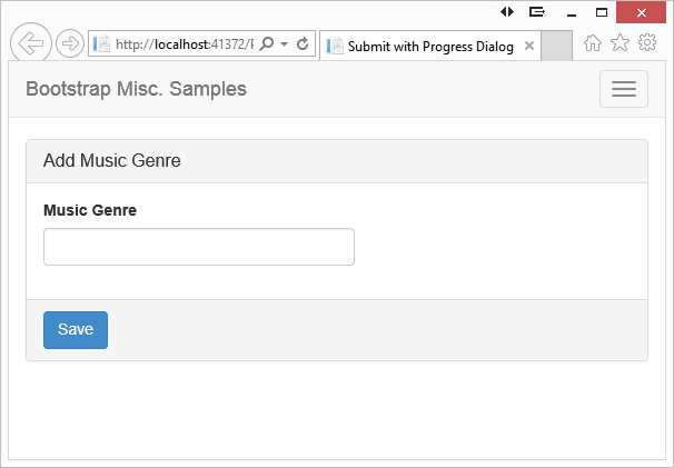
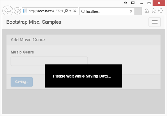
In Figure 1 is a screen where the user might fill in some data, then post that data back to the server to save in a database. When the user clicks on the Save button you will add the ‘disabled’ property to the button, change the text of the button, pop-up a message in the middle of the screen and gray out the background as shown in Figure 2.

Figure 1: A sample screen that will perform some processing.

Figure 2: Give the user feedback that something is happening.
Changing the Button on Click
The first step is to create a simple JavaScript function that can be called from the onclick event of the Save button.
<button type="submit"
id="submitButton"
class="btn btn-primary"
onclick="return
DisplayProgressMessage(this, 'Saving...');">
Save
</button>
The DisplayProgressMessage first has to add the ‘disabled’ property to the button, then change the text of the button from ‘Save’ to ‘Saving…’. Notice that you pass ‘this’ and the text ‘Saving…’ to the DisplayProgressMessage. Here is the first pass at our DisplayProgressMessage function:
<script>
function DisplayProgressMessage(ctl, msg) {
$(ctl).prop("disabled", true);
$(ctl).text(msg);
return true;
};
</script>
Add Pop-Up Message
Add a pop-up message by creating a <div> with a <label> in it. Within the label, place the text you wish to display. Add a CSS class called ‘submit-progress’ to style the pop-up message. Set this <div> as hidden so it won’t show up until you want it to.
<div class="submit-progress hidden">
<label>Please wait while Saving Data...</label>
</div>
Create the submit-progress style using a fixed position on the screen. You will set the top and left to 50% to place this <div> in the middle of the page. Set some padding, width and margins that are appropriate for the message you are displaying. Also select a background and foreground color.
.submit-progress {
position: fixed;
top: 50%;
left: 50%;
height: 6em;
padding-top: 2.3em;
/* The following rules are the ones most likely to change */
width: 20em;
/* Set 'margin-left' to a negative number
that is 1/2 of 'width' */
margin-left: -10em;
padding-left: 2.1em;
background-color: black;
color: white;
}
Now update the DisplayProgressMessage function to display this message when the button is clicked:
<script>
function DisplayProgressMessage(ctl, msg) {
$(ctl).prop("disabled", true).text(msg);
$(".submit-progress").removeClass("hidden");
return true;
};
</script>
Notice in the above code that I chained the setting of the disabled property and the setting of the text on the button. This is not absolutely necessary, but it is a little more efficient as the selector only needs to be called one time.
Gray Out the Background
To provide even more feedback to the user that something is happening when they click on the button, you might gray out the whole web page. This is accomplished by applying a background color of ‘lightgray’ and an opacity of 50% to the <body> element. To do this add a style to your page that you can add to the <body> using JavaScript.
<style>
.submit-progress-bg {
background-color: lightgray;
opacity: .5;
}
</style>
Change your DisplayProgressMessage to add this class to the <body> tag when the button is clicked.
<script>
function DisplayProgressMessage(ctl, msg) {
$(ctl).prop("disabled", true);
$(ctl).text(msg);
$(".submit-progress").removeClass("hidden");
$("body").addClass("submit-progress-bg");
return true;
};
</script>
Summary
In this blog post you saw how easy it is to add some feedback to your user when they are about to call a long operation on the server. It is important to provide the feedback so they don’t try to click on the same button again, or try to navigate somewhere else while you are finishing a process. I am sure you can expand upon the idea presented in this article and apply it to your specific use cases.
Past Blog Content
Blog Archive
-
2015
-
2014 (18)
-
2013 (11)
-
2012 (19)
-
2011 (29)
-
2010 (19)
-
2009 (28)
-
2008 (0)
-
2007 (14)
-
2006 (6)