Mobile enabled web apps with ASP.NET MVC 3 and jQuery Mobile
In my previous blog posts, I have demonstrated a simple web app using ASP.NET MVC 3 and EF Code First. In this post, I will be focus on making this application for mobile devices. A single web site will be used for both mobile browsers and desktop browsers. If users are accessing the web app from mobile browsers, users will be redirect to mobile specific pages and will get normal pages if users are accessing from desktop browsers. In this demo app, the mobile specific pages are maintained in an ASP.NET MVC Area named Mobile and mobile users will be redirect to MVC Area Mobile.
Let’s add a new area named Mobile to the ASP.NET MVC app.
For adding Area, right click the ASP.NET MVC project and
select Area from Add option. Our mobile specific pages using
jQuery Mobile will be maintained in the Mobile Area.
ASP.NET MVC Global filter for redirecting mobile visitors to Mobile area
Let’s add an ASP.NET MVC Global filter for redirecting mobile visitors to Mobile area. The below Global filter is taken from the sample app http://aspnetmobilesamples.codeplex.com/ created by the ASP.NET team. The below filer will redirect the Mobile visitors to an ASP.NET MVC Area Mobile.
- public class RedirectMobileDevicesToMobileAreaAttribute : AuthorizeAttribute
- {
- protected override bool AuthorizeCore(System.Web.HttpContextBase httpContext)
- {
- // Only redirect on the first request in a session
- if (!httpContext.Session.IsNewSession)
- return true;
- // Don't redirect non-mobile browsers
- if (!httpContext.Request.Browser.IsMobileDevice)
- return true;
- // Don't redirect requests for the Mobile area
- if (Regex.IsMatch(httpContext.Request.Url.PathAndQuery, "/Mobile($|/)"))
- return true;
- return false;
- }
- protected override void HandleUnauthorizedRequest(AuthorizationContext filterContext)
- {
- var redirectionRouteValues = GetRedirectionRouteValues(filterContext.RequestContext);
- filterContext.Result = new RedirectToRouteResult(redirectionRouteValues);
- }
- // Override this method if you want to customize the controller/action/parameters to which
- // mobile users would be redirected. This lets you redirect users to the mobile equivalent
- // of whatever resource they originally requested.
- protected virtual RouteValueDictionary GetRedirectionRouteValues(RequestContext requestContext)
- {
- return new RouteValueDictionary(new { area = "Mobile", controller = "Home", action = "Index" });
- }
- }
Let’s add the global filer
RedirectMobileDevicesToMobileAreaAttribute to the global
filter collection in the Application_Start() of
Global.asax.cs file
- GlobalFilters.Filters.Add(new RedirectMobileDevicesToMobileAreaAttribute(), 1);
Now your mobile visitors will be redirect to the
Mobile area. But the browser detection logic in the
RedirectMobileDevicesToMobileAreaAttribute filter will not
be working in some modern browsers and some conditions. But
the good news is that ASP.NET’s browser detection feature is
extensible and will be greatly working with the open source
framework
51Degrees.mobi. 51Degrees.mobi is a Browser Capabilities Provider that
will be working with ASP.NET’s Request.Browser and will
provide more accurate and detailed information. For more
details visit the documentation page at
http://51degrees.codeplex.com/documentation.
Let’s add a reference to 51Degrees.mobi library using NuGet
We can easily add the 51Degrees.mobi from NuGet and this will update the web.config for necessary configuartions.
Mobile Web App using jQuery Mobile Framework
jQuery Mobile Framework is built on top of jQuery that provides top-of-the-line JavaScript in a unified User Interface that works across the most-used smartphone web browsers and tablet form factors. It provides an easy way to develop user interfaces for mobile web apps. The current version of the framework is jQuery Mobile Alpha 3.We need to include the following files to use jQuery Mobile.
- The jQuery Mobile CSS file (jquery.mobile-1.0a3.min.css)
- The jQuery library (jquery-1.5.min.js)
- The jQuery Mobile library (jquery.mobile-1.0a3.min.js)
Let’s add the required jQuery files directly from jQuery CDN . You can download the files and host them on your own server.
jQuery Mobile page structure
The basic jQuery Mobile page structure is given below
<!DOCTYPE html>
<html>
<head>
<title>Page Title</title>
<link rel="stylesheet" href="http://code.jquery.com/mobile/1.0a3/jquery.mobile-1.0a1.min.css"
/>
<script src="http://code.jquery.com/jquery-1.5.min.js"></script>
<script src="http://code.jquery.com/mobile/1.0a3/jquery.mobile-1.0a3.min.js"></script>
</head>
<body>
<div data-role="page">
<div data-role="header">
<h1>Page
Title</h1>
</div>
<div data-role="content">
<p>Page
content goes here.</p>
</div>
<div data-role="footer">
<h4>Page
Footer</h4>
</div>
</div>
</body>
</html>
The data- attributes are the new feature of HTML5 so that jQuery Mobile will be working on browsers that supporting HTML 5. You can get a detailed browser support details from http://jquerymobile.com/gbs/ . In the Head section we have included the Core jQuery javascript file and jQuery Mobile Library and the core CSS Library for the UI Element Styling. These jQuery files are minified versions and will improve the performance of page load on Mobile Devices.
The jQuery Mobile pages are identified with an element with the data-role="page" attribute inside the <body> tag.
<div data-role="page">
</div>
Within the "page" container, any valid HTML markup can
be used, but for typical pages in jQuery Mobile, the
immediate children of a "page" are div element with
data-roles of "header", "content", and "footer".
<div data-role="page">
<div
data-role="header">...</div>
<div
data-role="content">...</div>
<div
data-role="footer">...</div>
</div>
The div data-role="content" holds the main content of
the HTML page and will be used for making user interaction
elements. The div data-role="header" is header part of the
page and div data-role="footer" is the footer part of the
page.
Creating Mobile specific pages in the Mobile Area
Let’s create Layout page for our Mobile area
- <!DOCTYPE html>
- <html>
- <head>
- <title>@ViewBag.Title</title>
- <link rel="stylesheet" href="http://code.jquery.com/mobile/1.0a3/jquery.mobile-1.0a3.min.css" />
- <script src="http://code.jquery.com/jquery-1.5.min.js"></script>
- <script src="http://code.jquery.com/mobile/1.0a3/jquery.mobile-1.0a3.min.js"></script>
- </head>
- <body>
- @RenderBody()
- </body>
- </html>
In the Layout page, I have given reference to jQuery
Mobile JavaScript files and the CSS file.
Let’s add an Index view page
Index.chtml
- @{
- ViewBag.Title = "Index";
- }
- <div data-role="page">
- <div data-role="header">
- <h1>Expense Tracker Mobile</h1>
- </div>
- <div data-role="content">
- <ul data-role="listview">
- <li>@Html.Partial("_LogOnPartial")</li>
- <li>@Html.ActionLink("Home", "Index", "Home")</li>
- <li>@Html.ActionLink("Category", "Index", "Category")</li>
- <li>@Html.ActionLink("Expense", "Index", "Expense")</li>
- </ul>
- </div>
- <div data-role="footer">
- Shiju Varghese | <a href="http://weblogs.asp.net/shijuvarghese">Blog
- </a> | <a href="http://twitter.com/shijucv">Twitter</a>
- </div>
- </div>
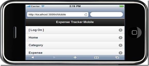
In the Index page, we have used data-role “listview” for showing our content as List View
Let’s create a data entry screen
create.cshtml
- @model MyFinance.Domain.Category
- @{
- ViewBag.Title = "Create Category";
- }
- <div data-role="page">
- <div data-role="header">
- <h1>Create Category</h1>
- @Html.ActionLink("Home", "Index","Home",null, new { @class = "ui-btn-right" })
- </div>
- <div data-role="content">
- @using (Html.BeginForm("Create","Category",FormMethod.Post))
- {
- <div data-role="fieldcontain">
- @Html.LabelFor(model => model.Name)
- @Html.EditorFor(model => model.Name)
- <div>
- @Html.ValidationMessageFor(m => m.Name)
- </div>
- </div>
- <div data-role="fieldcontain">
- @Html.LabelFor(model => model.Description)
- @Html.EditorFor(model => model.Description)
- </div>
- <div class="ui-body ui-body-b">
- <button type="submit" data-role="button" data-theme="b">Save</button>
- </div>
- }
- </div>
- </div>
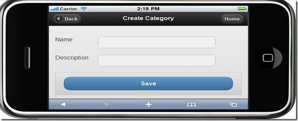
In jQuery Mobile, the form elements should be placed inside the data-role="fieldcontain"
The below screen shots show the pages rendered in mobile browser
Index Page
Create Page
Source Code
You can download
the source code from
http://efmvc.codeplex.com
Summary
We have created a single web app for desktop browsers and mobile browsers. If a user access the site from desktop browsers, users will get normal web pages and get mobile specific pages if users access from mobile browsers. If users are accessing the website from mobile devices, we will redirect to a ASP.NET MVC area Mobile. For redirecting to the Mobile area, we have used a Global filer for the redirection logic and used open source framework 51Degrees.mobi for the better support for mobile browser detection. In the Mobile area, we have created the pages using jQuery Mobile and users will get mobile friendly web pages. We can create great mobile web apps using ASP.NET MVC and jQuery Mobile Framework.


