Building my new blog with Orchard – Part 3: one way to skin a cat
 These last few weeks I’ve been refraining from starting any deep work on my new Orchard-powered blog because most of what I had in mind involved widgets, which are being built right now. Version 0.8 is just around the corner: the team is just putting the final touches to the new theme engine and to the widget system.
In the meantime, there is still some work I could do that I knew would not be throw-away, and that is CSS.
My objectives with this new blog is to reflect in design what the content is about and what it is not about. VuLu is about knowledge, science, art and philosophy. It’s not about shiny gadgets, technology or engineering.
That of course means I want nothing web 2.0 in here. Good thing as I don’t have much love for rounded corners and shiny gradients.
Seriously, I'm not a designer so I had to go for something simple to set-up and maintain, but it comes as a welcome coincidence that the designs I've been liking lately have been heavy on typography with an emphasis on imperfection and organic looks.
But I wanted something even more radical than this, something that would look more like a book than like a web site. Preferably even like an old science book. The Dollar Dreadful web site is a pretty good example of what I had in mind, although it looks more like a wild west newspaper than a science book. The monochromatic, ancient look and reliance on typography are all there though: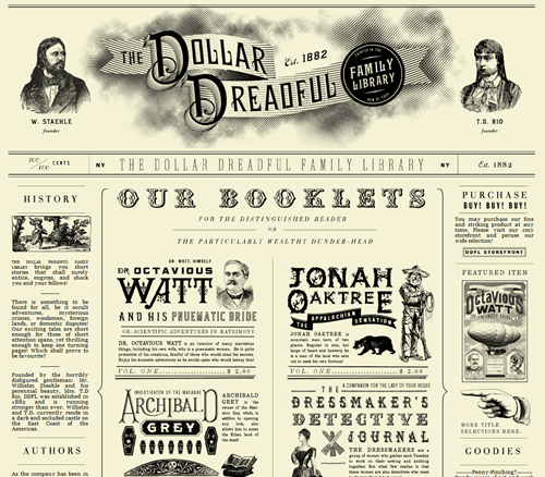
I started from Jon Wall’s Classic white theme for Orchard, which is extremely simple and typography-based: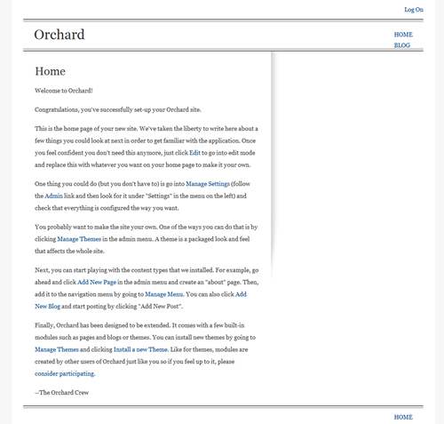
I wanted the markup to remain the same so that I could switch to the new version of the Classic theme when it’s available and also because it’s rather clean to begin with. The only adjustments I wanted to make for the moment were to the style sheet and images. More precisely, I wanted to change the typo.
Typography has not got enough love from web designers, mainly because their options were fairly limited so far. In the last few years though things have started to look a lot better and including font beyond the boring Times, Arial and Courier we were forced to use before is now possible with little effort. And it even works on old versions of IE.
There are many options, such as typekit.com, that recently got lots of high quality fonts added by Adobe, but that’s not a completely free option and it so happened that I found exactly what I wanted on Google’s Font Directory. I went for two imperfect and ancient-looking fonts: OFL Sorts Mill Goudy TT for the text, and IM Fell English SC for the titles.
I am particularly fond of IM Fell English SC, which has a very pirate-y look.
Adding the fonts to the site was extremely simple and was done pretty much the way you’d expect it, in the style sheet:
body {
    font: normal 62.5% "OFL Sorts Mill Goudy TT", serif;
    height: 100%;
    text-align:left;
    color:#444;
    background:#eee;
}

h1,h2,h3,h4,h5,h6,legend {
    font-family: "IM Fell English SC", sans-serif;
}
I did have to include Google’s font bootstrapping library to my theme’s document.aspx:
<script type="text/javascript">
  WebFontConfig= {
    google: {
      families: [
        'IM Fell English SC',
        'OFL Sorts Mill Goudy TT'
      ]
    }
  };
</script>
<script type="text/javascript"
src="http://ajax.googleapis.com/ajax/libs/webfont/1/webfont.js">
</script>
All I needed to do was to declare the Google fonts I intended to use in a small parameter object, then include a small library.
The rest of the changes to the original stylesheet were mainly size adjustments for the new fonts and removing all color to leave only shades of gray, nearly blacks and nearly whites.
In all of my blog posts, I try to include an illustration in order to make the post more appealing. On this blog, I’ve been using mostly my own photography but that wasn’t an option on the new blog because of the black and white parti-pris. After some binging, I did find quite a lot of public domain illustrations coming from old science books that were exactly appropriate for the site. In particular, Gray’s anatomy and http://www.oldbookillustrations.com/ are gold mines if you’re into that sort of delightful old-fashioned gravures.
In the end, I’m quite happy with the end result and how it looks on post pages, although it’s still a little too austere on the home page because of the lack of illustrations and widgets. This will improve soon.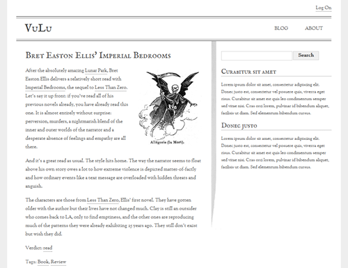
You can find the first two posts in this series here:


