Ellipses (…) In UI Command Text
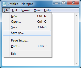
Some times, command text is followed by ellipsis (…) or not:

For years, many developers told me that ellipses mean a new window or dialog will pop up. For example, here:
- Clicking New / Save / Exit will not pop up new window or dialog;
- Clicking Open… / Save As… / Page Setup… / Print… will pop up new window or dialog.
But this is not correct. Take a look at About Notepad.
Recently, someone argues about this old topic again. I think it is time to copy something from latest Windows User Experience Interaction Guidelines, and save to my blog. So next time when some other people are confused, I can just send a link to them.
Page 10, Top Guidelines Violations:
Ellipses mean incompleteness. Use ellipses in UI text as follows:
- Commands. Indicate that a command needs additional information. Don’t use an ellipsis whenever an action displays another window—only when additional information is required. Commands whose implicit verb is to show another window don’t take an ellipsis, such as Advanced, Help, Options, Properties, or Settings.
Page 236, Menus:
Using ellipses
While menu commands are used for immediate actions, more information might be needed to perform the action. Indicate a command that needs additional information (including a confirmation) by adding an ellipsis at the end of the label.

In this example, the Print... command displays a Print dialog box to gather more information.
Proper use of ellipses is important to indicate that users can make further choices before performing the action, or even cancel the action entirely. The visual cue offered by an ellipsis allows users to explore your software without fear.
This doesn’t mean you should use an ellipsis whenever an action displays another window—only when additional information is required to perform the action. For example, the commands About, Advanced, Help, Options, Properties, and Settings must display another window when clicked, but don’t require additional information from the user. Therefore they don’t need ellipses.
In case of ambiguity (for example, the command label lacks a verb), decide based on the most likely user action. If simply viewing the window is a common action, don’t use an ellipsis.
Correct:
More colors...
Version informationIn the first example, users are most likely going to choose a color, so using an ellipses is correct. In the second example, users are most likely going to view the version information, making ellipses unnecessary.
Note: When determining if a menu command needs an ellipsis, don’t use the need to elevate privileges as a factor. Elevation isn’t information needed to perform a command (rather, it’s for permission) and the need to elevate is indicated with the security shield.
Labels
There are similar description in the other sections, like Buttons, Toolbars, etc.