Archives
-
WPF: How to (Maybe) Prevent the Text of a Time Display from Jiggling Around
Imagine you want to develop a time display that is updated in quick succession, e.g., the timecode during media playback. One unexpected problem that you may run into, depending on the typeface you use, is that the time display shifts to the left or right after updates.
Why you may not notice it at first
When you create a WPF application and do not specify the
FontFamily, text output uses the system font of your operating system. The default is “Segoe UI”, a typeface where all digits take up the same space: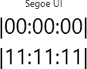
If you change to, e.g., the “Impact” typeface (
FontFamily="Impact"), the digit “1” takes up less space than, e.g., a “0”:
Granted, a time display usually does not jump from “00:00:00” straight to “11:11:11”. But even if just one digit changes, the different width is still noticeable:

For “Impact”, the digits “1” and “7” take up the same space, “2” and “4” are different, and “0”, “3” as well as “5” to “9” have the same width. So from “0” to “5”, the width changes every second, creating the visual effect of the time display “jiggling” left and right.
What to do
The
Typographyclass provides access to various OpenType typography properties. The propertyTypography.NumeralAlignmentis intended to control the alignment of digits (note the choice of the word “intended”, more on that later).If you set
Typography.NumeralAlignment="Tabular"on aTextBlockor aRun, all digits take up the same width:
Note how the glyph of the “1” does not change, it is just laid out differently.
In contrast, the typeface “Bahnschrift” (introduced with Windows 10 version 1704) actually changes the glyph:
Default:
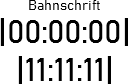
Tabular:
What about the “Maybe” in the title?
Unfortunately, not all fonts support modifying the numeral alignment. Text set in “Arial”, for instance, is not affected by setting
Typography.NumeralAlignment="Tabular":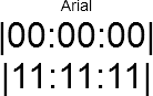
In general, setting the numeral alignment does not hurt, but if you want to be certain, you obviously have to try it out.
Here are the results of testing fonts that come with Windows and that have different widths for digits:
- “Tabular” does work for:
- Candara
- Comic Sans MS
- Constantia
- Corbel
- Impact
- “Tabular” does not work for:
- Arial
- Gabriola
- Georgia
Links
- Code used for creating the screenshots: https://github.com/RWeigelt/WpfNumeralAlignmentDemo
- Microsoft documentation: https://learn.microsoft.com/en-us/dotnet/api/system.windows.documents.typography.numeralalignment