HTML/CSS: How to (Maybe) Prevent the Text of a Time Display from Jiggling Around, Part 2
In my previous blog post, I described how to deal with text output of time codes (e.g., hours:minutes:seconds) in Windows Presentation Foundation (WPF) when using a font where not all digits take up the same space.
This article is a short follow-up on how to solve this issue in HTML/CSS.
What to do in CSS
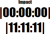
Here is the default behavior for the “Impact” typeface:

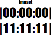
After setting
font-variant-numeric: tabular-nums; in CSS, the
result is

Why the “Maybe” in the title?
Not all fonts actually support the feature; for more information, see the WPF version of the article.
Links
- WPF Article: https://weblogs.asp.net/rweigelt/wpf-how-to-maybe-prevent-the-text-of-a-time-display-from-jiggling-around
- HTML/CSS demo: https://github.com/RWeigelt/CssFontVariantNumeric
- Documentation on mozilla.org: https://developer.mozilla.org/en-US/docs/Web/CSS/font-variant-numeric