Contents tagged with User Interface
-
Goodbye Ribbon–Going Full Screen Metro Style with SharePoint
Having some fun with a previous post I did about generating a Metro-style menu from a Custom List in SharePoint for the purpose of building something like an Application Directory. It’s a great navigation system and by adding something like Live Tiles (that pulls information from each site) via JavaScript it can be an informative dashboard rather than a pretty menu. You can read the previous write-up I did on this here.
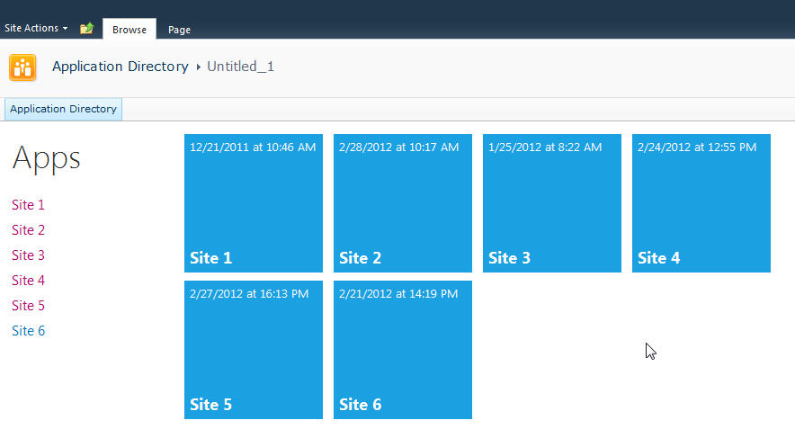
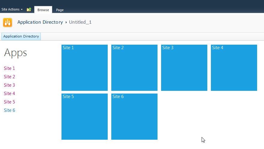
Here’s what my Application Directory looks like:

Nice, but all that SharePoint chrome isn’t needed for the purpose of navigating the directory.
The answer is simple. Just a few CSS styles you override to hide everything.
Here’s the CSS markup you need:
And here’s the result:

Nice and clean.
If your admins need to get to the underlying system pages just navigate to “/_layouts/viewlsts.aspx” and they can navigate around normally from there. You could also create a link on the main page for that, even wrap it in a security token so only admins can see it!
I have a blog post in the works on turning those pretty Metro icons into Live Tiles with data from the subsites, but that’s for another day.
Until then, enjoy!
-
What If Mad Men Landed the Microsoft Advertising Contract?
Back in the day, Marvel had a wonderful comic book series. It was called What If and featured titles like What If Spider-Man Joined the Fantastic Four, What If Captain America Became President, and What If Conan the Barbarian Walked The Earth Today?

Here’s some Sunday afternoon Photoshop fun and my What If version of Mad Men doing the advertising for Microsoft products.


Enjoy!
-
Metro Style Site Directory for SharePoint Using EMCAScript
I’ve always been trying to come up with a useful and clever way to allow users to navigate around SharePoint sites. Recently I put together an “Application Directory” which basically displayed a menu system to navigate around apps. Using the JavaScript Class Library for SharePoint to pull values out of SharePoint I quickly put together something that normally would be a lot of C# code and a web part.
The EMCAScript object model is powerful in that you can quickly pull data out of SharePoint sites and lists and make a pleasant user experience with just a little JavaScript, CSS, HTML, and jQuery. It still will make a call back to the server to fetch the data but it’s done asynchronously so the perception to the user is almost seamless.
This post walks you through building a site directory of sorts. It could be used as a landing page on a top level site collection or as a web part sitting on a team site (to show the contents below the site). It’s up to you but the net result is a nice navigation system (done with a little “Metro” styling) all done in a hundred lines of JavaScript.
Here’s what we’re building:
Let’s start with the simplest thing possible. A script that we’ll insert into the page using the Content Editor Web Part via a Content Link. This is my preferred way of doing lightweight adds to SharePoint (like JavaScript or even just raw HTML). The Content Link points to a file in my SiteAssets library in the site and since it’s a link it just gobbles up the content and serves it up. If you try adding HTML to a Content Editor Web Part you’ll find a nice message after saving “Your HTML may have been modified”.
WTF?
Yeah, SharePoint deliciously will go in after you save your nicely formatted content and do some neat things like rename your CSS entities. Oh yeah, it’ll also strip away your JavaScript if it doesn’t like it.
Trust me. Just include the file and you’ll be much better off in the end. Having the file located in the SiteAssets library also lets me just crack it open in SharePoint Designer and while the editor isn’t the greatest, it does give you some Intellisense but the real advantage is saving it in SPD then hitting refresh on your page to see the effect. The file will contain the CSS, JavaScript, and HTML markup. I like putting everything together so I don’t have to worry about files all over my system but you can just as easily use multiple files if you want.
Alright, back to business. Create a new file in your SiteAssets library (you get a SiteAssets library when you create a new site regardless of what template you use or what feature you activate, it’s always there and accessible through SharePoint Designer).
Name the file SiteDirectory.js or something. Doesn’t really matter and you can call it ISavedTheWorldUsingPork.HowAboutThat if you want, but leaving it with a .js extension will give you some semblance of Intellisense inside of SPD.
Drop a Content Editor Web Part on the home page of your site (or wherever you want to put this). This could be a Wiki Page (the Home.aspx page is a wiki page if you activate the Wiki Home Page Feature on a site) or a Web Part Page. There are a few small tweaks you should do depending on what type of page you put this on but just adjust the CSS we’ll be building as you see fit.
Starting simple we're going to just enumerate the child sites and display them in an unordered list. The list is easy to style and works well with jQuery later to be able to animate or attach plugins to.
Here’s the initial code that we’ll put into the SiteDirectory.js file:
Like I said, all this is doing is a) enumerating through the list of subsites then b) spitting them out into an unordered list. Here’s a breakdown of how this works:
Line 1-2: We’ll include some CSS styles here later
Line 4: We include jQuery so we can a) make it easy to replace elements on the page and b) support plugins later. You can choose to use pure JavaScript or omit this if your site already includes jQuery.
Line 8: We declare a variable we’re going to use to hold the list of sites
Line 10: We wait until the core JavaScript files are loaded by SharePoint. This ensures the ClientContext is setup for us when we need it.
Line 12-23: This is the function that calls the Client Object Model to get our web then get the subwebs for the current user. Finally on lines 19-21 we execute the call (which is where we talk to the server) and define the success and failed methods.
Line 25-46: We define the success function to call with our list of subwebs. Here we’re getting an enumerator to the web collection and iterating through them, grabbing the url and title of the site then creating our unordered list using regular HTML markup. Finally on line 45 we find the DIV tag we’re replacing and substitute the HTML we just created.
Line 55-57: This is the HTML markup we’re going to replace in our JavaScript. We initially set the text to “Loading…” so users will see this when the page loads then *magically* it’ll get replaced with our content.
Here’s the result:
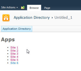
Looks good and lets us know we’re on the right track. If there are any failures you’ll see them here because our failed function will get called and output the error message. This could be anything from a JavaScript error to not calling a known method. Also note that this is already security trimmed since we’re using the getSubwebsForCurrentUser method so we’ll only see sites the user has access to.
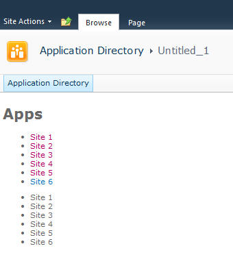
Let’s add another list and DIV tag so we have two lists to use:
Not much to explain here, just added a new DIV tag and built up the HTML just like the original. Now we have two unordered lists. We also wrapped up each list in its own DIV tag.
Now we’ll do some simple styling by floating the list of sites down the left hand side and the second list on the right and applying a little styling to the text.
Here’s the updated output:
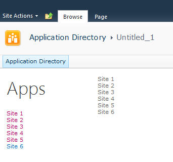
Now it’s starting to look like our target. Let’s style the menu list with a larger font. We’ll also just make one line of code change in our markup in the onSuccess method. Find the line that says menuNavContent += ‘<ul>’ and change it to read menuNavContent += ‘<ul class=”apps”>’. This will style just the unordered list of items on the left.
Here are the new styles to add to the CSS
Now that we have the list done lets focus on the second list which will form our tiles. They’re not as live and vibrant as they could be but they do show some metadata from the site so are at least a little more informative than just navigation boxes.
First we’ll apply some styles to the list to make them into boxes and space them apart. It’s just CSS markup here to add and a couple of small changes in the construction of the HTML for the second list.
We’re just adding some new styles here. There’s a class called theme_blue set to the Metro blue (#1ba1e2) which we set as the background colour for each tile. In addition we set the entire tile to be clickable to the same url as the site. This lets the user click anywhere on the tile (or the list one the left) to launch the site rather than having to click on the title.
Here’s the updated output.
Now that we have our tiles we can add some dynamic metadata to them. This will be pulled from the website itself and give us a navigation system that’s more information than just links.
We wrap the title in a DIV tag with a class of tileTitle which lets us style it to place it at the bottom of the tile and give it a larger font. You do need to be careful of the length of the titles of your sites as this doesn’t work for all scenarios but just adjust it to fit your needs.
We also pull the last modified item date from the web properties. Every site tracks whatever the last item that was modified is and holds onto the date for that item. So now users can see when some content on the site was last changed.
Also we parse out the date from SharePoint into a JavaScript Date object and build a formatted date to display on the tile.
The final image:
That’s it! You now have a single script that you can just drop onto any site to create a Metro style navigation to the subsites. New sites can be added and will automatically show up and users can see when the content on the site was last modified and be able to click on the site to visit it.
Here’s the full source code for the page for you play with.
Remember, this is just a start. There are some fun things you can do with this. For example create custom styles for different colours (for example blue for team sites, red for wikis, etc.) and style them accordingly. Other ideas are to pull other data from the site like description, etc. and put that on a bigger tile. Enumerate the number of subsites in a site and display that. There are other properties you can access off the Web object like if RSS is enabled, etc. so you might want to display different icons on the tile to reflect that. The list of properties on the SP.Web class can be found here.
If you’re following the “Metro” style then remember to keep the UI light and simple. Content over chrome. You don’t want to be dumping all kinds of information here, just enough that your users need to make it useful.
Enjoy!
-
Adopting the Metro Style for Line of Business Apps
Here are some thoughts around adoption the new Metro style look and feel for line of business applications (LOB) in your organization.
I am not a UX expert (is anyone?) but I think I know what looks and feels right and I strive to try to include that in every solution I build. Metro introduces us to some new concepts and as Jensen Harris pointed out, it isn’t just recompiling your app on WinRT. You have to re-imagine it and think about how it’s organized, how users will interact with it, and do some trimming of the fat so to speak as you move into the Metro world.
Good design practices still apply here. Appropriate use of whitespace, good layout, clear typography, and consistent UI patterns make a big difference so remember these and use them. A UI checklist might be in order for any app, not just Metro ones. I’ll state this from my experience. Very few business users know what they need and most can’t visualize past what they already have. Know this and learn to adapt from this perspective and I think you’ll go farther with the success factor with your users. Far too many times users are stuck with what they have, perhaps a spreadsheet-like application (where the one and only screen is 8000 rows of data and 300 columns). Anything you present to them, no matter how effective, is just shadowed by that grid in their mind.
I’m a strong advocate of the task oriented UI and think it works. Try to keep this in mind when designing the system and don’t let your user try to do 80 things at once on the same screen. You’ll just run around like a chicken with your head cut off trying to cater to everyone and in the end deliver a mediocre product that works for all cases rather than separate UX instances that are stellar for each situation.
Metro is different. It forces you to think about your application in a different manner. No longer are you trying to get tree view feeding items into list view feeding details into file view. There are still groups and collection of groups and all that but remember your UI now is a functional, breathing, living thing. Minimalism is best here so you want to get out as much information in as effective space as possible. As Microsoft pointed out, a live tile isn’t something you should be posting every detail to. It’s an extension of the application so treat it as a first class citizen, not a UI element that needs to be pretty.
Lists should contain just the right amount of information. Again, go back to your users and push them. Try not to take the route of “What do you need” but rather provide them with a solution that accomplishes the goal they’re aiming for (of course that means you need to establish a goal first). If they’re coming from a giant screen of data saying “We need *this*” then push them to answer what they use it for. What goal are they trying to accomplish? Are they trying to summarize information or are they looking for something (e.g. show me all the users with more than 10GB of storage). If they have a goal, key in on it and that might become the basis of a UI workflow.
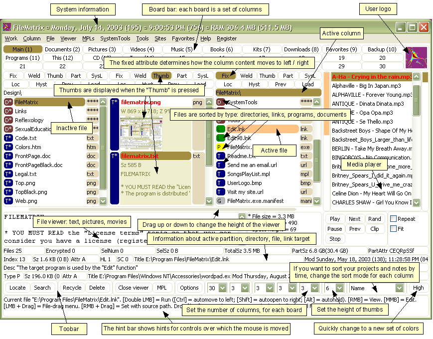
Again keep the focus on the goal. You don’t want this thing to get out of hand or you’ll end up with a Frankenstein monster of a UI like this:
Take them by the hand and show them. Lead by example and show them what is possible. Giving them design documents might not be enough and don’t describe things like “Imagine this window over here with a list of things…”. You’ll probably be met with the deer in the headlight look. You might be thinking that Metro isn’t right for this app and perhaps you’re right. Don’t assume that you *have* to build a new UI in Metro just because it’s there. Photoshop isn’t going to be a Metro app (ever, at least I hope) but your LOB app might. You need to be sure you’re doing the right thing and don’t try to fit a square peg into a non-existent hole. LOB apps *can* be great looking and useful. I highly recommend you check out Billy Hollis’ screencast he did on LOB apps with WPF. While it’s not Metro, it does show that LOB apps can be great looking and functional. A lot of great tips from Billys talk.
Build something. Even if you sit with them in a whiteboard session and draw pictures on the screen it’ll help. Build up the UI using something like Basalmiq is great and easy for them to see quickly. Visio is just too mechanical to fiddle around with and your users will quickly loose interest. Rapid feedback wins over here but then take that back to the development environment and build it. The next day show them it in action on the real website or desktop you’re building it for.
There’s a danger here that I’ve seen of the “It’s done” syndrome. Users will see a mock-up in a website and think that all the work is done. It isn’t so temper your system with that and read your users. Find out if they really believe it’s just some if/then/else statements you have to do to make it work. I would opt to not call this “prototype” or “mockup”. I prefer to call it the working software. It’s what they’ll use in the production release and it’ll just evolve as they provide feedback, new elements are added, and parts of the system become functionally complete.
Look for some re-imaging of “Classic” apps into Metro ones soon as I’m planning on doing a few blog posts about this.
Many thanks to @colinbowern for some great tips on Twitter.


