Archives
-
Using the Builder Pattern To Create SharePoint Lists
In building out a custom solution I get tired of writing procedural code to create a list, add the columns, setup the views, and add some initial data. Many moons ago I decided to follow a creational design pattern called the Builder pattern. This pattern separates the construction of a complex object from it’s representation so that the same process can create different representations. Basically, let’s build a bunch of custom lists using OO instead of repetitive procedural-like code. Here’s how.
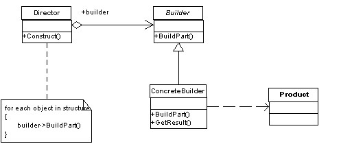
First let’s take a look at the Builder pattern. Here it in UML form for visual dudes:
Pretty straight forward. The principle here is that all concrete objects will adhere to a contract (the Builder) and implement the specific way they need to build things while the Director handles the correct sequence of object creation.
This suites Lists pretty nicely in SharePoint. A list needs to be created via the SPWeb it lives in, it needs fields added to it, views setup, and items added to the finished list.
Okay, time for some code.
First here’s our abstract ListBuilder. All implementations of creating a new list will inherit from this. It provides abstract methods that make up all the parts of a list (fields, views, items, and the list itself).
public abstract class ListBuilder
<pre style='margin: 0em; padding: 0px; width: 100%; text-align: left; color: black; line-height: 12pt; overflow: visible; font-family: "Courier New", courier, monospace; font-size: 8pt; direction: ltr; background-color: rgb(244, 244, 244);'>{</pre><pre style='margin: 0em; padding: 0px; width: 100%; text-align: left; color: black; line-height: 12pt; overflow: visible; font-family: "Courier New", courier, monospace; font-size: 8pt; direction: ltr; background-color: white;'> <span style="color: rgb(0, 0, 255);">protected</span> SPList TheList {get; set;}</pre><pre style='margin: 0em; padding: 0px; width: 100%; text-align: left; color: black; line-height: 12pt; overflow: visible; font-family: "Courier New", courier, monospace; font-size: 8pt; direction: ltr; background-color: rgb(244, 244, 244);'> <span style="color: rgb(0, 0, 255);">public</span> <span style="color: rgb(0, 0, 255);">abstract</span> <span style="color: rgb(0, 0, 255);">void</span> CreateList(SPWeb web);</pre><pre style='margin: 0em; padding: 0px; width: 100%; text-align: left; color: black; line-height: 12pt; overflow: visible; font-family: "Courier New", courier, monospace; font-size: 8pt; direction: ltr; background-color: white;'> <span style="color: rgb(0, 0, 255);">public</span> <span style="color: rgb(0, 0, 255);">abstract</span> <span style="color: rgb(0, 0, 255);">void</span> CreateFields();</pre><pre style='margin: 0em; padding: 0px; width: 100%; text-align: left; color: black; line-height: 12pt; overflow: visible; font-family: "Courier New", courier, monospace; font-size: 8pt; direction: ltr; background-color: rgb(244, 244, 244);'> <span style="color: rgb(0, 0, 255);">public</span> <span style="color: rgb(0, 0, 255);">abstract</span> <span style="color: rgb(0, 0, 255);">void</span> CreateViews();</pre><pre style='margin: 0em; padding: 0px; width: 100%; text-align: left; color: black; line-height: 12pt; overflow: visible; font-family: "Courier New", courier, monospace; font-size: 8pt; direction: ltr; background-color: white;'> <span style="color: rgb(0, 0, 255);">public</span> <span style="color: rgb(0, 0, 255);">abstract</span> <span style="color: rgb(0, 0, 255);">void</span> AddInitialData();</pre><pre style='margin: 0em; padding: 0px; width: 100%; text-align: left; color: black; line-height: 12pt; overflow: visible; font-family: "Courier New", courier, monospace; font-size: 8pt; direction: ltr; background-color: rgb(244, 244, 244);'> <span style="color: rgb(0, 0, 255);">public</span> <span style="color: rgb(0, 0, 255);">abstract</span> <span style="color: rgb(0, 0, 255);">void</span> DeleteList(SPWeb web);</pre><pre style='margin: 0em; padding: 0px; width: 100%; text-align: left; color: black; line-height: 12pt; overflow: visible; font-family: "Courier New", courier, monospace; font-size: 8pt; direction: ltr; background-color: white;'>}</pre>Pretty basic stuff. We have methods to create and delete the list (which requires the SPWeb object it belongs to) and there’s methods for creating fields and views and adding some initial data (for example if you have a lookup list you’re creating and you want to seed it with some initial values).
There’s also a protected property called TheList which holds an instance of the list created. This is for adding fields and views later in the construction process. P.S. Personally I hate the property name “TheList” but “List” gets all confused with System.Generic.List types and SPList is already a SharePoint type so to avoid conflicts I picked this. I’m also lazy and didn’t want to call it SharePointList or something. Feel free to make it whatever you want.
Now that we have our abstract ListBuilder let’s create the ListDirector. This class will handle building the list by orchestrating the assembly of the pieces. It also provides outside access to create and delete the lists (which we’ll call from our feature activating/deactivating).
public class ListDirector
<pre style='margin: 0em; padding: 0px; width: 100%; text-align: left; color: black; line-height: 12pt; overflow: visible; font-family: "Courier New", courier, monospace; font-size: 8pt; direction: ltr; background-color: rgb(244, 244, 244);'>{</pre><pre style='margin: 0em; padding: 0px; width: 100%; text-align: left; color: black; line-height: 12pt; overflow: visible; font-family: "Courier New", courier, monospace; font-size: 8pt; direction: ltr; background-color: white;'> <span style="color: rgb(0, 0, 255);">private</span> <span style="color: rgb(0, 0, 255);">readonly</span> SPWeb _web;</pre><pre style='margin: 0em; padding: 0px; width: 100%; text-align: left; color: black; line-height: 12pt; overflow: visible; font-family: "Courier New", courier, monospace; font-size: 8pt; direction: ltr; background-color: rgb(244, 244, 244);'> </pre><pre style='margin: 0em; padding: 0px; width: 100%; text-align: left; color: black; line-height: 12pt; overflow: visible; font-family: "Courier New", courier, monospace; font-size: 8pt; direction: ltr; background-color: white;'> <span style="color: rgb(0, 0, 255);">public</span> ListDirector(SPWeb web)</pre><pre style='margin: 0em; padding: 0px; width: 100%; text-align: left; color: black; line-height: 12pt; overflow: visible; font-family: "Courier New", courier, monospace; font-size: 8pt; direction: ltr; background-color: rgb(244, 244, 244);'> {</pre><pre style='margin: 0em; padding: 0px; width: 100%; text-align: left; color: black; line-height: 12pt; overflow: visible; font-family: "Courier New", courier, monospace; font-size: 8pt; direction: ltr; background-color: white;'> _web = web;</pre><pre style='margin: 0em; padding: 0px; width: 100%; text-align: left; color: black; line-height: 12pt; overflow: visible; font-family: "Courier New", courier, monospace; font-size: 8pt; direction: ltr; background-color: rgb(244, 244, 244);'> }</pre><pre style='margin: 0em; padding: 0px; width: 100%; text-align: left; color: black; line-height: 12pt; overflow: visible; font-family: "Courier New", courier, monospace; font-size: 8pt; direction: ltr; background-color: white;'> </pre><pre style='margin: 0em; padding: 0px; width: 100%; text-align: left; color: black; line-height: 12pt; overflow: visible; font-family: "Courier New", courier, monospace; font-size: 8pt; direction: ltr; background-color: rgb(244, 244, 244);'> <span style="color: rgb(0, 0, 255);">public</span> <span style="color: rgb(0, 0, 255);">void</span> CreateUsing(ListBuilder builder)</pre><pre style='margin: 0em; padding: 0px; width: 100%; text-align: left; color: black; line-height: 12pt; overflow: visible; font-family: "Courier New", courier, monospace; font-size: 8pt; direction: ltr; background-color: white;'> {</pre><pre style='margin: 0em; padding: 0px; width: 100%; text-align: left; color: black; line-height: 12pt; overflow: visible; font-family: "Courier New", courier, monospace; font-size: 8pt; direction: ltr; background-color: rgb(244, 244, 244);'> builder.CreateList(_web);</pre><pre style='margin: 0em; padding: 0px; width: 100%; text-align: left; color: black; line-height: 12pt; overflow: visible; font-family: "Courier New", courier, monospace; font-size: 8pt; direction: ltr; background-color: white;'> builder.CreateFields();</pre><pre style='margin: 0em; padding: 0px; width: 100%; text-align: left; color: black; line-height: 12pt; overflow: visible; font-family: "Courier New", courier, monospace; font-size: 8pt; direction: ltr; background-color: rgb(244, 244, 244);'> builder.CreateViews();</pre><pre style='margin: 0em; padding: 0px; width: 100%; text-align: left; color: black; line-height: 12pt; overflow: visible; font-family: "Courier New", courier, monospace; font-size: 8pt; direction: ltr; background-color: white;'> builder.AddInitialData();</pre><pre style='margin: 0em; padding: 0px; width: 100%; text-align: left; color: black; line-height: 12pt; overflow: visible; font-family: "Courier New", courier, monospace; font-size: 8pt; direction: ltr; background-color: rgb(244, 244, 244);'> }</pre><pre style='margin: 0em; padding: 0px; width: 100%; text-align: left; color: black; line-height: 12pt; overflow: visible; font-family: "Courier New", courier, monospace; font-size: 8pt; direction: ltr; background-color: white;'> </pre><pre style='margin: 0em; padding: 0px; width: 100%; text-align: left; color: black; line-height: 12pt; overflow: visible; font-family: "Courier New", courier, monospace; font-size: 8pt; direction: ltr; background-color: rgb(244, 244, 244);'> <span style="color: rgb(0, 0, 255);">public</span> <span style="color: rgb(0, 0, 255);">void</span> DeleteUsing(ListBuilder builder)</pre><pre style='margin: 0em; padding: 0px; width: 100%; text-align: left; color: black; line-height: 12pt; overflow: visible; font-family: "Courier New", courier, monospace; font-size: 8pt; direction: ltr; background-color: white;'> {</pre><pre style='margin: 0em; padding: 0px; width: 100%; text-align: left; color: black; line-height: 12pt; overflow: visible; font-family: "Courier New", courier, monospace; font-size: 8pt; direction: ltr; background-color: rgb(244, 244, 244);'> builder.Delete(_web);</pre><pre style='margin: 0em; padding: 0px; width: 100%; text-align: left; color: black; line-height: 12pt; overflow: visible; font-family: "Courier New", courier, monospace; font-size: 8pt; direction: ltr; background-color: white;'> }</pre><pre style='margin: 0em; padding: 0px; width: 100%; text-align: left; color: black; line-height: 12pt; overflow: visible; font-family: "Courier New", courier, monospace; font-size: 8pt; direction: ltr; background-color: rgb(244, 244, 244);'>}</pre>The ListDirector is created using the SPWeb object (so it can tell the list builder where to create/delete lists from) and knows the order to put the pieces of the list together. This way ListBuilder (and any classes inheriting from it) don’t need to know how to orchestrate the pieces and can just work independently. You can also create special ListDirectors that do things like update lists (avoid the creation) or append data.
Armed with our abstract class and our director we head down the path of actually creating a specific list. For this sample we’ll do something really simple. A lookup list for countries and contains a name we’ll use for picking items and some internal codes for each item.
First we’ll start with the bare bones builder:
public class CountryListBuilder : ListBuilder
<pre style='margin: 0em; padding: 0px; width: 100%; text-align: left; color: black; line-height: 12pt; overflow: visible; font-family: "Courier New", courier, monospace; font-size: 8pt; direction: ltr; background-color: rgb(244, 244, 244);'>{</pre><pre style='margin: 0em; padding: 0px; width: 100%; text-align: left; color: black; line-height: 12pt; overflow: visible; font-family: "Courier New", courier, monospace; font-size: 8pt; direction: ltr; background-color: white;'> <span style="color: rgb(0, 0, 255);">public</span> <span style="color: rgb(0, 0, 255);">override</span> <span style="color: rgb(0, 0, 255);">void</span> CreateList(SPWeb web)</pre><pre style='margin: 0em; padding: 0px; width: 100%; text-align: left; color: black; line-height: 12pt; overflow: visible; font-family: "Courier New", courier, monospace; font-size: 8pt; direction: ltr; background-color: rgb(244, 244, 244);'> {</pre><pre style='margin: 0em; padding: 0px; width: 100%; text-align: left; color: black; line-height: 12pt; overflow: visible; font-family: "Courier New", courier, monospace; font-size: 8pt; direction: ltr; background-color: white;'> }</pre><pre style='margin: 0em; padding: 0px; width: 100%; text-align: left; color: black; line-height: 12pt; overflow: visible; font-family: "Courier New", courier, monospace; font-size: 8pt; direction: ltr; background-color: rgb(244, 244, 244);'> </pre><pre style='margin: 0em; padding: 0px; width: 100%; text-align: left; color: black; line-height: 12pt; overflow: visible; font-family: "Courier New", courier, monospace; font-size: 8pt; direction: ltr; background-color: white;'> <span style="color: rgb(0, 0, 255);">public</span> <span style="color: rgb(0, 0, 255);">override</span> <span style="color: rgb(0, 0, 255);">void</span> CreateFields()</pre><pre style='margin: 0em; padding: 0px; width: 100%; text-align: left; color: black; line-height: 12pt; overflow: visible; font-family: "Courier New", courier, monospace; font-size: 8pt; direction: ltr; background-color: rgb(244, 244, 244);'> {</pre><pre style='margin: 0em; padding: 0px; width: 100%; text-align: left; color: black; line-height: 12pt; overflow: visible; font-family: "Courier New", courier, monospace; font-size: 8pt; direction: ltr; background-color: white;'> }</pre><pre style='margin: 0em; padding: 0px; width: 100%; text-align: left; color: black; line-height: 12pt; overflow: visible; font-family: "Courier New", courier, monospace; font-size: 8pt; direction: ltr; background-color: rgb(244, 244, 244);'> </pre><pre style='margin: 0em; padding: 0px; width: 100%; text-align: left; color: black; line-height: 12pt; overflow: visible; font-family: "Courier New", courier, monospace; font-size: 8pt; direction: ltr; background-color: white;'> <span style="color: rgb(0, 0, 255);">public</span> <span style="color: rgb(0, 0, 255);">override</span> <span style="color: rgb(0, 0, 255);">void</span> CreateViews()</pre><pre style='margin: 0em; padding: 0px; width: 100%; text-align: left; color: black; line-height: 12pt; overflow: visible; font-family: "Courier New", courier, monospace; font-size: 8pt; direction: ltr; background-color: rgb(244, 244, 244);'> {</pre><pre style='margin: 0em; padding: 0px; width: 100%; text-align: left; color: black; line-height: 12pt; overflow: visible; font-family: "Courier New", courier, monospace; font-size: 8pt; direction: ltr; background-color: white;'> }</pre><pre style='margin: 0em; padding: 0px; width: 100%; text-align: left; color: black; line-height: 12pt; overflow: visible; font-family: "Courier New", courier, monospace; font-size: 8pt; direction: ltr; background-color: rgb(244, 244, 244);'> </pre><pre style='margin: 0em; padding: 0px; width: 100%; text-align: left; color: black; line-height: 12pt; overflow: visible; font-family: "Courier New", courier, monospace; font-size: 8pt; direction: ltr; background-color: white;'> <span style="color: rgb(0, 0, 255);">public</span> <span style="color: rgb(0, 0, 255);">override</span> <span style="color: rgb(0, 0, 255);">void</span> AddInitialData()</pre><pre style='margin: 0em; padding: 0px; width: 100%; text-align: left; color: black; line-height: 12pt; overflow: visible; font-family: "Courier New", courier, monospace; font-size: 8pt; direction: ltr; background-color: rgb(244, 244, 244);'> {</pre><pre style='margin: 0em; padding: 0px; width: 100%; text-align: left; color: black; line-height: 12pt; overflow: visible; font-family: "Courier New", courier, monospace; font-size: 8pt; direction: ltr; background-color: white;'> }</pre><pre style='margin: 0em; padding: 0px; width: 100%; text-align: left; color: black; line-height: 12pt; overflow: visible; font-family: "Courier New", courier, monospace; font-size: 8pt; direction: ltr; background-color: rgb(244, 244, 244);'> </pre><pre style='margin: 0em; padding: 0px; width: 100%; text-align: left; color: black; line-height: 12pt; overflow: visible; font-family: "Courier New", courier, monospace; font-size: 8pt; direction: ltr; background-color: white;'> <span style="color: rgb(0, 0, 255);">public</span> <span style="color: rgb(0, 0, 255);">override</span> <span style="color: rgb(0, 0, 255);">void</span> DeleteList(SPWeb web)</pre><pre style='margin: 0em; padding: 0px; width: 100%; text-align: left; color: black; line-height: 12pt; overflow: visible; font-family: "Courier New", courier, monospace; font-size: 8pt; direction: ltr; background-color: rgb(244, 244, 244);'> {</pre><pre style='margin: 0em; padding: 0px; width: 100%; text-align: left; color: black; line-height: 12pt; overflow: visible; font-family: "Courier New", courier, monospace; font-size: 8pt; direction: ltr; background-color: white;'> }</pre><pre style='margin: 0em; padding: 0px; width: 100%; text-align: left; color: black; line-height: 12pt; overflow: visible; font-family: "Courier New", courier, monospace; font-size: 8pt; direction: ltr; background-color: rgb(244, 244, 244);'>}</pre><pre style='margin: 0em; padding: 0px; width: 100%; text-align: left; color: black; line-height: 12pt; overflow: visible; font-family: "Courier New", courier, monospace; font-size: 8pt; direction: ltr; background-color: white;'> </pre>Now let’s look at each method in detail. There’s not a lot here to see because our list builder should be lightweight. Of course this completely depends on your needs so you might have something with 30 fields but the ListBuilder class should simplify things and remove redundancies for you.
First we’ll create the list. To do this we need the SPWeb object which we’ll pass in.
public override void CreateList(SPWeb web)
<pre style='margin: 0em; padding: 0px; width: 100%; text-align: left; color: black; line-height: 12pt; overflow: visible; font-family: "Courier New", courier, monospace; font-size: 8pt; direction: ltr; background-color: rgb(244, 244, 244);'>{</pre><pre style='margin: 0em; padding: 0px; width: 100%; text-align: left; color: black; line-height: 12pt; overflow: visible; font-family: "Courier New", courier, monospace; font-size: 8pt; direction: ltr; background-color: white;'> var id = web.Lists.Add(<span style="color: rgb(0, 96, 128);">"Countries"</span>, <span style="color: rgb(0, 96, 128);">"Country lookup list"</span>, SPListTemplateType.GenericList);</pre><pre style='margin: 0em; padding: 0px; width: 100%; text-align: left; color: black; line-height: 12pt; overflow: visible; font-family: "Courier New", courier, monospace; font-size: 8pt; direction: ltr; background-color: rgb(244, 244, 244);'> TheList = web.Lists[id];</pre><pre style='margin: 0em; padding: 0px; width: 100%; text-align: left; color: black; line-height: 12pt; overflow: visible; font-family: "Courier New", courier, monospace; font-size: 8pt; direction: ltr; background-color: white;'> TheList.OnQuickLaunch = <span style="color: rgb(0, 0, 255);">true</span>;</pre><pre style='margin: 0em; padding: 0px; width: 100%; text-align: left; color: black; line-height: 12pt; overflow: visible; font-family: "Courier New", courier, monospace; font-size: 8pt; direction: ltr; background-color: rgb(244, 244, 244);'> TheList.Update();</pre><pre style='margin: 0em; padding: 0px; width: 100%; text-align: left; color: black; line-height: 12pt; overflow: visible; font-family: "Courier New", courier, monospace; font-size: 8pt; direction: ltr; background-color: white;'>}</pre>Here we create a generic list, retrieve it, and update the metadata (in this case if it’s on the Quick Launch or not, but you could do things like setting the Title or other values. The call to Update() is only needed to update the metadata. If all you’re doing is adding the list then the first line is all you need.
Next we’ll add our additional fields:
public override void CreateFields()
<pre style='margin: 0em; padding: 0px; width: 100%; text-align: left; color: black; line-height: 12pt; overflow: visible; font-family: "Courier New", courier, monospace; font-size: 8pt; direction: ltr; background-color: rgb(244, 244, 244);'>{</pre><pre style='margin: 0em; padding: 0px; width: 100%; text-align: left; color: black; line-height: 12pt; overflow: visible; font-family: "Courier New", courier, monospace; font-size: 8pt; direction: ltr; background-color: white;'> TheList.Fields.Add(<span style="color: rgb(0, 96, 128);">"Code"</span>, SPFieldType.Text, <span style="color: rgb(0, 0, 255);">true</span>);</pre><pre style='margin: 0em; padding: 0px; width: 100%; text-align: left; color: black; line-height: 12pt; overflow: visible; font-family: "Courier New", courier, monospace; font-size: 8pt; direction: ltr; background-color: rgb(244, 244, 244);'> TheList.Fields.Add(<span style="color: rgb(0, 96, 128);">"Currency"</span>, SPFieldType.Text, <span style="color: rgb(0, 0, 255);">true</span>);</pre><pre style='margin: 0em; padding: 0px; width: 100%; text-align: left; color: black; line-height: 12pt; overflow: visible; font-family: "Courier New", courier, monospace; font-size: 8pt; direction: ltr; background-color: white;'>}</pre>Since we’re creating this list from a generic (custom) list we already have a title field. Here we add two new fields.
Next up is the views.
public override void CreateViews()
<pre style='margin: 0em; padding: 0px; width: 100%; text-align: left; color: black; line-height: 12pt; overflow: visible; font-family: "Courier New", courier, monospace; font-size: 8pt; direction: ltr; background-color: rgb(244, 244, 244);'>{</pre><pre style='margin: 0em; padding: 0px; width: 100%; text-align: left; color: black; line-height: 12pt; overflow: visible; font-family: "Courier New", courier, monospace; font-size: 8pt; direction: ltr; background-color: white;'> var defaultView = TheList.Views[0];</pre><pre style='margin: 0em; padding: 0px; width: 100%; text-align: left; color: black; line-height: 12pt; overflow: visible; font-family: "Courier New", courier, monospace; font-size: 8pt; direction: ltr; background-color: rgb(244, 244, 244);'> view.ViewFields.Add(<span style="color: rgb(0, 96, 128);">"Code"</span>);</pre><pre style='margin: 0em; padding: 0px; width: 100%; text-align: left; color: black; line-height: 12pt; overflow: visible; font-family: "Courier New", courier, monospace; font-size: 8pt; direction: ltr; background-color: white;'> view.ViewFields.Add(<span style="color: rgb(0, 96, 128);">"Currency"</span>);</pre><pre style='margin: 0em; padding: 0px; width: 100%; text-align: left; color: black; line-height: 12pt; overflow: visible; font-family: "Courier New", courier, monospace; font-size: 8pt; direction: ltr; background-color: rgb(244, 244, 244);'> view.Update();</pre><pre style='margin: 0em; padding: 0px; width: 100%; text-align: left; color: black; line-height: 12pt; overflow: visible; font-family: "Courier New", courier, monospace; font-size: 8pt; direction: ltr; background-color: white;'>}</pre>When a list is created a default view is created that contains the Title field. Here we grab that view then add our two custom fields to it. You could also do all kinds of things with the view like setting the sort order, adding filters or creating entirely new views.
Finally we want to seed our list with some initial data so every time our feature is activated we have some data for it.
public override void AddInitialData()
<pre style='margin: 0em; padding: 0px; width: 100%; text-align: left; color: black; line-height: 12pt; overflow: visible; font-family: "Courier New", courier, monospace; font-size: 8pt; direction: ltr; background-color: rgb(244, 244, 244);'>{</pre><pre style='margin: 0em; padding: 0px; width: 100%; text-align: left; color: black; line-height: 12pt; overflow: visible; font-family: "Courier New", courier, monospace; font-size: 8pt; direction: ltr; background-color: white;'> addItem(<span style="color: rgb(0, 96, 128);">"Canada"</span>, <span style="color: rgb(0, 96, 128);">"CAN"</span>, <span style="color: rgb(0, 96, 128);">"CDN"</span>);</pre><pre style='margin: 0em; padding: 0px; width: 100%; text-align: left; color: black; line-height: 12pt; overflow: visible; font-family: "Courier New", courier, monospace; font-size: 8pt; direction: ltr; background-color: rgb(244, 244, 244);'> addItem(<span style="color: rgb(0, 96, 128);">"United States"</span>, <span style="color: rgb(0, 96, 128);">"US"</span>, <span style="color: rgb(0, 96, 128);">"USD"</span>);</pre><pre style='margin: 0em; padding: 0px; width: 100%; text-align: left; color: black; line-height: 12pt; overflow: visible; font-family: "Courier New", courier, monospace; font-size: 8pt; direction: ltr; background-color: white;'>}</pre><pre style='margin: 0em; padding: 0px; width: 100%; text-align: left; color: black; line-height: 12pt; overflow: visible; font-family: "Courier New", courier, monospace; font-size: 8pt; direction: ltr; background-color: rgb(244, 244, 244);'> </pre><pre style='margin: 0em; padding: 0px; width: 100%; text-align: left; color: black; line-height: 12pt; overflow: visible; font-family: "Courier New", courier, monospace; font-size: 8pt; direction: ltr; background-color: white;'><span style="color: rgb(0, 0, 255);">private</span> <span style="color: rgb(0, 0, 255);">void</span> addItem(<span style="color: rgb(0, 0, 255);">string</span> title, <span style="color: rgb(0, 0, 255);">string</span> code, <span style="color: rgb(0, 0, 255);">string</span> currency)</pre><pre style='margin: 0em; padding: 0px; width: 100%; text-align: left; color: black; line-height: 12pt; overflow: visible; font-family: "Courier New", courier, monospace; font-size: 8pt; direction: ltr; background-color: rgb(244, 244, 244);'>{</pre><pre style='margin: 0em; padding: 0px; width: 100%; text-align: left; color: black; line-height: 12pt; overflow: visible; font-family: "Courier New", courier, monospace; font-size: 8pt; direction: ltr; background-color: white;'> var item = TheList.Items.Add();</pre><pre style='margin: 0em; padding: 0px; width: 100%; text-align: left; color: black; line-height: 12pt; overflow: visible; font-family: "Courier New", courier, monospace; font-size: 8pt; direction: ltr; background-color: rgb(244, 244, 244);'> item[<span style="color: rgb(0, 96, 128);">"Title"</span>] = title;</pre><pre style='margin: 0em; padding: 0px; width: 100%; text-align: left; color: black; line-height: 12pt; overflow: visible; font-family: "Courier New", courier, monospace; font-size: 8pt; direction: ltr; background-color: white;'> item[<span style="color: rgb(0, 96, 128);">"Code"</span>] = code;</pre><pre style='margin: 0em; padding: 0px; width: 100%; text-align: left; color: black; line-height: 12pt; overflow: visible; font-family: "Courier New", courier, monospace; font-size: 8pt; direction: ltr; background-color: rgb(244, 244, 244);'> item[<span style="color: rgb(0, 96, 128);">"Currency"</span>] = currency;</pre><pre style='margin: 0em; padding: 0px; width: 100%; text-align: left; color: black; line-height: 12pt; overflow: visible; font-family: "Courier New", courier, monospace; font-size: 8pt; direction: ltr; background-color: white;'> item.Update();</pre><pre style='margin: 0em; padding: 0px; width: 100%; text-align: left; color: black; line-height: 12pt; overflow: visible; font-family: "Courier New", courier, monospace; font-size: 8pt; direction: ltr; background-color: rgb(244, 244, 244);'>}</pre>Here we have a helper to add an item to the list. Adding an item requires a few steps (creating the SPItem via Add, setting the data, calling update) so it’s wrapped in a method in the class.
You might be balking at the use of hard coded values and field names and whatnot here. That’s fine. You could go ahead and assign those to constants inside the class. The point is that the field names are all contained within this one class so if you ever wanted to change them you only have to change the values here. Create constants for the field name might be a good idea too. You could also do something like read from a text or xml file in your AddInitialData method if you had a lot of data to seed (or even pull it from a resource file in the assembly).
Now we have all the parts to build up the list. Let’s call it in a feature. As we move up the ladder and away from our list builder things get dead simple. Here’s the code we have to activate the feature:
public override void FeatureActivated(SPFeatureReceiverProperties properties)
<pre style='margin: 0em; padding: 0px; width: 100%; text-align: left; color: black; line-height: 12pt; overflow: visible; font-family: "Courier New", courier, monospace; font-size: 8pt; direction: ltr; background-color: rgb(244, 244, 244);'>{</pre><pre style='margin: 0em; padding: 0px; width: 100%; text-align: left; color: black; line-height: 12pt; overflow: visible; font-family: "Courier New", courier, monospace; font-size: 8pt; direction: ltr; background-color: white;'> <span style="color: rgb(0, 0, 255);">using</span>(var web = properties.Feature.Parent <span style="color: rgb(0, 0, 255);">as</span> SPWeb)</pre><pre style='margin: 0em; padding: 0px; width: 100%; text-align: left; color: black; line-height: 12pt; overflow: visible; font-family: "Courier New", courier, monospace; font-size: 8pt; direction: ltr; background-color: rgb(244, 244, 244);'> {</pre><pre style='margin: 0em; padding: 0px; width: 100%; text-align: left; color: black; line-height: 12pt; overflow: visible; font-family: "Courier New", courier, monospace; font-size: 8pt; direction: ltr; background-color: white;'> var director = <span style="color: rgb(0, 0, 255);">new</span> ListDirector(web);</pre><pre style='margin: 0em; padding: 0px; width: 100%; text-align: left; color: black; line-height: 12pt; overflow: visible; font-family: "Courier New", courier, monospace; font-size: 8pt; direction: ltr; background-color: rgb(244, 244, 244);'> director.CreateUsing(<span style="color: rgb(0, 0, 255);">new</span> CountryListBuilder());</pre><pre style='margin: 0em; padding: 0px; width: 100%; text-align: left; color: black; line-height: 12pt; overflow: visible; font-family: "Courier New", courier, monospace; font-size: 8pt; direction: ltr; background-color: white;'> }</pre><pre style='margin: 0em; padding: 0px; width: 100%; text-align: left; color: black; line-height: 12pt; overflow: visible; font-family: "Courier New", courier, monospace; font-size: 8pt; direction: ltr; background-color: rgb(244, 244, 244);'>}</pre>Like I said. Dead simple. We pass the SPWeb object to the director (who will internally pass it along to the ListBuilder as needed) and we call the CreateUsing method passing it a new CountryListBuilder.
If we want to add new lists all we have to do is this:
- Create a new ListBuilder class inheriting from ListBuilder
- Fill in the abstract methods
- Add a new CreateUsing call in our FeatureActivated method
- Deploy
Cool huh?
Okay, so we have it build but what about getting rid of it? Just as easy.
First we need to finish our CountryListBuilder. There’s one more method we need to implement:
public override void DeleteList(SPWeb web)
<pre style='margin: 0em; padding: 0px; width: 100%; text-align: left; color: black; line-height: 12pt; overflow: visible; font-family: "Courier New", courier, monospace; font-size: 8pt; direction: ltr; background-color: rgb(244, 244, 244);'>{</pre><pre style='margin: 0em; padding: 0px; width: 100%; text-align: left; color: black; line-height: 12pt; overflow: visible; font-family: "Courier New", courier, monospace; font-size: 8pt; direction: ltr; background-color: white;'> var id = web.Lists[<span style="color: rgb(0, 96, 128);">"Countries"</span>].ID;</pre><pre style='margin: 0em; padding: 0px; width: 100%; text-align: left; color: black; line-height: 12pt; overflow: visible; font-family: "Courier New", courier, monospace; font-size: 8pt; direction: ltr; background-color: rgb(244, 244, 244);'> web.Lists.Delete(id);</pre><pre style='margin: 0em; padding: 0px; width: 100%; text-align: left; color: black; line-height: 12pt; overflow: visible; font-family: "Courier New", courier, monospace; font-size: 8pt; direction: ltr; background-color: white;'>}</pre>Now to finish off we just implement the FeatureDeactivating method:
public ovveride void FeatureDeactivating(SPFeatureReceiverProperties properties)
<pre style='margin: 0em; padding: 0px; width: 100%; text-align: left; color: black; line-height: 12pt; overflow: visible; font-family: "Courier New", courier, monospace; font-size: 8pt; direction: ltr; background-color: rgb(244, 244, 244);'>{</pre><pre style='margin: 0em; padding: 0px; width: 100%; text-align: left; color: black; line-height: 12pt; overflow: visible; font-family: "Courier New", courier, monospace; font-size: 8pt; direction: ltr; background-color: white;'> <span style="color: rgb(0, 0, 255);">using</span>(var web = properties.Feature.Parent <span style="color: rgb(0, 0, 255);">as</span> SPWeb)</pre><pre style='margin: 0em; padding: 0px; width: 100%; text-align: left; color: black; line-height: 12pt; overflow: visible; font-family: "Courier New", courier, monospace; font-size: 8pt; direction: ltr; background-color: rgb(244, 244, 244);'> {</pre><pre style='margin: 0em; padding: 0px; width: 100%; text-align: left; color: black; line-height: 12pt; overflow: visible; font-family: "Courier New", courier, monospace; font-size: 8pt; direction: ltr; background-color: white;'> var director = <span style="color: rgb(0, 0, 255);">new</span> ListDirector(web);</pre><pre style='margin: 0em; padding: 0px; width: 100%; text-align: left; color: black; line-height: 12pt; overflow: visible; font-family: "Courier New", courier, monospace; font-size: 8pt; direction: ltr; background-color: rgb(244, 244, 244);'> director.DeleteUsing(<span style="color: rgb(0, 0, 255);">new</span> CountryListBuilder());</pre><pre style='margin: 0em; padding: 0px; width: 100%; text-align: left; color: black; line-height: 12pt; overflow: visible; font-family: "Courier New", courier, monospace; font-size: 8pt; direction: ltr; background-color: white;'> }</pre><pre style='margin: 0em; padding: 0px; width: 100%; text-align: left; color: black; line-height: 12pt; overflow: visible; font-family: "Courier New", courier, monospace; font-size: 8pt; direction: ltr; background-color: rgb(244, 244, 244);'>}</pre>Just reverse of activating we call the DeleteUsing method on the director passing it a CountryListBuilder object. We really don’t have to keep the variable around and there’s little cost to creating a new object to pass it. There’s nothing unique that we have to keep around from creation. The CountryListBuilder class is just there to provide us the interace to it’s methods.
You might be thinking why do all this? Why don’t I just create the ListBuilder class and call the methods directly. Like I said, the Director abstracts away all the co-ordination you need to build the list while the list knows how to build its parts, it doesn’t necessarily know how to construct itself. This is done for reason. Maybe you want to build the list up differently depending on the environment. Or maybe you have a Director to handle creating items from scratch and another director for updating existing data (say in the Feature Upgrading event with a production site). The same pattern and classes apply, there are just different implementations to create. Also with the abstraction the ListDirector and ListBuilder provides, the code you have to maintain (and debug) in the Feature events is next to nothing and any errors can happen and be handled down where they need to be, not have to bubble up to the feature (remember you have no UI in the feature events).
So that’s it. Now I just have to create a new class for each List I want to build, inherit from ListBuilder and just add one line of code to my Feature activating/deactiving. Pretty clean and pretty quick to get up and running.
This is just *one* way of doing this. You could use other patterns that might be more appropriate (the Abstract Factory or perhaps Prototype comes to mind) but this is the one I went with and it works pretty good for me so far. Fields are more complex beasts so my CreateFields() method is sort of doing double duty by adding fields and also updating existing ones (or new ones) by setting the field lengths. This could be split out to say two methods (CreateFields and UpdateFields) or even a FieldBuilder class could be created and handled by the ListBuilder (who would act as the Director) but maybe that’s over complicating things.
I’m sure there are a lot of things that could be better in this code. Interface vs. abstract class; passing in the SPWeb as a constructor to the ListBuilder; etc. And yes, there’s no exception handling, logging, or backout in case things fail here. What if someone renamed the list? What if the list doesn’t exist when the feature is deactivated? Hey guys, it’s a blog post, not production code. Feel free however to comment and suggest improvements and alternate ideas.
Hope this helps! Happy coding.
-
Metro Inspiration–Designing Better Looking Apps for Windows Phone 7
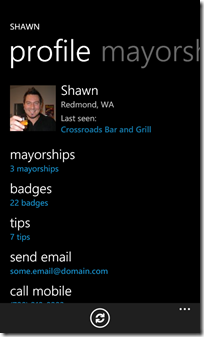
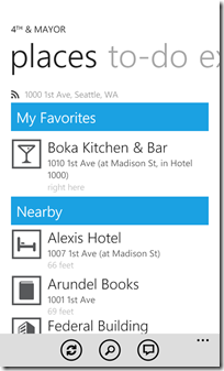
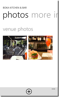
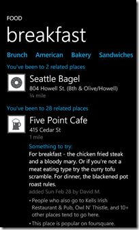
Recently I had the pleasure of checking out @jeffwilcox’s newest app for the Windows Phone 7 platform called 4th & Mayor. It allows you to interact with the location-based platform called foursquare.
His app allows you to check in, take pictures, find friends, etc. Everything other mobile apps for foursquare do. In the design of the app, Jeff has really done a nice job on embracing and extending the Metro look and feel that’s prevalent on the Windows Phone 7 platform.
Inspiration
For me, I’m not even a foursquare junkie. I (still) don’t see the value in telling the world where I am at any given moment but I gave it a shot with Jeff’s app. Using his app I created an account, checked into a few places, and even became mayor of a few local hops (like the corner variety store, go me). I still think foursquare is silly, but 4th & Major made it fun for me.
Some key design features I saw in 4th & Mayor:
- Large touchable icons. Not tiny little things but big, bold 200 pixel wide images that expanded out to full size when tapped.
- Use of Accent Colour. Jeff uses it sparingly and doesn’t overdo it by setting subtitles and key information on the screens in whatever accent colour you use.
- Light and Dark. Jeff makes sure that the app still looks good in both dark and light themes and uses bold Metro like icons for types of locations (instead of say photos)
- Whitespace and Alignment. Nothing is too crowded in the design, even when there’s a lot of information to present and all the text aligns nicely so it’s not all over the place.
Enter Metro
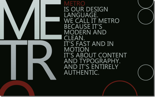
What’s Metro? Metro is the name of the new design language created for the Windows Phone 7 interface. It’s heavily influenced by Swiss print and packaging and focusing on simplicity. You can read up more about Metro here and review the Windows Phone 7 design guide that talks about specific controls and implementation here.
Since the release Jeff has also posted what he’s calling his Metro Design Guide. It’s a checklist (of sorts) that goes through the various aspects of the Metro design fundamentals and some things he’s sharing with everyone. It’s a great read and gets you into “thinking Metro” so I encourage everyone to check it out.
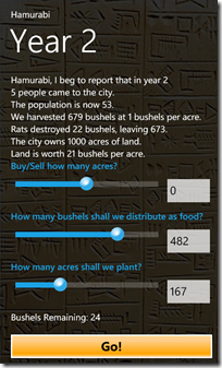
So where were we? Oh yeah. After playing around with 4th & Major and checking out a few other apps (like the Rock & Snow App out of the U.K. Marketplace) I thought it would be appropriate to give my simplistic Hamurabi game a facelift, Metro style. Little tweaks here and there just to clean things up a little. Here’s how I transformed the app to the next version.
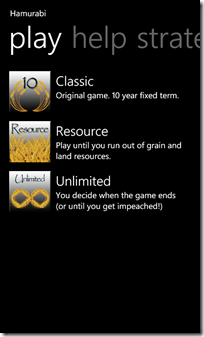
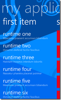
The app is pretty basic. A pivot table with various sections for playing the app, getting help, etc. and one gameplay screen where all the action takes place. Here’s version 1.0
Bland and boring. The pivot control is the out of the box one. The gameplay screen is just a portrait page with some controls on it. I did do some styling in the first version around the slider control to make it a little better. I really didn’t care for the out of the box slider as my first test user claimed they didn’t know how to use it. So I just styled it with a round button with a little gradient background to make it more prominent. Yes, it looks a little like an iPhone control but there’s no real Metro equivalent and the default implementation sucks.
Metrofication
First up I went through the entire app and cleaned up the various offsets. In Jeff’s guide, the magic number is 12 pixels. I think I have engrained into my head now. 12, 12, 12, 12. And multiples of 12 are fine too, but by default regular text is indented 12 pixels from the edge of the screen. It’s a nice number so don’t mess with it.
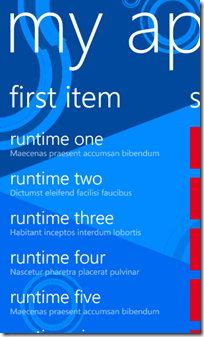
As you can see from the screenshots above, I’m not completely consistent in my alignment and spacing. Text overhangs various places and isn’t consistent. Also the text on the home page doesn’t seem to stand out. It’s hard to tell the difference between the titles and the descriptions (they’re larger in size but I think we can do better).
The Prime Directive
If there were a Prime Directive when building an app for WP7 this might be it. Simplicity through consistency. Stick with known styles and numbers. The default spacing is 12 pixels and while you might need some more, try to keep with that number in mind. Keep your spacing consistent throughout your entire app as well as colours and fonts. I don’t mean use the same font everywhere but I do mean to not arbitrarily space controls on the design surface.
This idea here is that when a user is looking at one app, then flipping to another it shouldn’t be a jarring user experience. Your own app pages should be consistent in their font use and spacing as well. If everyone follows some simple consistent rules (both in and out of your app) then the user benefits. The experience is consistent and while you’re totally allowed to be creative, don’t overdo it.
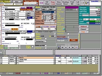
That is, don’t do this:
Here’s a Windows app that someone wrote which just goes to show that being unique isn’t the best experience in the world for the end user. Cluttered, multiple colours, multiple fonts. In a word, confusion just from an aesthetic sense (let alone the poor sucker who has to use this app).
Metro is like a design pattern. In software development we have all kinds of patterns. Patterns for separation of responsibility, patterns for accessing external data. If you can program it, there’s probably a pattern for it. The thing is with patterns think of them like sewing patterns. They provide a shape to cut out and some instructions on how to use them. You can follow them by the book and get a good result. It’s the people that take patterns and apply their own creativity to them that makes them stand out. This is the same with Metro. There’s no rule written in stone that says you have to use a specific font in a specific size for a panorama title. What the Windows Phone toolkit provides out of the box is a default implementation.
Pivot to Panorama
For example let’s take a look at the Panorama control. As I was cleaning up the Hamurabi app I thought it might fare better as a panorama control instead of a pivot. It’s a choice as to what control to use as the two are very similar but I follow a simple rule. If the data presented is different slices of a bigger list (for example filtered views of a large list) then a pivot might be more appropriate. If the screens are somewhat disjointed and don’t really go well together then a panorama might work. Again, no hard and fast rule here but I thought I would try a panorama control.
Here’s the default panorama control you get if you use the Microsoft template:
Simple and it works. Nothing special you need to do except replace the background image with you own.
Or is there?
For Hamurabi I didn’t want the harshness of the title that comes with the out of the box panorama control so I created a new style for the title and added it to the page:
Then instead of using the default Header property I overrode that with a custom TitleTemplate:
The result is a slightly less glaring title. It’s still a Panorama control but I like it better than the default one. The text doesn’t stand out as much and I find it more inviting. Also with the reduced font size from the default, I have a little more room for my application.
Next up were the Panorama Items. Again, here’s the default:
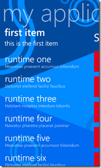
And again we do a little styling. Instead of a single text title I wanted to put in a subtitle and change up the font weights and sizes a bit. Here’s the new XAML styles that we’ll use in our custom item header:
And here’s the updated XAML for the Panorama Item:
And here’s the updated Panorama control from the app:
These are simple changes we’re making here. Nothing Earth shattering but they’re making a difference. I’m not saying everyone should go out and make their apps look like this but be creative. Look at your subject and think about what experience you want your user to have. Is it better to identify things with icons than words? If you’re building something common that everyone knows by sight, maybe you should use graphics for titles (or to supplement them). Again, don’t go overboard here. Look back at good examples like 4th & Mayor. It’s not littered with graphics in every corner. Use it sparingly as an accent, not as the cornerstone of your app.
After doing the initial changes I found a suitable background image for the Panorama control. As Jeff points out in his article, don’t use a Panorama control if you only have two pages (it doesn’t flow very well) and keep the number down (he recommends no more than three). I went a little overboard with mine as I had help, tips, and strategy pages. If I combine them all I could bring that number and maybe I will.
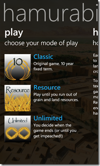
The other slight change I did was to style the default button. Again I didn’t go overboard here as I didn’t want buttons to look like WinForms apps or something. I just felt the default white border button was boring so I just used a simple gradient background and a colour that was more appropriate for the application. Hopefully it blends in a little more. Here’s some screenshots from the transformation.
A little different from the original but not by much. Here’s a summary of the UI changes I did:
- Changed from Pivot control to Panorama (new background image)
- Styled Panorama Title (smaller font; lighter opacity)
- Styled Panorama Item Header to be two lines instead of one (plus slight font and size changes)
- Styled default buttons
- More use of Accent colours sprinkled on various pages to highlight important parts
- Larger icons for game mode selection (130 pixels instead of 100)
- More consistent alignment and spacing throughout the app
All in all it took me about two hours to do all the changes (including hunting down some stock images and putzing around with the button gradient). No real investment and I think it’s an improvement over the original version. It’s still not perfect and I can see a few little tweaks here and there with margins that I need to correct. There’s also version 1.2!
So if you’re going to take anything away from this its to be creative. Don’t always just accept the norm as norm. Apply your artistic talents to your apps and with a few slight modifications you can go from bland and boring to interesting and fun. And remember to not to go crazy. Get an outside opinion. Pass your app onto others, post screenshots, etc. Above all, go out and create.
-
SharePoint Content and Site Editing Tips
A few content management and site editing tips for power users on this bacon flavoured unicorn morning. The theme here is keep it clean!
- Write "friendly" email addresses
- Remember it's human beings reading your content. So seeing something like "If you have questions please send an email to Corporate.Comm@mycompany.com" breaks up the readiblity. Instead just do the simple steps of writing the content in plain English and going back, highlighting the name and insert a link (note: you might have to prefix the link with mailto:first.last@yourcompany.com). It makes for a friendlier looking page and hides the ugliness that are sometimes in email addresses.
- Use friendly column and list names
- This is a big pet peeve of mine. When you first create a column or list with spaces the internal name is changed. The display name might be "My Amazing List of Animals with Large Testicles" but the internal (and link) name becomes "My_x00x20_Amazing_x00x20_List_x00x20_of_x00x20_Animals_x00x20_with_x00x20_Large_x00x20_Testicles". What's worse is if you create a publishing page named "This Website is Fueled By a Dolphin's Spleen". Not only is it incorrect grammar, but the apostrophe wreaks havoc on both the internal name for the list (with lots of crazy hex codes) as well as the hyperlink (where everything is uuencoded). Instead create the list with a distinct and compact name then go back and change it to whatever you want. The end result is a better formed name that you can both script and access in code easier.
- Keep your Views Clean
- When you add a column to a list or create a new list the default is to add it to the default view. Do everyone a favour and don't check this box! The default view of a list should be something similar to the Title field and nothing else. Keep it clean. If you want to set a defalt view that's different, go back and create one with all the fields and filtering and sorting columns you want and set it as default. It's a good idea to keep the original AllItems.aspx (note the lack of space in the filename!) easy and unfiltered. It's also a good idea to keep your column count down in views. Don't let every column be added by default and don't add every column just because you can. Create separate views for distinct responsibilities and try to keep the number of columns down to a single screen to prevent horizontal scrolling.
- Simple Navigation
- The Quick Launch is a great tool for navigating around your site but don't use the default of adding all lists to it. Uncheck that box and keep navigation simple. Create custom groupings that make sense so if you don't have a site with "Documents and Lists" but "Reports and Notices" makes more sense then do it. Also hide internal lists from the Quick Launch. For example, if most users don't need to see all the lookup tables you might have on a site don't show them. You can use audience filtering on the Quick Launch if you want to hide admin items from non-admin users so consider that as an option.
Enjoy!
-
WP7 Mobile Friendly WordPress Site
If you're running a WordPress site you owe it to yourself to check out WPTouch. WPTouch is a fabulous plug-in for WordPress that instantly transforms your site into a navigatable mobile friendly one.
Browse to a WordPress site and it's pretty clean. Here's my site using the default Twenty Ten theme in my Windows Phone 7 IE browser:

That's pretty good. In fact, comparing it to the site in the browser it's identical. However navigating tiny links on the site or menus can be tedius with fat fingers. Sure, mobile devices offer pinch zoom and features like that but do you really want to be constantly zooming in, panning around, and zooming back out to read content?
Andrew Woodward over at 21apps turned me onto a WordPress plugin called WPTouch this weekend so I thought I would give it a go. I have a few sites I run on WordPress and I wanted to see what it could do. Wow. What a transformation. Once you install and activate the WPTouch plugin (all from the comfort of your WordPress dashboard) your site will magically be transformed into this:

My WordPress site looks like an iPhone app! No software to install on the client, this is all magically done behind the scenes by detecting the browser and serving up an alternate theme via the plug-in.
To get it working for WP7 I had to add a quick modification to the settings. Once you're installed WPTouch and activated it (just add it through the built-in search in the WordPress dashboard, it's the first one to come up) then go to Settings > WPTouch. Scroll down to Advanced Options. There you'll see a list of currently enabled user-agents so the list is pretty full; Android, BlackBerry, iPhone, etc.
What's missing is the user agent to detect the Windows Phone 7.
Just add "iemobile" which is the lowest common denominator to the Custom user-agents box and save the settings. Visit your site with your WP7 phone and voila, everything will be right as rain.
Don't worry about navigation as it's covered by a clever menu that's created by the plugin so you'll have access to tags, categories and any part of the site:

The rest of the site looks awesome and your browser users will still continue to see the site with whatever theme you have applied. It's not perfect on WP7 as the theme is designed for iPhones but IMHO it's a far better experience than trying to tap on tiny links in a browser. Everything is big and bold, the way it should be on a mobile device.
Finally, if you do decide to add the plugin (it's free, although there is a Pro version too) then show your WPTouch pride to your desktop browser users with a decal. The guys ask you link back to the site if you do. You grab whatever size and format image you want from here.

Hope that helps and here's to a better mobile experience from your WordPress site!
P.S. The "boys" and I were discussing something like this for SharePoint. Yeah, it would be totally awesome if we had something like this which would serve up say a Metro view for WP7 phones. Not sure if it'll become a reality but food for thought.
-
Secret Agent Man
Just a quick one this morning as we all get started in the week. Something that comes into play (sometimes in a big way) is the user agent string your browser gives off. So for example using the User-Agent field in the request header, you can determine what browser the user is running and act accordingly.
Internet Explorer 9 modified the UA string slightly so just in case you're looking for it here are the user agent strings for IE9 (in various modes):
- Internet Explorer 9 Mode: Mozilla/5.0 (compatible; MSIE 9.0; Windows NT 6.1; WOW64; Trident/5.0)
- Internet Explorer 8 Mode: Mozilla/4.0 (compatible; MSIE 8.0; Windows NT 6.1; WOW64; Trident/4.0; SLCC2; .NET CLR 2.0.50727; .NET CLR 3.5.30729; .NET CLR 3.0.30729; MS-RTC LM 8; InfoPath.3; .NET4.0C; .NET4.0E; Zune 4.7)
- Internet Explorer 7 Mode: Mozilla/4.0 (compatible; MSIE 7.0; Windows NT 6.1; WOW64; SLCC2; .NET CLR 2.0.50727; .NET CLR 3.5.30729; .NET CLR 3.0.30729; MS-RTC LM 8; InfoPath.3; .NET4.0C; .NET4.0E; Zune 4.7)
- Internet Explorer 9 (Compatibility Mode): Mozilla/4.0 (compatible; MSIE 7.0; Windows NT 6.1; WOW64; Trident/5.0; SLCC2; .NET CLR 2.0.50727; .NET CLR 3.5.30729; .NET CLR 3.0.30729; MS-RTC LM 8; InfoPath.3; .NET4.0C; .NET4.0E; Zune 4.7)
A couple of things to note here:
- This was from a 64-bit Windows 7 client so that might account for the WOW64 in the agent string (I don't have a 32-bit client to test from)
- Various applications and platforms add to the UA string just like they do in previous IE releases. So for example you can see I have various .NET versions installed as well as Zune. You can take advantage of this by querying the UA string for compatibilities and present options accordingly to the end user.
- As applications will continue to add and modify this string you'll want to query the string for parts not the entire string. For example if you want to detect if you're coming from IE running on a Windows Phone 7 just look for "iemobile" in the user agent string
Happy hacking!
