My Font and Color Settings for Visual Studio 2010
One of the first things I do each time I start using a new version of Visual Studio is to customize the font and color settings.
For Visual Studio 2010 this turned out to be a bit more complicated, though, because of the way XML documentation comments are rendered in the new editor.
I like my doc comments to be shown with a background color, but different from earlier versions of Visual Studio, VS2010 will not continue the background color until the right margin, but instead until the last character of the line – which turns out to be kind of ugly.
Fortunately, there’s an extension for that.
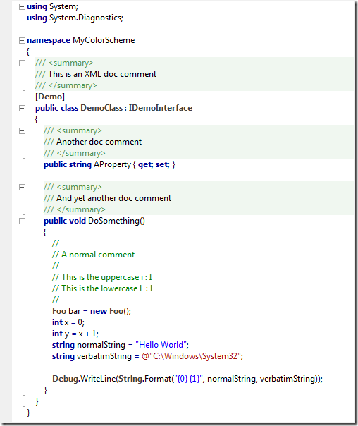
So in order to get something similar to this…
…you’ll need the Background Color Fix extension by Noah Richards. Note that the extension doesn’t always reflect changes you make to the colors immediately; you’ll have to close and open documents or even restart Visual studio. But once you’re set, this is a non-issue.
My personal font and color settings for Visual Studio 2010 shown in the screenshot above can be downloaded here (right-click the link and "Save Target/Link As").
