How the web could be
The phrase always comes up. “Blame Hanselman”. Scott Hanselman is the bane of new technology, gadgets, and tools for me. Like a lemming, he mentions something cool and we all flock to it. Today he was rambling on about a new reader from the NY Times (written using WPF) that is the cat’s meow. I’m not one to normally read the times as I find it bloated and boring, but figured it was WPF and Scott’s blog entry on it looked interesting.
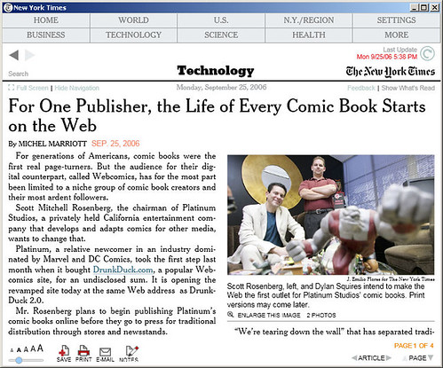
This really is the killer app for WPF, as it not only has everything but it’s brilliantly done. So many times paper publications have tried to make electronic versions of themselves and just basically failed. Others will convert their paper copies to something like a PDF file, but for whatever reason, the fonts/images just don’t look that great. Take a look at the image above. Even in the size the image is now (500px wide) you can still read the text (and that’s at the second lowest setting).
The layout is simple yet functional. The designers didn’t take the “one-resolution-fits-all” approach. As you resize the reader window, it moves elements around and fits them in smartly (for example, the newspaper sections wrap as the window changes size. However, everything stays relative so you’re not hunting around for a button or function that vanished off the page because you sized the screen too small. Too many developers omit little things like this when they build software. The NY Times guys got it right.
As for the features, you can search, change the font size, save the article (only in Times Reader format), email an excerpt (with links to the reader for those that don’t have it), and even create ink notes (if you have a tablet). Very slick.
The app is updating and you can just click on the update icon to download newer content. Like I said, I don’t read the Times so not sure if they post multiple issues during the day or if this app is fast becoming a more “live” version of the newspaper. People always say newspapers and magazines are so outdated because they report the news but then have to print and distribute. This removes that problem.
Okay, it’s not the first time a newspaper or magazine put their content into a reader (like I said, some have tried and failed) but I think it’s the first in using the Windows Presentation Foundation so there’s a cool factor here. And it’s well done. That says a lot.
However, just imagine if your favourite RSS reader delivered it’s content this way? Some newsreaders offer a “newspaper-like” view (Omea reader can do this, and I think FeedDemon can) which reformats RSS feeds into this style (and sucks in any photos in a blog entry to supplement the article). I don’t see why an RSS reader can’t be like this all the time as it’s a very user-friendly experience and would make reading feeds that much more fun everyday.
While I know the WPF is not for the web, with the advent of Atlas coming and web apps getting all AJAXy on us, why not have a web like this? Why can’t we have rich-web apps like the New York Times reader online? Sure this implementation is a client application, but the UI is so thin it could easily be done as an AJAX/Atlas website. The next step is to have the choice or a seamless transition from one to the other. Why can’t your browser be a shell for rich-client ClickOnce apps instead of a HTML rendering engine. I would like to see more apps built this way (both web and client) where appropriate.
I agree with Scott that the NY Times should have made this a ClickOnce app so it would always be current but other than that, this is a freakin’ cool demonstration of the Windows Presentation Foundation and how it can deliver a simple, yet effective solution.
You can download the NY Times Reader application from here (registration required, free to those who are breathing with an email address)
